
Postcard Front - I created a communication system that incorporated natural elements into all of the pieces. The front of the postcard has a daisy in the background. I chose to use very clean colors of slate, white and lime green throughout the system.
Postcard Back
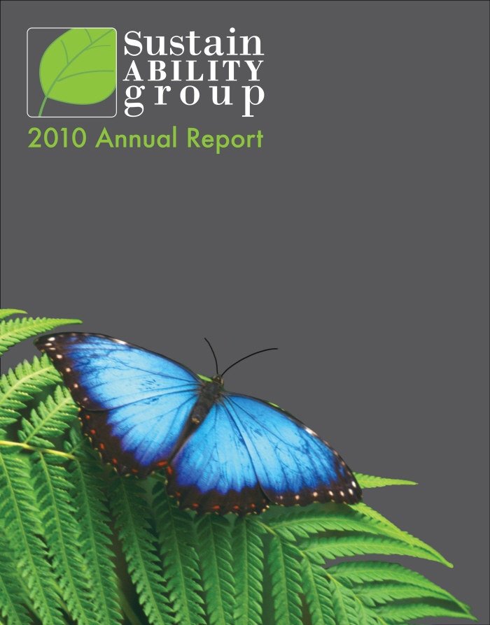
Annual Report - I created a communication system that incorporated natural elements into all of the pieces.
The annual report I chose this photo of a butterfly because it represents the completion of the year. The butterfly has made its transformation and is ready to start a new year. The photo also uses the colors slate, lime green, and gray.
Stationary
Envelope
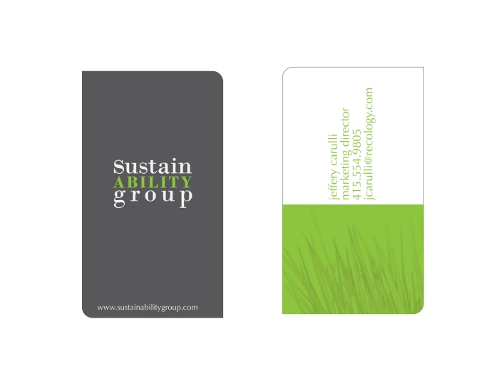
Business Card - I chose to use a die-cut business card to mimic more organic shapes. On the information side of the business card I used an image of grass. I placed the information vertically to represent growth and to flow with the lines of the grass growing upwards.
gLike