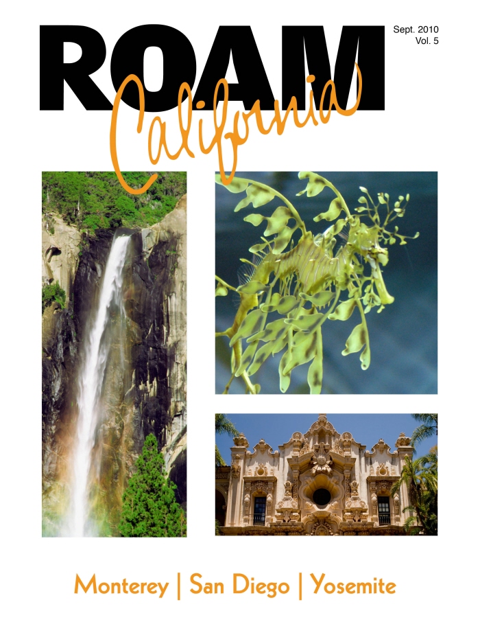
Cover - This is my modern approach to a travel magazine. The masthead would change per issue. Each issue would highlight a different location.
I used a strong grid throughout the magazine.
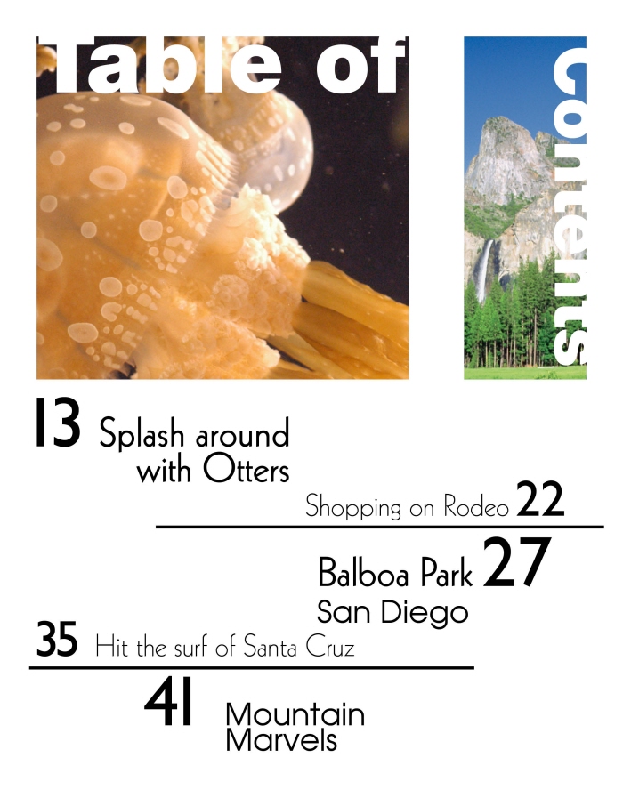
ToC - The table of contents uses a grid system. The highlighted articles have larger numbers and heavier fonts.
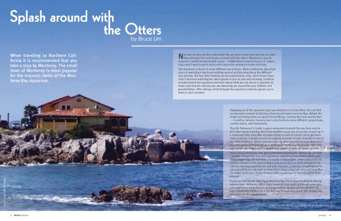
Spread 1 - I repeated the lines and grids from the ToC and the cover. I made the photo the focus of the spread and created a grid with the article.
View PDF
View PDF
Spread 2 - I chose to place the title on the right page to open up the photo of the bay, which will allow the reader to wonder and think about what is out there. Because the title is on the opposite page I used the repeated line to draw the eye down to the start of the article.
View PDF
View PDF
gLike