
Expresion - Dr. Santi Spread - What Made This Design Special:
By using the yellow swoosh in the design, I felt it really helped to unify everything, tie it all together and also reinforce the focus of the article if a reader was just flipping through the magazine.
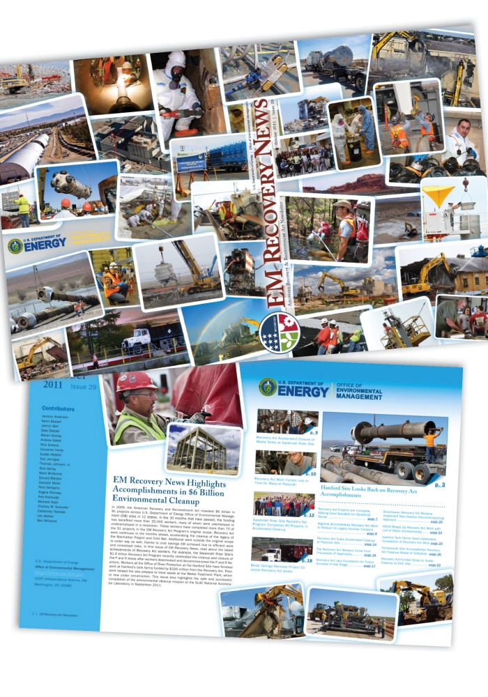
Department of Energy - Recovery Newsletter - the Department of Energy originally approached me asking how I could help update their recovery newsletter. Shown here is the final special wrap up issue, but the goal of the newsletter was to provide updates to all levels of government on how Recovery Act money was utilized.
During my initial meeting with the Office of Environmental Management I found out that they regularly received images from numerous offices across the U.S., however, they really weren't utilizing the photos. The template and style I proposed was focused almost solely on the images and they really dictated the design. The newsletter took on more of a magazine feel than your traditional newsletter. I also added some interactivity to it by linking to videos, images and adding internal links and jump marks so that a user could easily skip through the PDF from the table of contents or quick tabs. The new design shortened their timeline from 3 weeks originally to just 1.

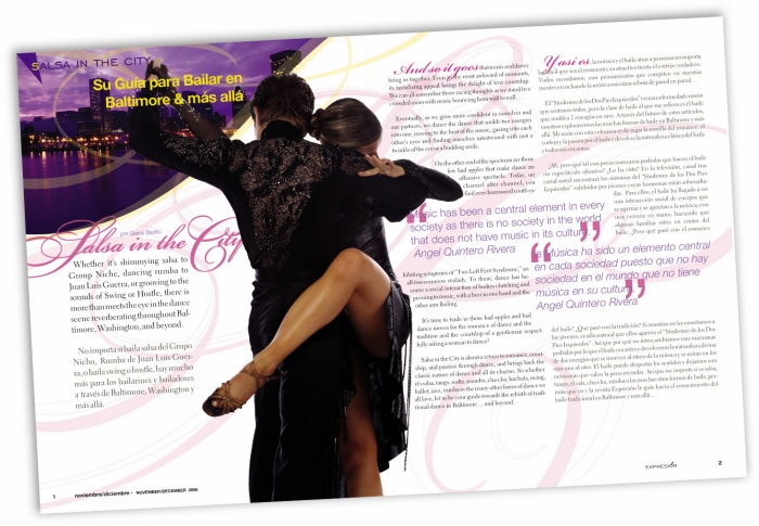
Expresion - Magazine Spread for Salsa in the City - What Made This Special:
Salsa is a very sensual dance and I felt that had to come through in the layout. By choosing a elegant font, the strong use of type helped to add to that sensual appeal and lead the readers eye through the spread.
Designing for Expresion was a bi-lingual publication. If you've ever dealt with english to spanish translations, they aren't literal. The spanish was always longer then the english, which made it difficult for the text to flow properly.

Expresion - Dental Emergencies Article - What Made This Design Special:
Expresion had a very small budget, which made it challenging to create 15-20 visually interesting articles that grabbed and kept the readers attention. So, most of the time we had to be creative with text and imagery.
For this spread, I shot the photography of the football player in the foreground and the field in the background which helped keep the cost down. By blurring the background it helped keep the focus on the player. Type was used to further draw attention and accent the imagery and content.
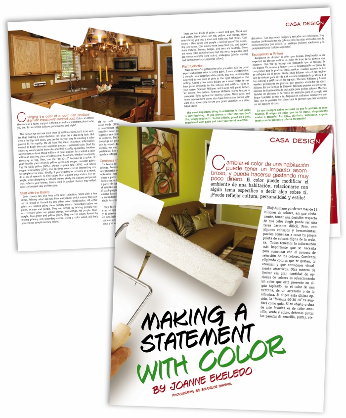
Expresion - Casa Design Spread - What Made This Special:
This article was about color. I proposed using the paint roller to sort of paint in the photos, which gives the impression your looking through a painted wall into the finished result. I think it also helped to break the square edged look of traditional photo boxes.
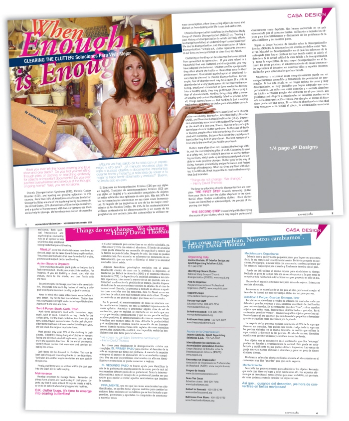
Expresion - Casa Design Article - What Made This Design Special:
Another example of how the design complimented the article. I pulled color from the imagery provided by the Interior Designer and used type and color to interact with the photos. Even though there wasn't a woman in the actual picture, by adding her in afterwards, it gave a more personal feel to the article. The pops of color throughout helped break up the text and make it visually more appealing.
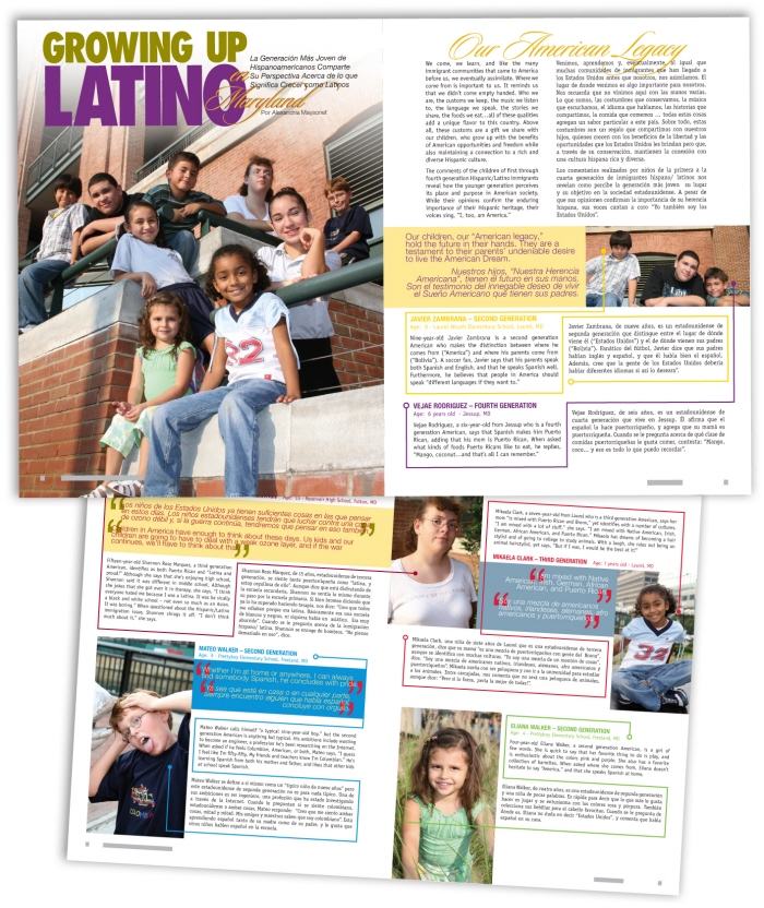
Expresion - Growing Up Latino Article - What Made This Design Challenging:
Coming up with a solution of how to interact all the images, with the quotes as well as bios for each child was challenging.
To solve the design problem, I used vibrant colors in the text drawn from the content within the images. I felt this helped to lead the readers through the text while adding visual interest to the article.

Expresion - Keep Your Cool Article - What Made This Design Special:
There aren't many editors that would allow you to build a "middle finger" from text, and work it into a design. Given the violent nature of the article, the editor and I felt it was justified and important to really stop the reader and encourage them to read.
The graphic was built from three different images. I over-layed and re-colored each to give a more dramatic feel. I also varied the size of the text to help lead the eye around the layout.

Expresion - Interviewing Landmines Article - What Made This Design Challenging:
For this article having so much text made it difficult to design around. I came up with the idea to use the english to spanish translation as a design feature, drawing more attention to it with the reversed out text. I also had the idea to change the title from just "Interviewing Landmines," to "Interviewing Landmines: Not Everything is Black & White Anymore." I felt this title was more engaging and fit even better with the layout.
gLike
Magazine & Editorial