
Spring Fashion Show Poster submission 2009 - This is a submission for the IADT-San Antonio Spring Fashion Show 2009. The theme is "The Golden Age of Hollywood". I sat down at the computer the day before deadline and put this work out in about three hours in Illustrator CS4.
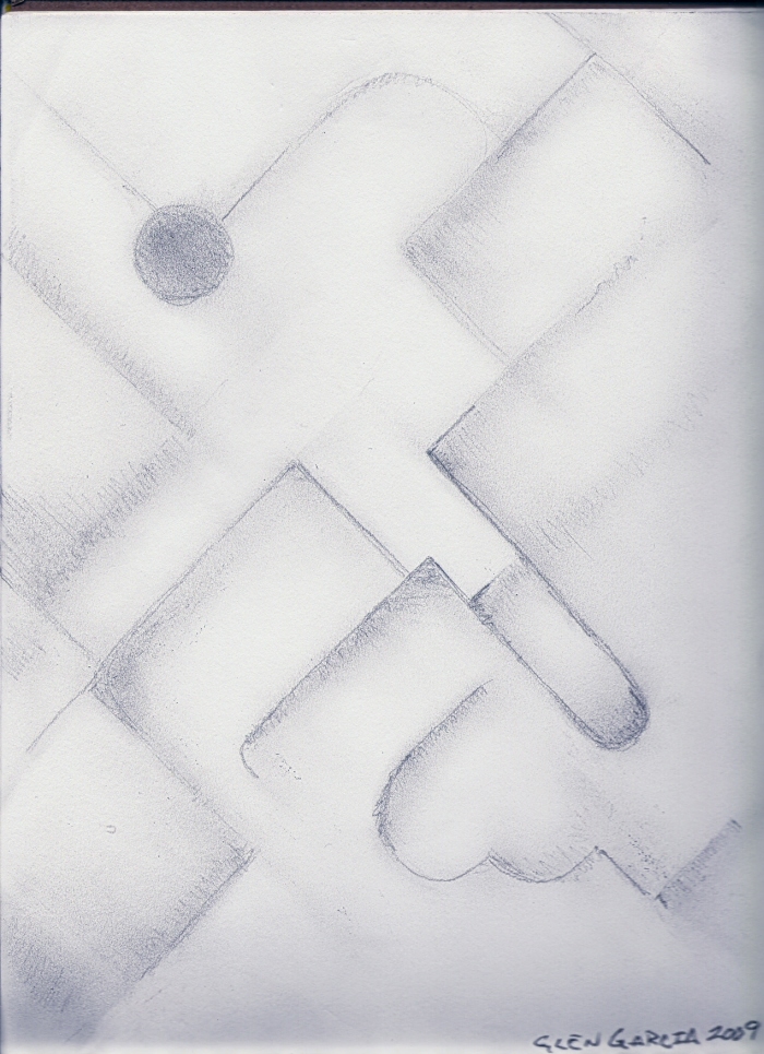
Patterns 1 - I drew this yesterday using an HB pencil on Strathmore 50 lb. 9" x 12" sketch paper; The pattern motifs have a southwestern feel to them, in my eyes. If it looks a little skewed, that's because I didn't use a ruler and I had the sketch pad in my lap at the time I drew this.
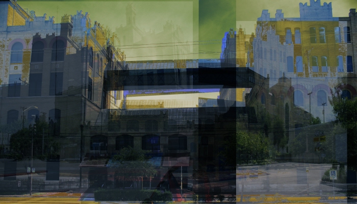
SAMA 1 - I put this collage together from images I took on a field trip to San Antonio Museum of Art last October. I used Photoshop CS3 to put it together.
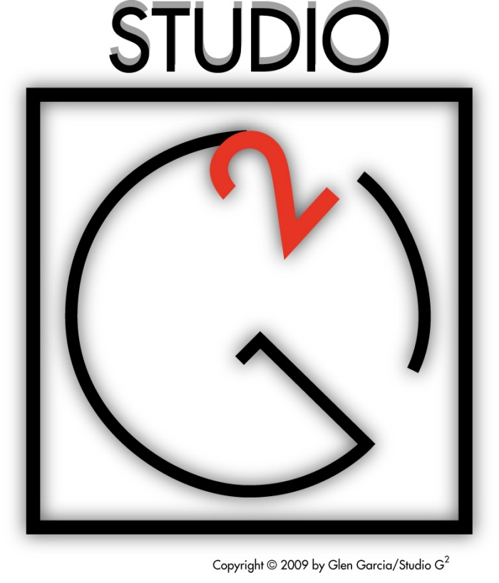
Geesquare logo Redux - A revisitation of my Studio G2 logotype, drawing more influence from the Bauhaus, particularly Behrens' work for AEG in the early 20th century.
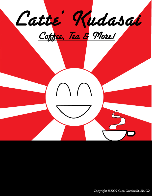
Latte' Kudasai Logo - This is just something I put together last night in Adobe Illustrator CS3; this is not a real place, mind you, I just made it up, and for those from Japan who might be offended by the pun, my sincerest apologies. I've had the name of the place bouncing around my head for awhile, and it had to come out sooner or later.
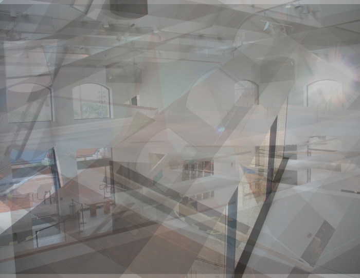
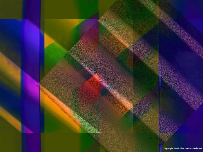
SAMA Impressions 2 - I put this work together from various photographs taken on a trip to the San Antonio Museum of Art in July 2008. I used Photoshop CS4 and incorporated layers, playing with the opacity and blending settings of each, then added a gradient map and a solid color adjustment layer to achieve this work.
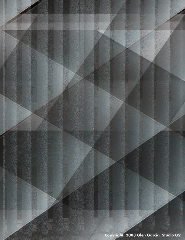
Blinds2 - Created using Photoshop CS4. Used blending modes, adjustment layer, and gradient map to create.
Blinds - Created New Years Eve day in about an hour using Photoshop CS4. I keep a large source file of seemingly useless shots such as out-of-focus shots, pavement, grass, brickwalls, and in this case, blinds, because you never know when you'll be inspired. I used layers and blending styles to create this cubist-inspired work.
Skyclad1 - I took this photo from my apartment building last weekend. I opened the picture in Photoshop, adjusted the shadows/highlights, added layers with color fills and a gradient map, then played with opacities and blending modes to achieve this effect.
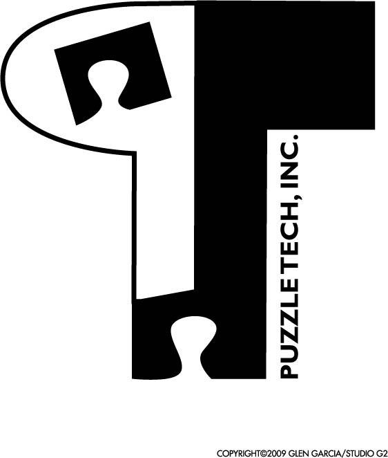
Puzzle Tech Logo - I did this for fun using Adobe Illustrator CS4. I simply wanted to challenge myself last Saturday to design a logo for some made-up company, and after some thumbnailing, came up with this.
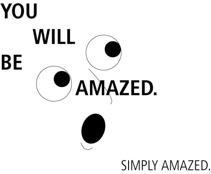
Simply Amazed - Just having some fun with Adobe Illustrator, a couple of Frutiger faces and some simple graphics.
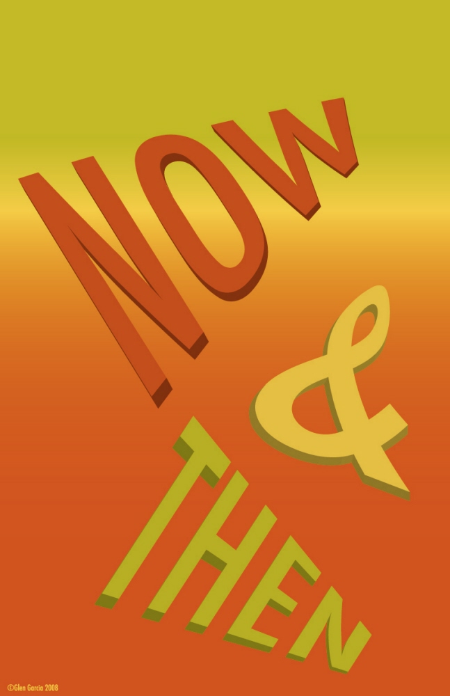
Now & Then - Application: Adobe Illustrator
Typeface: Futura Regular Condensed, converted to outlines
FX: 3D (extrude & bevel), Envelope Distort using Warp.
Colors used: Brass, Amber, Rust.
Process: Started with a drawing to thumbnail idea, worked up from scratch in Illustrator.
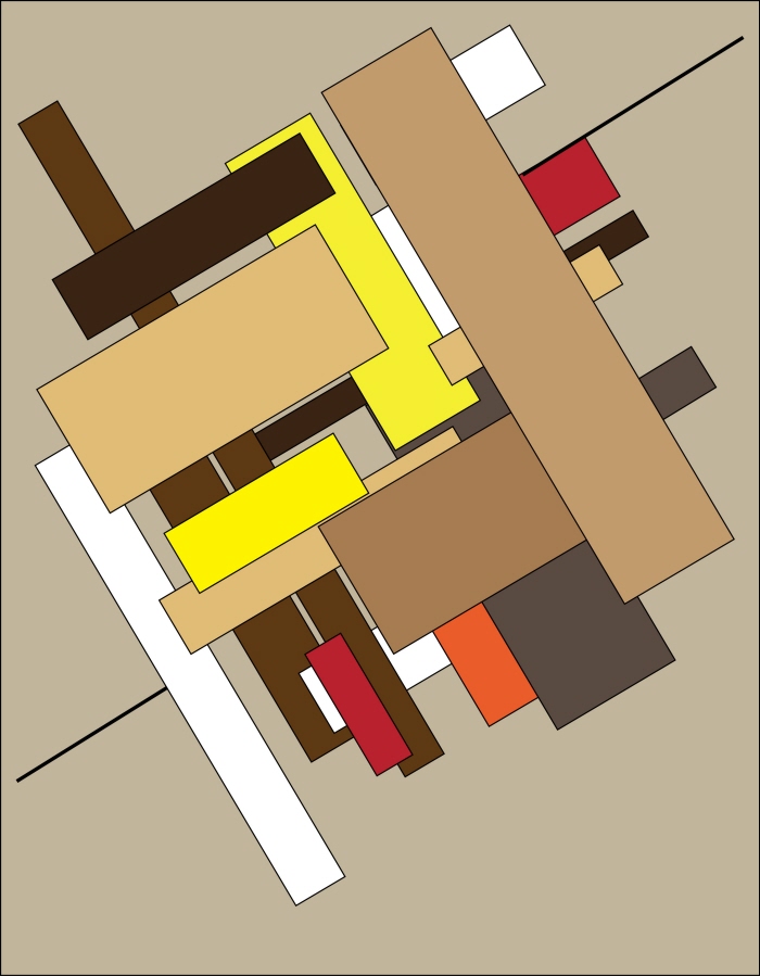
Angles & Tangents - Just something I did one day when I had absolutely nothing to do. This work was inspired in part by a famous jazz festival poster by Paula Scher. Plus, I love putting diagonals into rectangular formats. I don't wish to paint myself into a stylistic corner, but for some reason, I like the dynamics and design challenges.
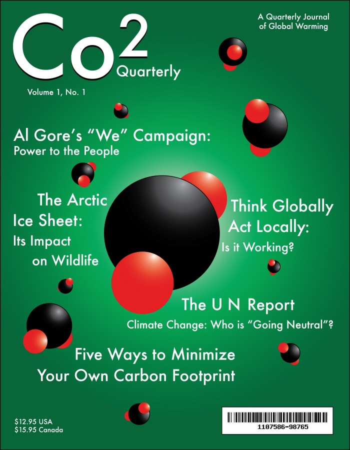
Fictional Magazine Cover Project, Graphic Design II - The assignment was to design the cover of a fictional magazine. I used Illustrator for the graphic and type elements on this one. I strove to achieve a balance between image-driven and text-driven design.
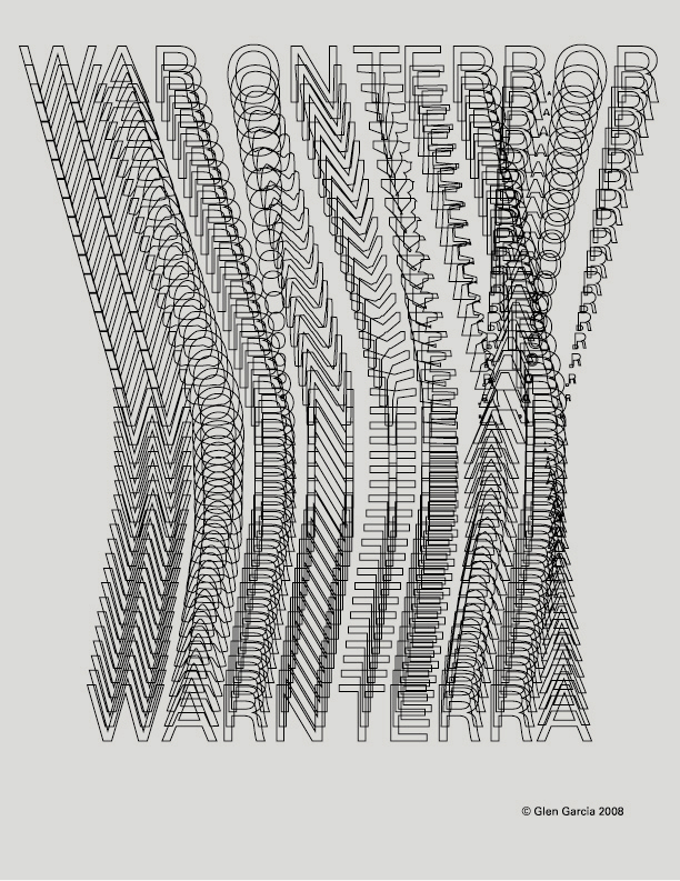
Warn Terra - Just a little take on a number of sensitive political subjects, from geopolitics to economics to ecological issues. My sincerest apologies to anyone who is offended.
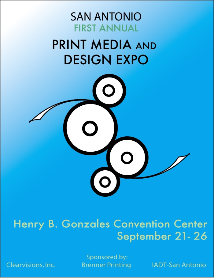
Print Media Poster-Computer Illustration Class - I created this one using Adobe Illustrator CS3 for my computer illustration class. The project was to create a movie/event poster. I did thumbnails, and came up with the logo right away. My thanks to my teacher, Jenni Klein, for help and inspiration.

Spaceship number 1 - Just something I came up with one evening in Adobe Illustrator. I love science fiction and I've been captivated by the sheer wonder of space travel and the mysteries of the universe ever since I was a kid. I remember seeing both the Gemini and Apollo missions, and I miss the excitement and vision of that time in the era of manned space flight.
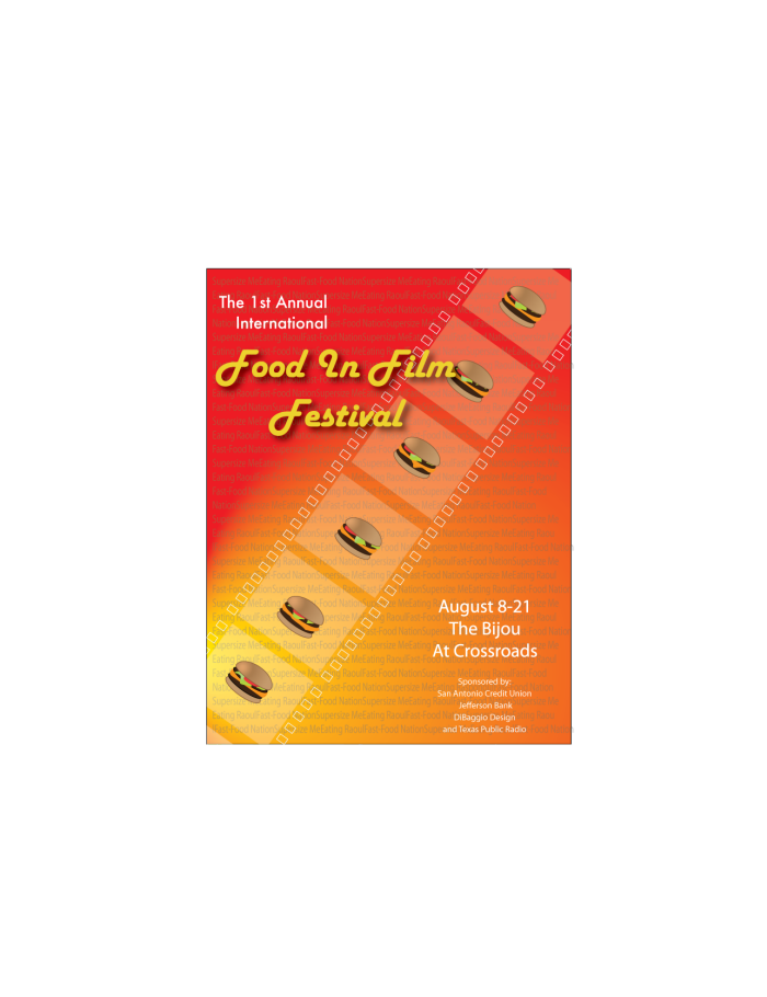
Food In Film Festival Poster - Another film/event poster I created for computer illustration. I really thrive in this class. My output has been prodigious. I am really going to miss this class when it's over. My thanks again to Jenni Klein for her help.
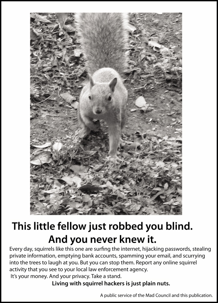
Just Plain Nuts! - This is a humorous fake public service ad I created for a project in my Graphic Design Class at IADT-San Antonio. It went into a 16-page magazine that a team of fellow students created. The original photo was shot from my patio. Little bugger came right up to me! Definitely a Kodak moment.
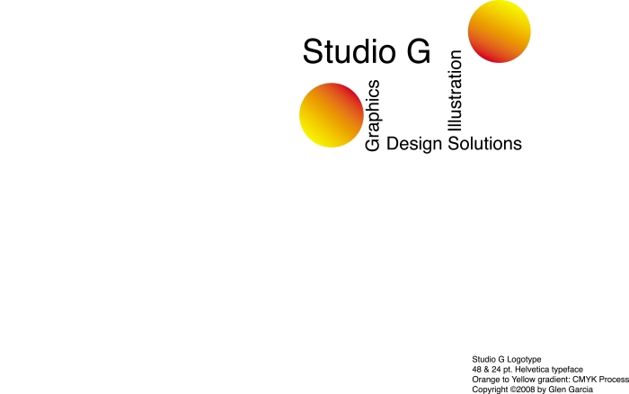
Studio G Logo - This is a logo I created for a fictional design studio. I used Adobe Illustrator to create the logo, then exported as a JPEG. This is a revised version with Helvetica as my font of choice, along with copyright info.
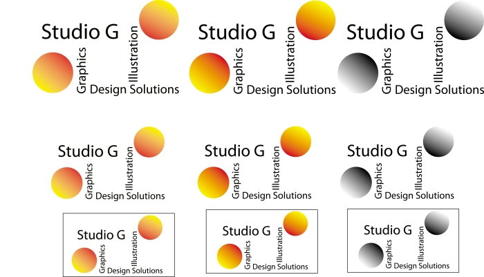
Studio G second view - A slightly better view of the Studio logo, using the same layout and the same color scheme as the DPI logo.
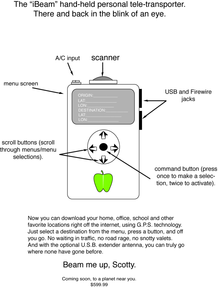
i-Beam Ad - Another ad I created early on in my second semester at IADT-San Antonio; this ad was created in Illustrator as part of a presentation in Verbal Communication class for a fictional product that I was to sell to my classmates.
I still think the idea of a hand-held teleportation device would solve a lot of issues with global warming, traffic congestion, etc., but I haven't a clue as to how we could get it to work without scrambling peoples' molecules. But, hey, we can dream, can't we?
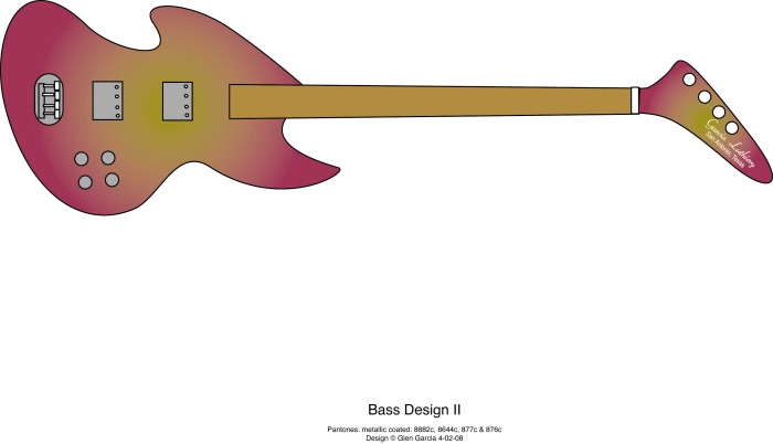
Bass Design II - Another work with the Vistablet and the Pen Tool in Illustrator. Getting a little bit better. Love those Pantones. I'm a fretless player, so naturally I'm going to show fretless instruments. Plus, I don't have to go in with the line tool and draw all those frets.

Illustrator files from Typography Class - The assignment was to create characters representing a given concept (work, sports, holidays, etc.) purely from letters in order to become familiar with letterforms and their spatial relationships with the format(s) on which they are created. These two parodies were created with Illustrator to represent the concept of work. I hope I haven't stepped on anyone's toes, but if I have, my apologies.
Illustrator files from Typography Class - The assignment was to create characters representing a given concept (work, sports, holidays, etc.) purely from letters in order to become familiar with letterforms and their spatial relationships with the format(s) on which they are created. These two parodies were created with Illustrator to represent the concept of work. I hope I haven't stepped on anyone's toes, but if I have, my apologies.
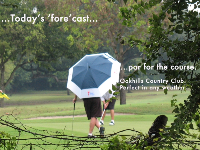
Oakhills Ad - I created this ad in Photoshop early on during my schooling. My patio backs right up to the golf course, and I couldn't resist getting this shot during a rainy day last summer.
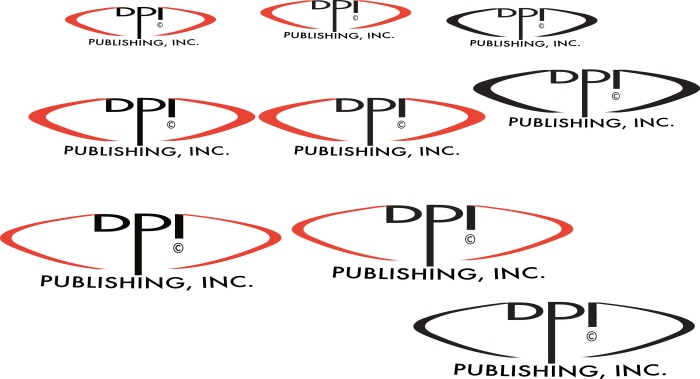
DPI Publishing Logo - Another assignment, this one for Digital Prepress. I was to come up with a logo for a fictitious publishing house, create it in CMYK, two-color and b/w, and show a proof in three different sizes to demonstrate scalability.
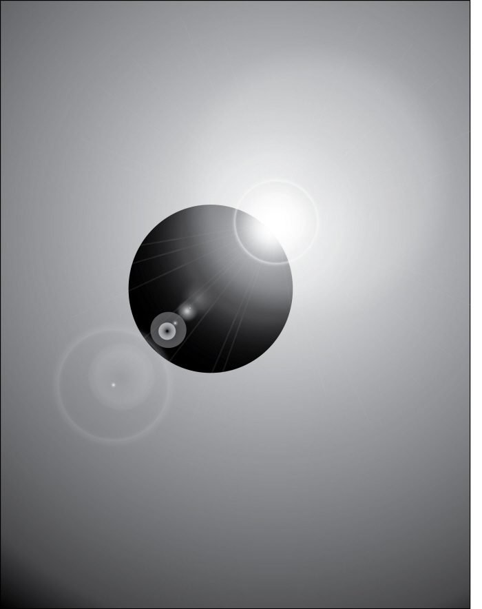
Eclipses - I was messing around with Illustrator one fine day, just learning how to use various features, and came up with these two. For some reason, I was obsessed with eclipses that day.
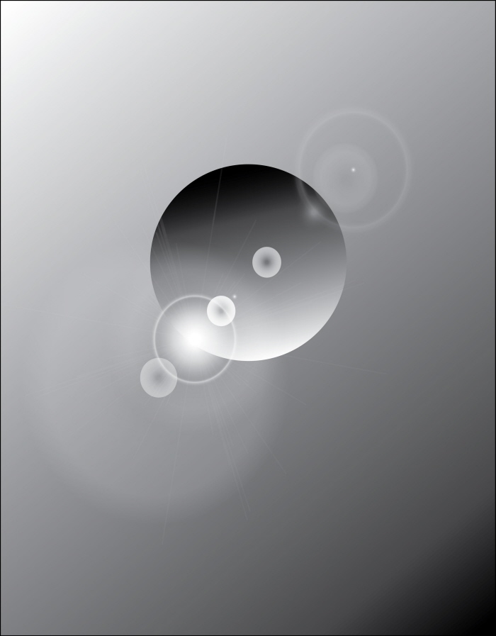
Eclipses - I was messing around with Illustrator one fine day, just learning how to use various features, and came up with these two. For some reason, I was obsessed with eclipses and other solar/planetary phenomena.
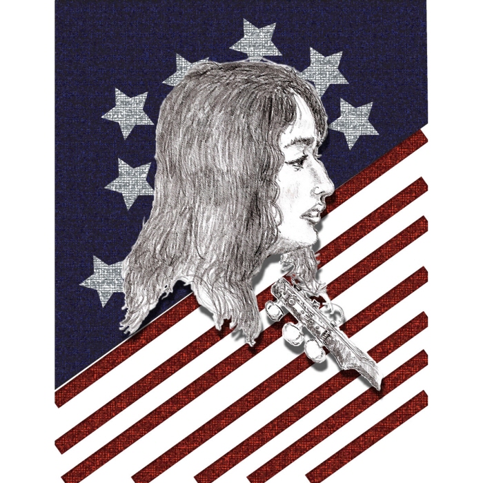
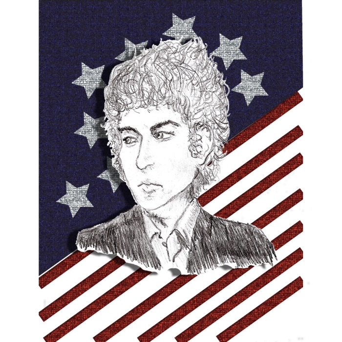
Joan, Bob & Woody - These are images I created for a postage stamp project in Digital Imaging. I sketched the images of Bob Dylan, Joan Baez and Woody Guthrie from famous photographs, then scanned them in as PDF's, opened in Photoshop, added the flag background from Illustrator, and these are the result.
Joan, Bob & Woody - These are images I created for a postage stamp project in Digital Imaging. I sketched the images of Bob Dylan, Joan Baez and Woody Guthrie from famous photographs, then scanned them in as PDF's, opened in Photoshop, added the flag background from Illustrator, and these are the result.
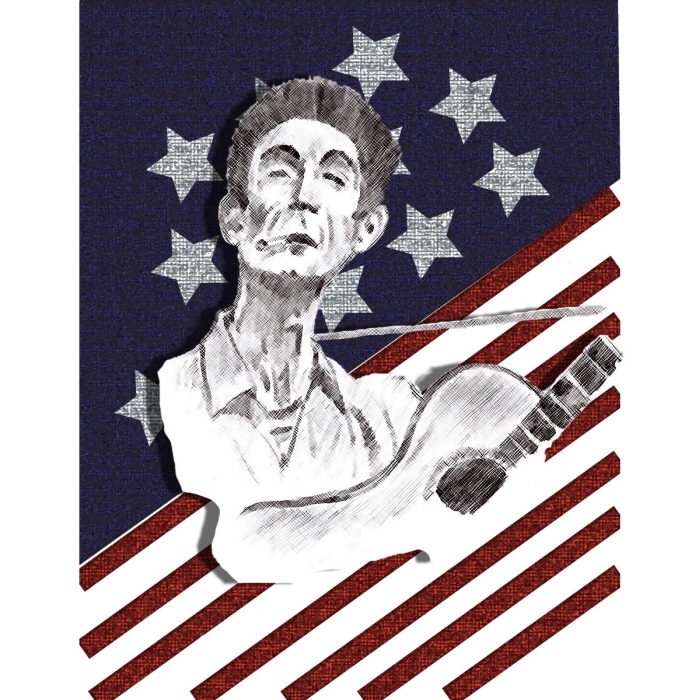
Joan, Bob & Woody - These are images I created for a postage stamp project in Digital Imaging. I sketched the images of Bob Dylan, Joan Baez and Woody Guthrie from famous photographs, then scanned them in as PDF's, opened in Photoshop, added the flag background from Illustrator, and these are the result.
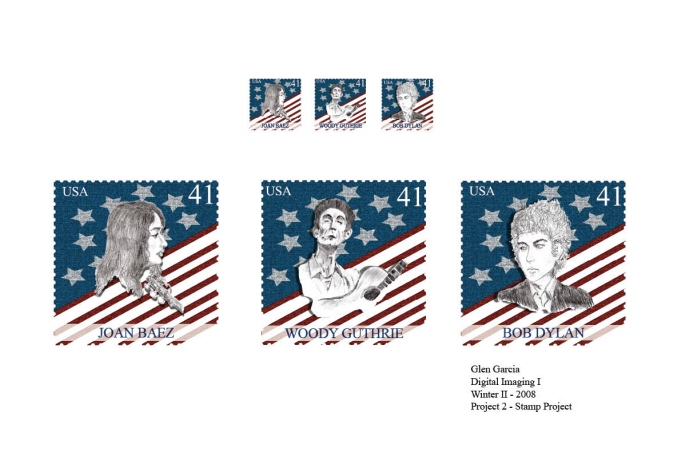
Stamp Project for Digital Imaging - These are the finished stamps I came up with for my digital imaging class. The teacher asked me to develop two motifs since I already had developed the second set as roughs along with the first. I lightened the background colors to make the first set more legible, and included a white background for the text at the bottom, and I knocked the opacity back about 19%. The designs were finalized in Adobe Indesign. I think this first set is the stronger of the two designs.
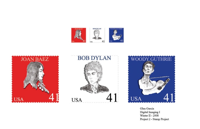
Stamp Project for Digital Imaging - These are the second set of finished stamps I came up with for my digital imaging class. If you look carefully, you'll see the French tri-color flag running through this set. I meant to do that, really! lol.
Bass Design I - I just acquired a Vistablet graphics tablet, and have been trying to master the tool in Illustrator. This is the first design I dare to show. I play bass, and love dreaming up designs of what would look cool with four strings. Not an auspicious beginning, but it's a start.
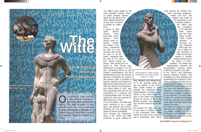
2 page Magazine Spread-Project for Graphic Design II Class - The assignment was to create a two-page spread for a fictional magazine. I went out to photograph the sights at the Witte Museum for this one.
Banner Design for IADT-San Antonio - Completed in late March, two copies of the banner were made. One is hanging in the student lounge at my school, the other is in my bedroom. I used Photoshop, Illustrator and Indesign to complete this project.
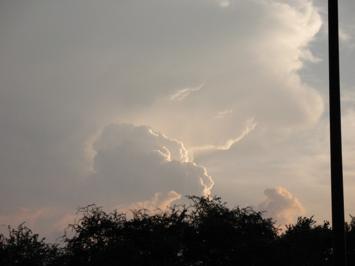
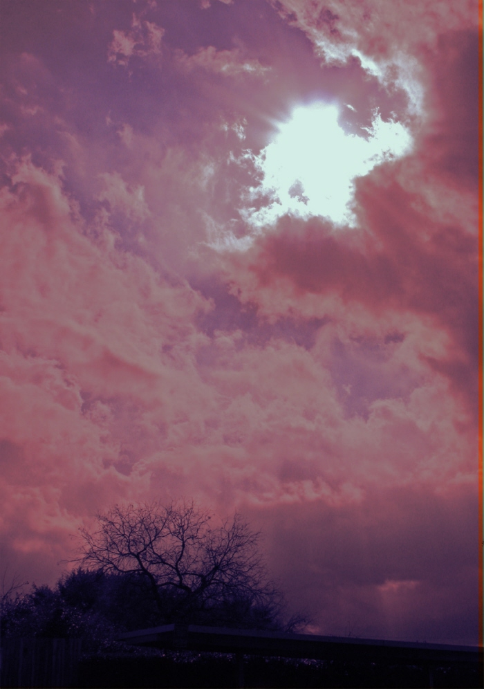
Three pictures of stormclouds - I took these last Wednesday, May 21st, at sunset, from the parking lot at school. We had a big storm brewing west of town, and I couldn't resist the urge to snap a few.
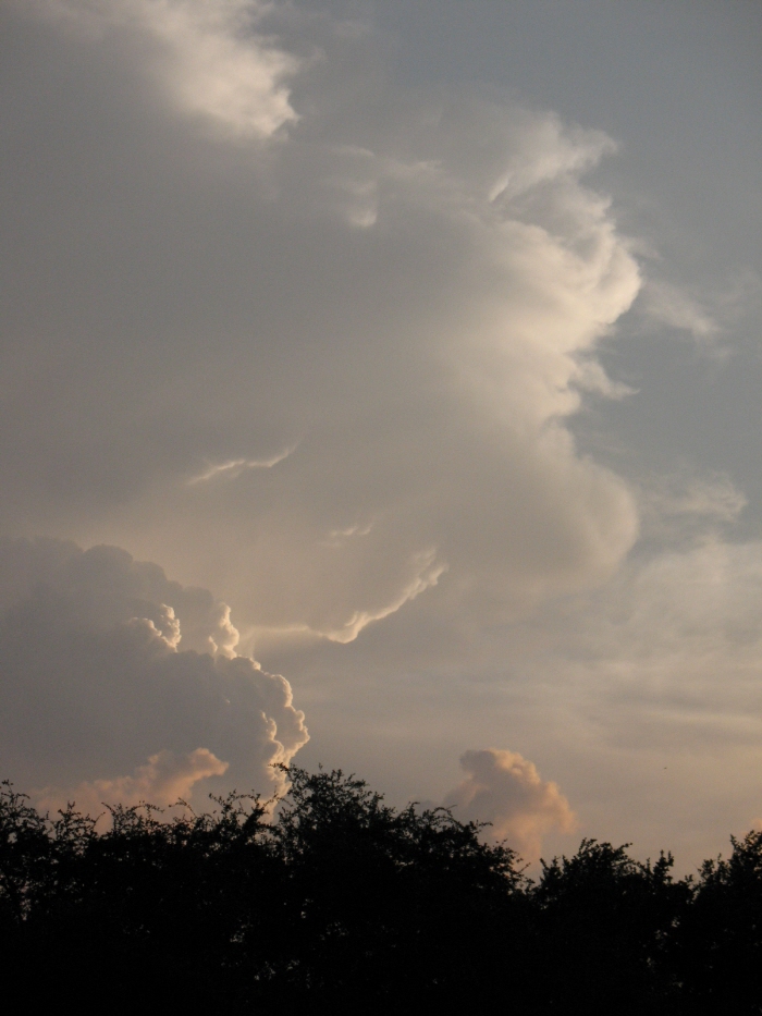
Three pictures of stormclouds - I took these last Wednesday, May 21st, at sunset, from the parking lot at school. We had a big storm brewing west of town, and I couldn't resist the urge to snap a few.
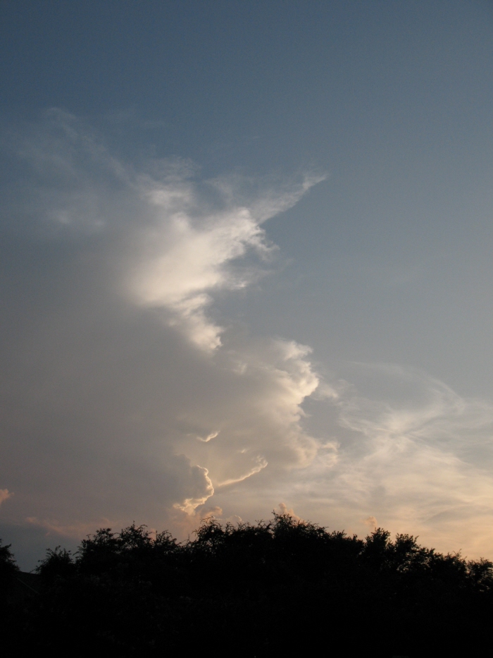
Three pictures of stormclouds - I took these last Wednesday, May 21st, at sunset, from the parking lot at school. We had a big storm brewing west of town, and I couldn't resist the urge to snap a few.
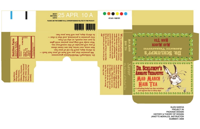
Teabox Design for Theory & History of Design Class - For this project, the class had to do a design based upon the Industrial Revolution/Victorian/Art Nouveau era. We were permitted to take a humorous tack on this project. I took as my model Lewis Carrol's Alice In Wonderland, and used the idea of the Mad March Hare, hawking a therapeutic tea that would regrow hair in thirty days. All of the Illustration and creative copy on the package is of my own devising. I used my Pantone color bridge and the Kuhler color guide in Illustrator as well.

Sunset 1-6-09 - Taken from the third floor of a building on the north end of my apartments. You can see the lights of Helotes, Texas in the distance in one of the shots.
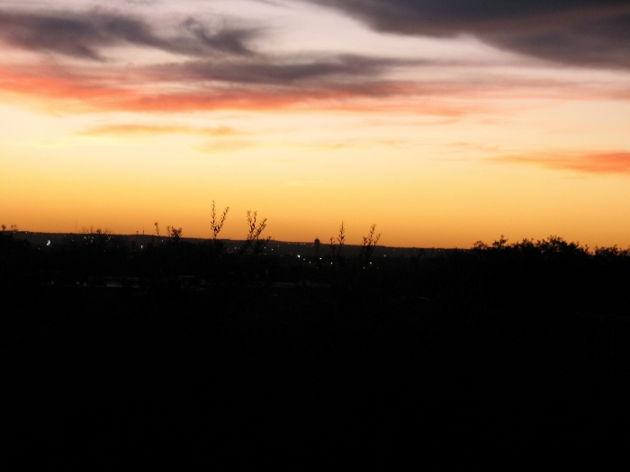
Sunset 1-6-09 - Taken from the third floor of a building on the north end of my apartments. You can see the lights of Helotes, Texas in the distance in one of the shots.
gLike
Glen Garcia Online