
Large format graphics for a fitness area at an Air Force Base. Concept was to express the feeling of energy and power while also serving as signage. (Not produced)

Large format graphics for a fitness area at an Air Force Base. Concept was to express the feeling of energy and power while also serving as signage. (Not produced)

Large format graphics for a fitness area at an Air Force Base. Concept was to express the feeling of energy and power while also serving as signage. (Not produced)


Wall graphic concept to greet students at Residence Halls. (Not Produced)

Wall graphic concept to greet students at Residence Halls. (Not Produced)

Large mural (12ft x 10 ft) at entrance to Summerfield Square clubhouse. Vinyl for the color letters, mirror finish metal letters for the name.

Room identification graphics. Applied on doors. Approx. 30" tall.

Room identification graphics. Applied on doors. Approx. 30" tall.

Room identification graphics. Applied on doors. Approx. 20" tall.

Men bathroom sign. Applied on doors. Approx. 30" tall (will be used in conjunction with standard ADA signage)

Women bathroom sign. Applied on doors. Approx. 30" tall (will be used in conjunction with standard ADA signage)

Bathroom directional sign. Vinyl on wall. 10" tall.

Welcome sign with map.

Detail of welcome sign. Map created by yours truly.


Composting Graphics - When we moved into a new building in 2010, we started an agressive program to increase composting and recycling. We created a series of color coded graphics that we used on the containers in the break rooms and the cafeteria, as well as a visual aid guide to help employees identify the disposable items.

Composting Graphics - Visual Aid - I photographed and drew all the icons in this visual guide.
When we moved into a new building in 2010, we started an agressive program to increase composting and recycling. We created a series of color coded graphics that we used on the containers in the break rooms and the cafeteria, as well as a visual aid guide to help employees identify the disposable items.

Recycling Graphics - When we moved into a new building in 2010, we started an agressive program to increase composting and recycling. We created a series of color coded graphics that we used on the containers in the break rooms and the cafeteria, as well as a visual aid guide to help employees identify the disposable items.

Recycling Graphics - Visual Aid - I photographed and drew all icons.
When we moved into a new building in 2010, we started an agressive program to increase composting and recycling. We created a series of color coded graphics that we used on the containers in the break rooms and the cafeteria, as well as a visual aid guide to help employees identify the disposable items.

Trash Graphics - When we moved into a new building in 2010, we started an agressive program to increase composting and recycling. We created a series of color coded graphics that we used on the containers in the break rooms and the cafeteria, as well as a visual aid guide to help employees identify the disposable items.

Trash Graphics - Visual Aid - When we moved into a new building in 2010, we started an agressive program to increase composting and recycling. We created a series of color coded graphics that we used on the containers in the break rooms and the cafeteria, as well as a visual aid guide to help employees identify the disposable items.

Recycling and Composting Graphics - When we moved into a new building in 2010, we started an agressive program to increase composting and recycling. We created a series of color coded graphics that we used on the containers in the break rooms and the cafeteria, as well as a visual aid guide to help employees identify the disposable items.
Each category has a color, a background texture, and a series of graphical elements that correspond with the type of items that should go in that container.

Recycle and Composting Graphics - When we moved into a new building in 2010, we started an agressive program to increase composting and recycling. We created a series of color coded graphics that we used on the containers in the break rooms and the cafeteria, as well as a visual aid guide to help employees identify the disposable items.
Each category has a color, a background texture, and a series of graphical elements that correspond with the type of items that should go in that container.

70 Years Anniversary Timeline - For the celebration of BCBSRI's 70 years as a company, we created a large display in our cafeteria. We created support graphics for each decade and added photos from our company archives. We encouraged employees to add photos of their own to the timeline.
I developed the concept and the look and feel, and worked with an intern to do the photo research and construction. Printed on a color copier and mounted on black foamcore.

70 Years Timeline Display - For the celebration of BCBSRI's 70 years as a company, we created a large display in our cafeteria. We created support graphics for each decade and added photos from our company archives. We encouraged employees to add photos of their own to the timeline.
I developed the concept and the look and feel, and worked with an intern to do the photo research and construction. Printed on a color copier and mounted on black foamcore.
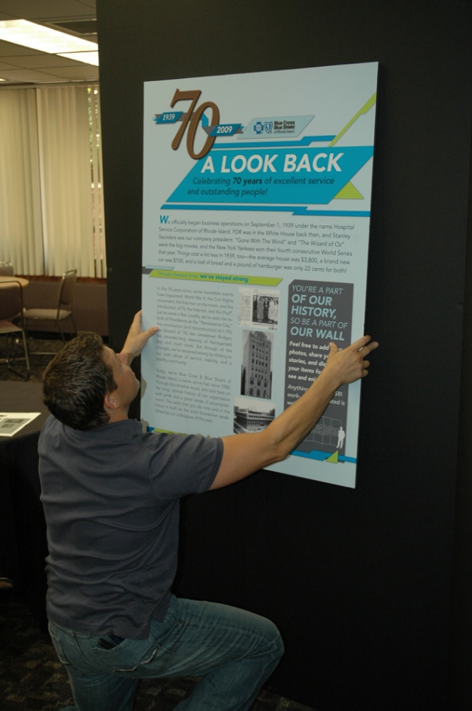
70 Years Timeline Display - For the celebration of BCBSRI's 70 years as a company, we created a large display in our cafeteria. We created support graphics for each decade and added photos from our company archives. We encouraged employees to add photos of their own to the timeline.
I developed the concept and the look and feel, and worked with an intern to do the photo research and construction. Printed on a color copier and mounted on black foamcore.

Take the stairs for fitness signs - A concept to use in our buildings to increase the use of the stairs, as a way to encourage a healthier lifestyle. Produce all the the headlines and design comps. Project not executed.

Take the stairs for fitness signs - A concept to use in our buildings to increase the use of the stairs, as a way to encourage a healthier lifestyle. Produce all the the headlines and design comps. Project not executed.

Take the stairs for fitness signs - A concept to use in our buildings to increase the use of the stairs, as a way to encourage a healthier lifestyle. Produce all the the headlines and design comps. Project not executed.

Concept for entrance sign. I wanted to convey strength by drawing inspiration from Tanks and a bit from the 80's movie Tron. Not produced.


Idea to rework an existing logo. Not produced.

Cast concrete and black iron in an impossible sculptural balance. Strength and finesse where my inspirations. Not produced.


gLike