
Choices Magazine - Award-winning member publication of Blue Cross & Blue Shield of Rhode Island. Along with a talented group of Designers, I Art Direct each issue, overseeing all phases of Design, Photography and Illustration.


Choices Magazine - On the Health Quiz section we had a lot of fun drawing fat bugs where we could fit the quiz questions inside. Irreverent but succesful. On the How To section we went with a subtle color palette to illustrate the steps to freeze your vegetables.

I wanted the opening of the article to have a dynamic feel, and this was achieved by the 'ribbon' going around the couple. The font and colors complement the photo.

I thought of this spread as a classic TV commercial of kids trying food they don't like. A case of finding the perfect stock photography.

This is not a new concept, but I think we did a great job putting it together and getting across the idea that stress is just as unhealthy as any disease. We had a lot of fun with the photography, designing the icons and giving it the 'old' gameboard look.

Choices Magazine - This is not a new concept, but I think we did a great job putting it together and getting across the idea that stress is just as unhealthy as any disease. We had a lot of fun with the photography, designing the icons and giving it the 'old' gameboard look.

Shooting food was always fun. Critical to shooting food is to have an experienced food photographer, and a great food stylist.

Choices Magazine - The challenge was to make all these separate blocks of information into one cohesive layout, The idea of setting the copy inside plates and napkins drives the theme across.

This could've been a very boring spread. Working closely with the Editor, we were able to color-code the different contraceptives and a subtle image in the background tied everything together.

Simple, clean layout focusing on good form.

The Health Briefs section always has unique articles on health and lifestyle issues, and we design it so each article stands out and it's easy and quick to read. We usually would commission all the illustration in this section.
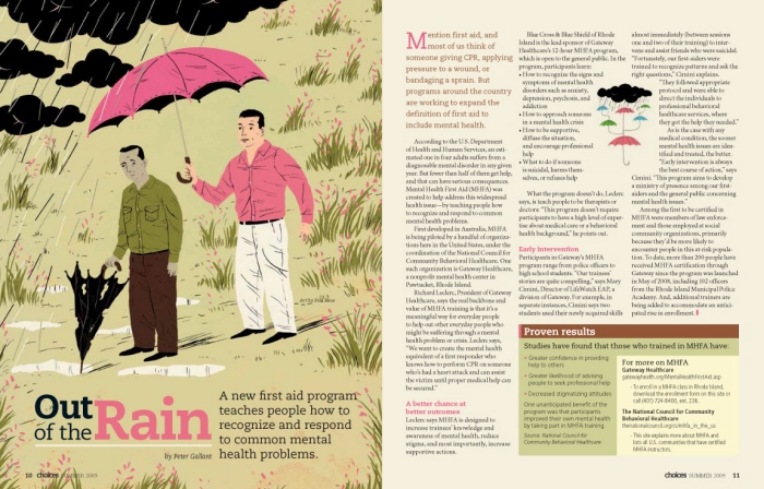
Tough subject, so we wanted a great illustration to bring the reader in.
gLike
Magazine Design
Choices was a quarterly publication that was sent to all subscribers of Blue Cross & Blue Shield of RI, with a circulation of 300,00+ magazines. I was in charge of the art direction, as well as coordinating photo shoots and commissioning illustrations.