
In Colour - I did layer blending in illustrator, witch i didn't know i could do. Originally i took on shape I made, made the top shape a solid colour(black) and power duplicated the same shape behind it, with different colours and transparencies. Then I made about 10 layers of the same pattern, rotated each one differently and put a colour dodge on all of them.
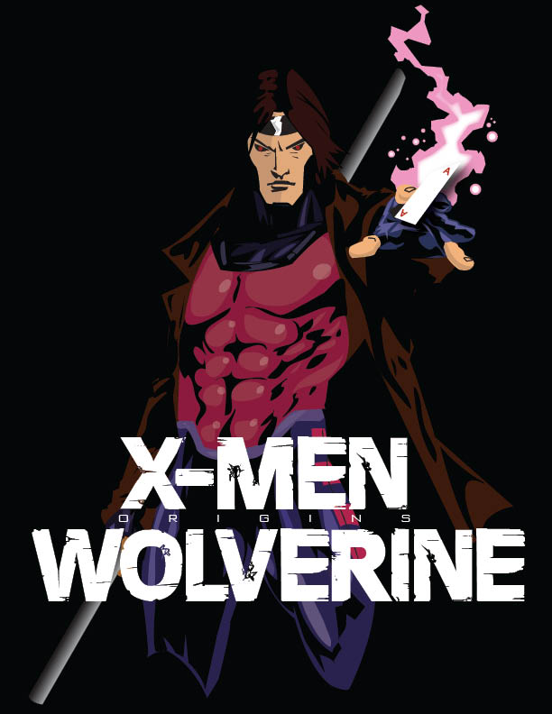
Gambit - This took me like an hour to do. It was pretty difficult. All vector.
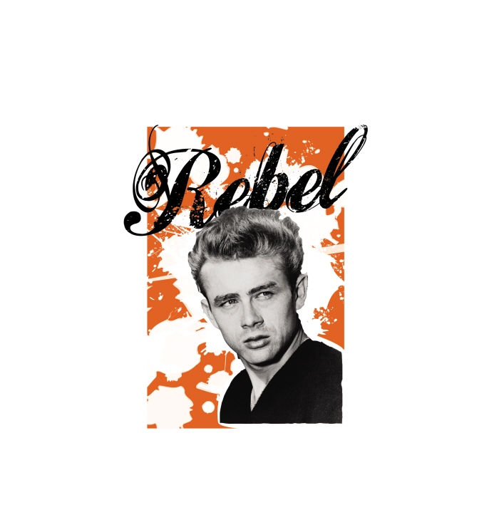
Rebel
Octaves on High brushes
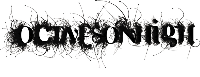
Octaves On High text - I took a font that i found, and really liked. then made it black, i took a brush and brushed everything in individually. took me an hour and a half.
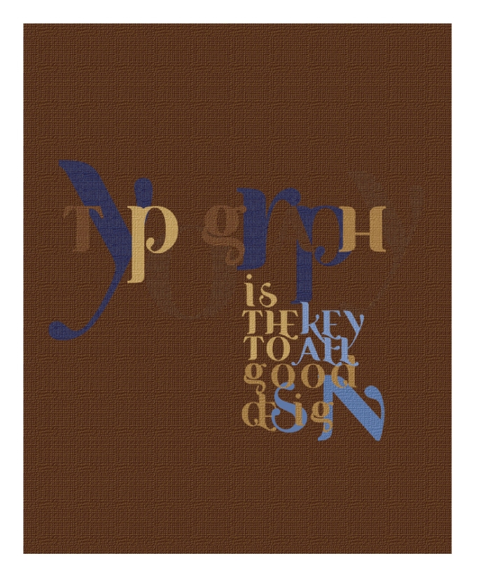
Type - I really enjoy typography, so i made a graphic of my feelings towards it. I used the basket effect to make it look almost Knitted.
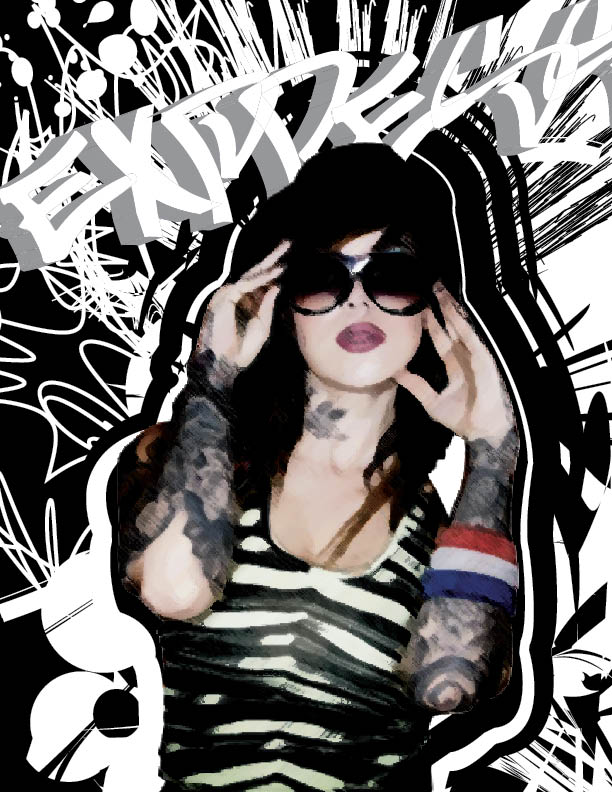
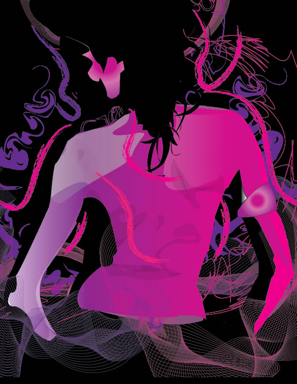
express - This is one of my favourites, express is all brushes and I put a water colour effect on Kat, then duplicated her put a poster edges effect on it then dropped the opacity on the top one and overlayed it.
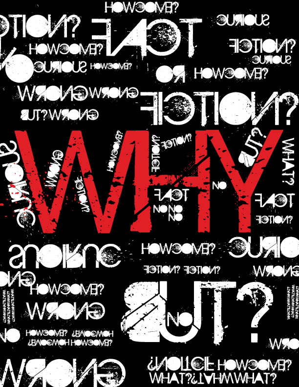
WHY - Why, Honestly this is just me getting bored. self expression isnt just for pencil and paper or canvas. You can make artsy pieces digitally as well. This was jus something i felt like doing. I do a lot of pieces like this.
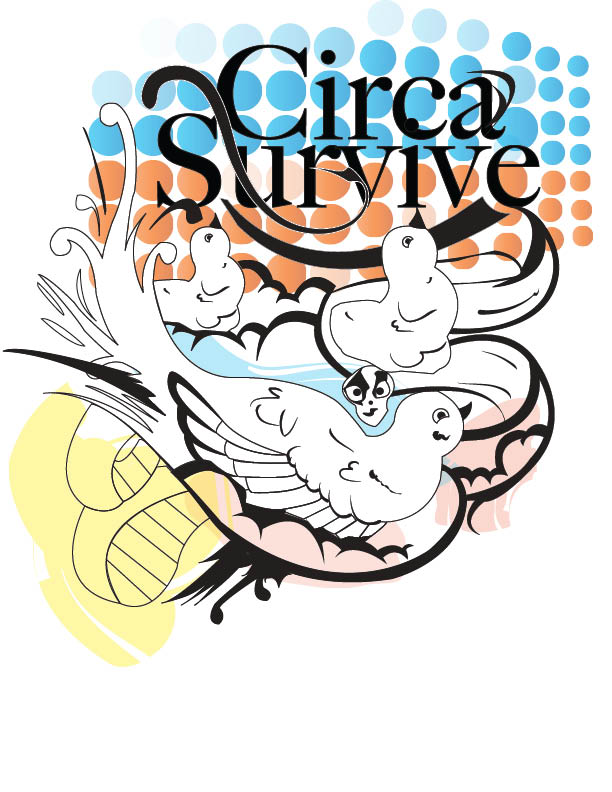
circa survive - This is a t-shirt I made for my friend, all illustrator graphics.
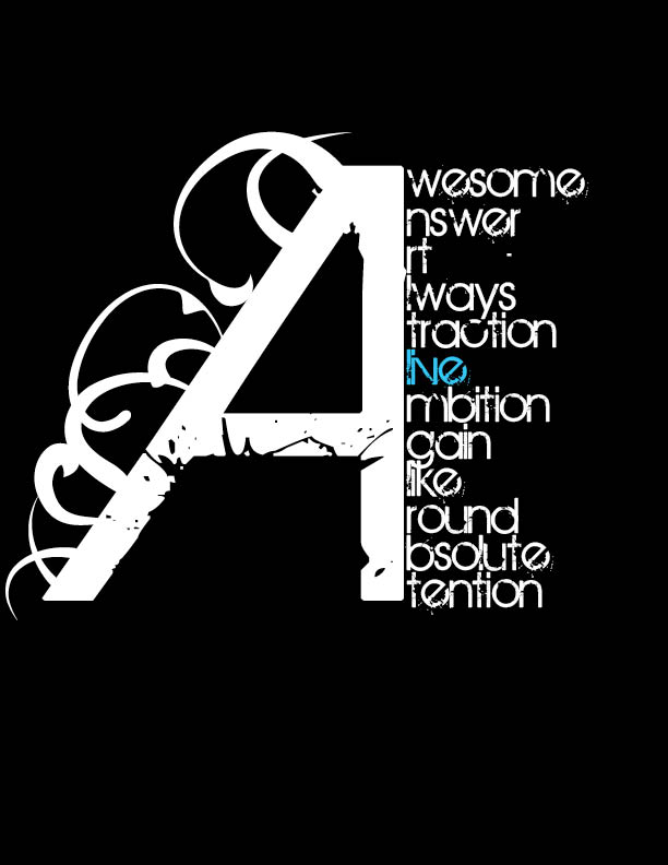
A's of excellence - A's of excellence, this i actually copied from an example that my teacher made me do for practice. I really liked mine a lot better so i added it to my portfolio.
Winter - This was a turtorial that I did, I changed the colour scheme to winter because I liked it better
Stare - This was a drawing that i did, i wanted to make it into a real portrait but the comic effect came over me and I had to do it.
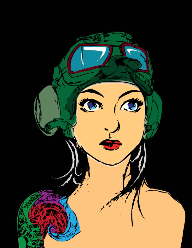
Pretty in pink - Kat Von D, looks pretty good as a cartoon. This is just a basic redraw with some extra gradients and effects.
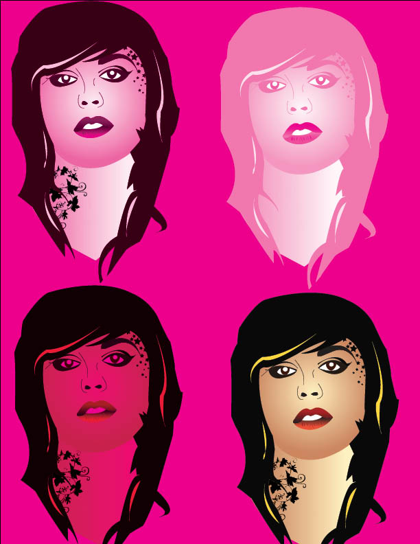
Colour Girl - Colour girl, i traced a girl, added a buch of shadows, gave them some cool colours and added some neat brushes in the backround.
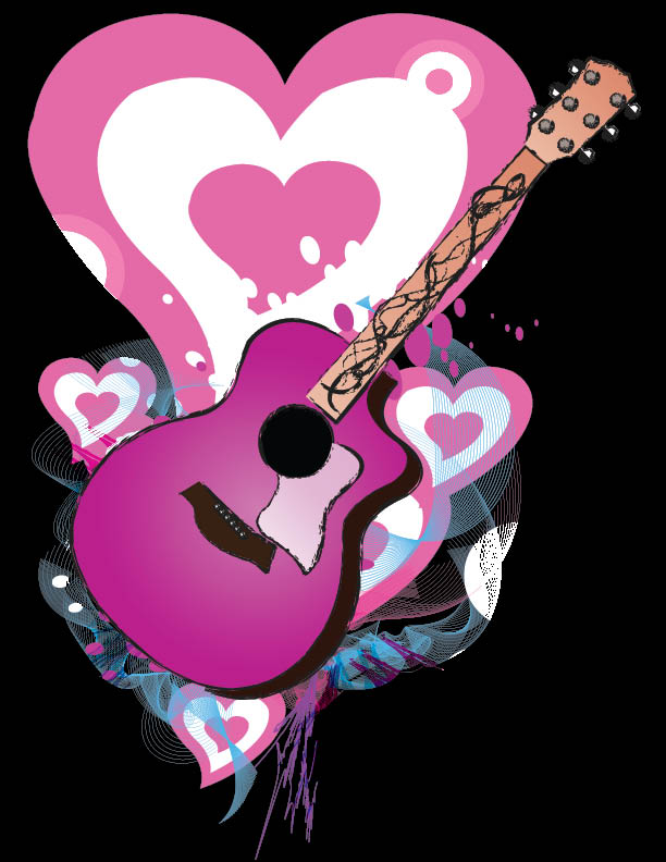
Colours of Music - This one i went crazy with making my own brushes and it actually turned out half decent. This is pretty much all in Illustrator.
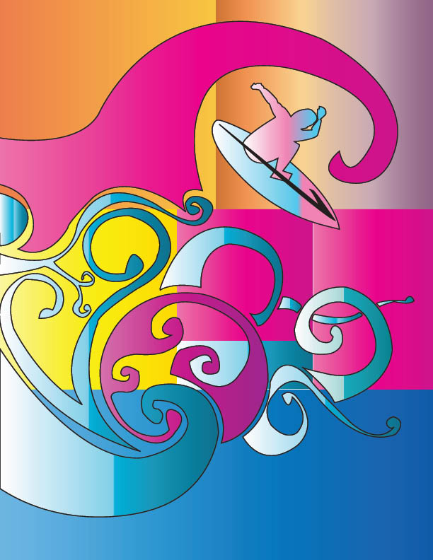
Surf - Torrent energy dink design, this one i really took advantage and almost over-used gradients. I traced a bunch of shaped and this just happened. I really like the way the different gradients look. Some disagree...( Mr.Bilous.)
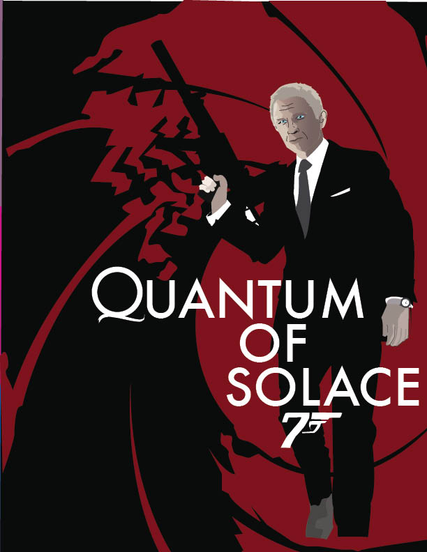
007 - 007, I traced Bond in Illustrator, the only thing that got complicated and why it's in my portfolio id the face. colour correction and the blend tool. If any one hase tried the blend tool, you know how big of a bitch it can be. i’ve gotten pretty good at it.
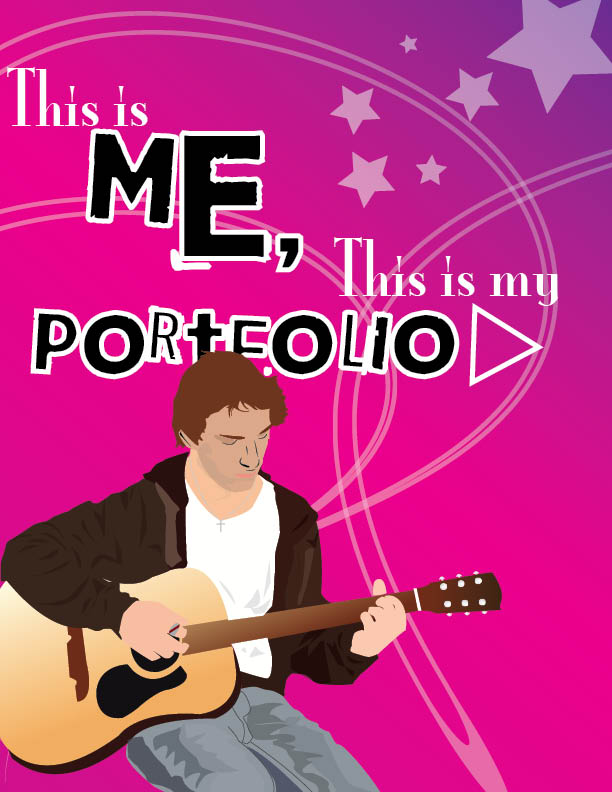
Me - This is the cover of my hard copy portfolio, i retraced myself and added some cool brushes.
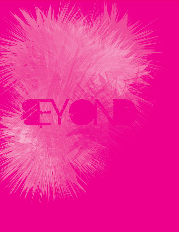
Beyond - This was a total accident, all in Indesign. It kinda looked cool. Not my favorite.
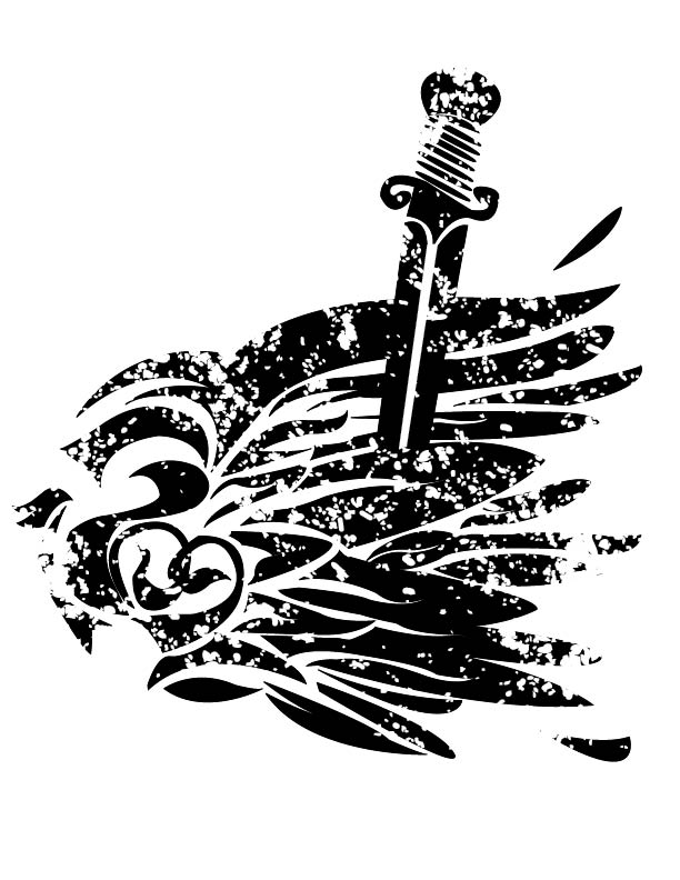
Broken Wing - Broken wing tattoo design. I drew this out first, it was for a tattoo that my friend wanted to get done. i just put my own spin on it in Illustrator.
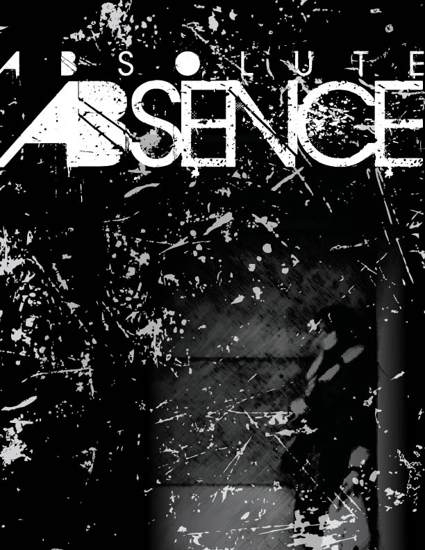
Absolute Absence - Absolute absence was origionally a piece i did cause i was really angry, but my band really liked it. So we turned into our C-D cover, name and title track. Absolute absence is definetly one of my favourites that i’ve done.
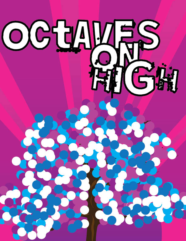
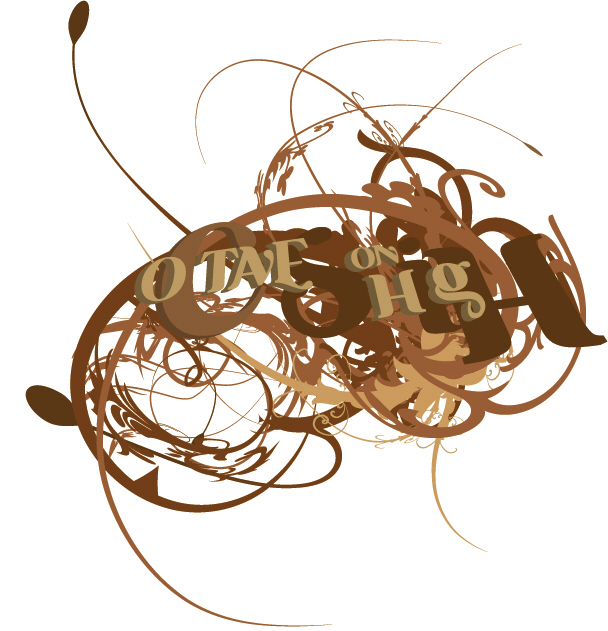
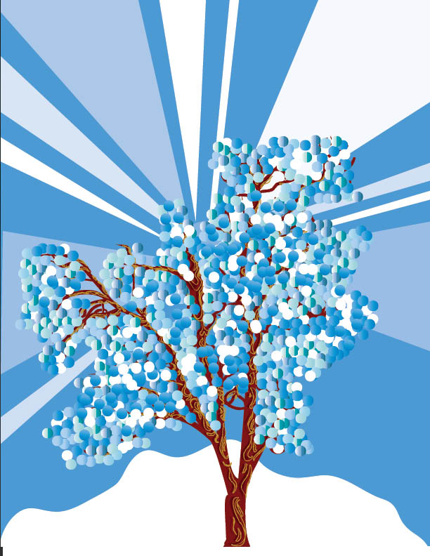
Octaves On High - Octaves on high poster, i made this for my band. i traced a tree and alt dragged a bunch of coloured circles to make them look like leaves. I actually ended up making it into a t-shirt too.
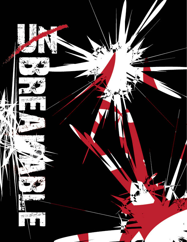
Unbreakable - This was just an idea I had, I started to mess around with different shapes and filters, transparency effects. It turned out o.k.
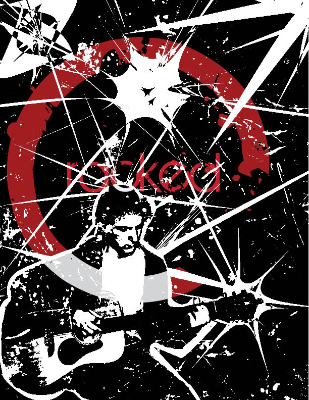
Cracked - This piece I called called Cracked I made a bunch of wierd shaped in Illustrator and went a little crazy with the pucker and bloat effect, as for me. I just traced my pic and made it black and white.
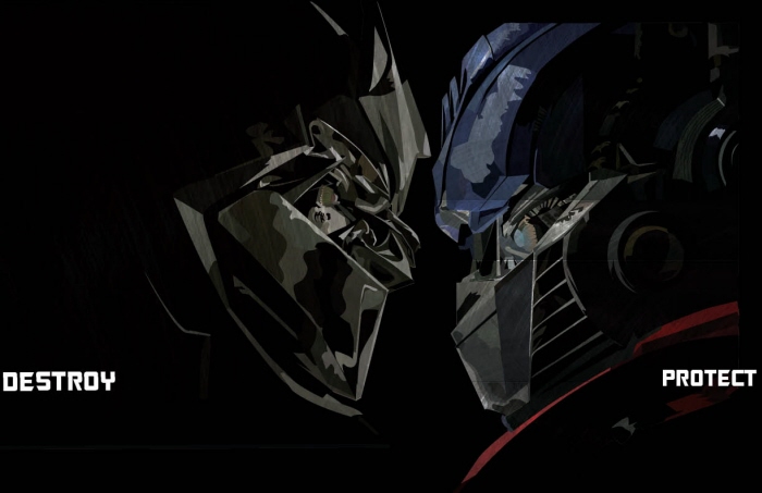
Transformers - Transformers! Believe it or not, this is all vector. i took like 4 classes and redrew the transformers. for the brushed metal effect I got a brushed metal pic and clipping masked it to the shape of the transformers and dropped the opacity to like 10.
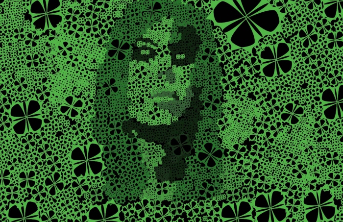
Girl in Green - Girl in green is actually all one shape tthat i made, i was origioally trying to make some kind of clover thing but this just kinda happened. I jus alt dragged the shape like a billion times. This was all in Illustrator.
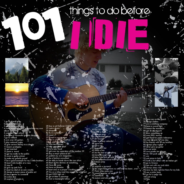
101 Things
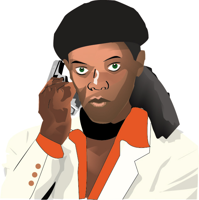
Samuel - Samuel L. I really liked this one because the blend tool really turned out the way i wanted it to. Overall one of my favourite redraws that I did.
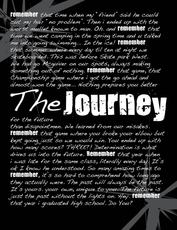
The Journey - I did this for my school year book, I kinda liked the layout.

I did this for practice for skills manitoba competition.
gLike
Illustrations