
RESTAURANT SCHWASS - Logo Design - Jonny Schwass is a legend amongst New Zealand chefs, captain of the New Zealand Cuisine, the genius behind what was continually rated as one of the country’s top restaurants. In the last year he has seen the restaurant destroyed by the earthquake, and been voted as Restauranteur of the Year by Cuisine magazine. This logo I created for Jonnys restaurant a few years ago still looks very appealing, with a hint of New Zealand and more importantly, looks good enough to eat!

Grasshopper Rock - Logo Design - This vineyard has two claims to fame, it is situated directly on the old gold dredge tailings next to the mighty Clutha river, and it contains the protected environment of a unique grasshopper. This ancient insect is unique and the vineyard has taken it upon themselves to help ensure its survival. Knowing this, the branding becomes self apparent, one of the grasshoppers sitting on a rock, which happens to be a gold nugget.

Fishbone Grill - Logo Design - This design is now many years old, it has been copied all over the world, see display section for neon sign version

Hamills Restaurant- Logo design - This vineyard has two claims to fame, it is situated directly on the old gold dredge tailings next to the mighty Clutha river, and it contains the protected environment of a unique grasshopper. This ancient insect is unique and the vineyard has taken it upon themselves to help ensure its survival. Knowing this, the branding becomes self apparent, one of the grasshoppers sitting on a rock, which happens to be a gold nugget.

LEAPFROG SERVICES - Logo design - Leapfrog Services offers mentoring services to companies wishing to tap into established marketing networks. Even though the name comes from the act of jumping over someone, I figured we could something more creative using the frog element. I wanted to show the market how our client could help them reach out to new horizons, an image of a frog doing this makes it all the more memorable, For the client the pink colour is a clear message that she has a female perspective.

Carrick Wines - Logo Design - The owners of Carrick Winery explained two known uses of the word carrick, one a boat, was not appropriate, the other is a knot. Using the knot as the basis for the graphic we added the terminated the rope ends in a New Zealand Maori art style. The whole icon is strengthened by mounting it on a black square, to give the graphic a timeless yet contemporary feel. The word Carrick is in a very traditional font, by letterspacing, the heading has a modern freshness.

Fox-Hat - Logo Design - Fox-Hat is the CMS my company developed over 4 years. We were looking for a name that was memorable, during that period a friend sent me the now famous Where the Foxhat beer advert, this struck a chord. The ikon features a foxes tail forming a a question mark or query. ActionStep has now taken over Fox-Hat and will continue to develop its cutting edge potential in conjunction with their own enterprise software.

NZ Guided Nature Walks - Logo Design - This company takes visitors into New Zealand wilderness areas, I wanted to mould the brand in a form that was in tune with what we would expect to see used by the official wilderness agencies, helping to stamp the credibilty of the organisation into the minds of those looking for guides. I also wanted an emphasis on their core business nature walks. The very simple brand works well on the guides uniforms and vehicles, is easy to embroider and cut in sign vinyl.

Mt Difficulty - Logo Design - For this brand I created a New Zealand style graphic of a hot burning sun, to pay tribute to the local environment, and heritage. I considered the name quite negative, so rather than hide it made it the focal point, rendering it in a complicated calligraphy style. The real issue with a composition like this, is balance, and in the case of a label, limited space for other critical elements. The finished composition has an elegant balance.

Touch of Spice - Logo Design - This company name gave few clues to what the business was about, a freelance concierge service. The name of the company was based on the founding directors name. The company works at the top of the market, I liked the idea of company being a guardian angel for travellers in a foreign land and produced the logo in a style that would not be out of place on a Bentley or Rolls Royce.

Onsen Hot Pools - Logo Design - The name Onsen as a description of a hot pool is an everyday term in Japan. This company offers hot pools in a unique indoor/outdoor environment. I wanted to keep the brand looking fresh and integrated the internationally recognised symbol of an onsen pool into the brand.

Queenstown Rafting - Logo Design - Queenstown Rafting is a large professional rafting company. The fern icon represents a golden canyon with a river flowing through it, in this case Skippers Canyon with the Shotover River running through it. The bonus is that all tourists want something with this logo on it as a souvenir of New Zealand. When first created, my client started selling jackets with the logo embroidered onto in, although expensive items they have become sought after.

Desert Heart - Logo Design - Making good wine involves hard work, knowledge, and a good dose of passion to add thad defining x factor. So it is at Desert Heart, where the ladies create something special. The vineyard is situated in a desert-like area, it gets very hot, For this brand I chose to create a heart in the shape of a grape leaf, the painted colours look hot and the words look like they were scribbled with charcoal.

Baxter Brown - Logo Design - I wanted to show how this Landscape Architect used the shapes of the nature. The logo is in the shape of the letter b, the base of the b is shaped to look like a snails shell.

Butter Factory - Logo Design - This is a new bar and cafe in a small city where there seemed to be no place sophisticated for locals to go and have a drink and something light to eat. the building the bar was in was originally a butter factory. The style of the bar is modern with touches of the old building. I created the logo using a classical font, with squares like chunks of butter behind joined by swirls. The highlighted letters for the word BAR.

Covet Clothing - Logo Design - A new women’s clothing store that stocked the top designer labels wanted a new logo that matched their new name, Covet. We chose a the image of a green eye of envy complete with fashionable eye makeup. The dramatic very simple typography uses is a classic style sans serif font, widely letter spaced to add drama and effect.

Dorothy Browns Cinema - Logo Design - Dorothy Browns Cinema and Bar in Arrowtown has become an iconic movie experience for locals and visitors alike. This small boutique movie theatres personality reflects those of the ladies that started it, bold and cheeky with a sense of style. From the pink mattress ceilings to the armchair style seating and great wines and arthouse movies, this place is serious fun. The logo features some traditional typography with the pink colour moving it into a more tongue in cheek dimension.

Logo-Gogo - Logo Design - Born out of frustration we built a website where clients have their logos stored in a variety of formats. These logos could be downloaded by publishers using a password, the website also explained the different formats and what was best for what use. For the purposes of projecting the concept that this facility only existed online, I designed a logo that has the classical web look, we also added a progress bar into the bottom blue line on the web version to give it some life.

Remarkable Physio - Logo Design - This physio has loads of character, or their logo wanted something a bit more contemporary and edgy. Whilst still having an obvious association with what they do and of course, looking like the medical professionals they are, their only instruction was that they like red. I chose to use a Matisse style, Creating a resting figure in a pensive pose, it had the right effect, on their launch they got a lot interest, and the company image quickly became synonymous with their business.

Barmuda - Logo construction - The owner of this bar knew exactly what he wanted, he was just going crazy because everyone who tried to execute his idea did not get the proportions right. Typography is one of the core skills that has a huge effect on a designers work. He was amazed at how quickly this was rendered just as he saw it in his head.

This company wanted a logo that matched the stock graphics and colours on their helicopters. This would save money for the company, and allow them to bring the other company vehicles into their branding. I created a similar set of graphics as were on the helicopters and added the company name in a tough modern stencil font. The company was adamant about having an image of one of the machines, luckily it words well to emphasise the Heli aspect of the wording and brand.

New Zealand Reservations - Logo design - For this company I wanted simple and clean, how the world sees New Zealand. The albatross graphic gives a great sense of effortless travel, and is an iconic world traveller. The logo features strong yet classical typography all rendered in a calm blue colour.

Underwater World - Logo design - Underwater World is under the wharf in Queenstown. Here visitors have an underwater view of and are able to feed huge trout. The problem is the facility is invisible, and there ids no perception of what is on offer - the name is quite generic, which doesn’t help. The purpose of the logo is to grab attention and somewhat explain what is on offer. The large fish/eel head definitely grabs attention and the blue box with stairs gets the message across of how the operation works.

Arrowtown House - Logo design - This elegant small lodge offer great style and comfort in a very exclusive setting. The house is surrounded by a hedge, with only the roof peeking over the hedge, this was the inspiration for the logo, it features a the shape of the house roof with chimneys made up of the letter A and H. The letters are crossed by a series of green swirls representing the top of the hedge. The background is bronze and green. The green represents the hedge and the bronze the house.

The first bungy company had to go through all sorts of hoops to get established as a credible mainstream tourism provider. The down side of this was that looking safe the company did come out looking quite corporate, this left the door open to a new company who had a street culture, that would be a hit with young people. For Pipeline I developed a brand culture trough all aspects of the company, it was very successful, eventually AJ Hackett bought them out to shut down the competition.

Mobile 2000 - Logo design - A small start up business often needs to tap into and provide services to larger businesses. a professional looking logo is a good start in the credibility stakes. In this case a mechanic is offering his services to companies needing their vehicles serviced on the road. The logo features colours similar to that found on diagnostic instruments used by mechanics. This logo is quite timeless, over 10 years old now, it still looks current and the company has prospered and still going strong.

Ellero Wines - Logo design - Ellero Wines is the brainchild of two wine industry professionals. This with a combination of very hard work and indepth knowledge is what it takes to make a great wine. They saw in the process of making wine how the forces of nature come together with the land to produce great wine. To highlight this they wanted branding and label that reflected these incessant forces, the graphic consists of swirling and flowing lines of water, air, heat, cold and sun.

Streamside 7 - Logo Design - This is a the name of a beautiful house for rent in Queenstown, New Zealand. Situated on a world famous golf course the obvious target market are golfers. I created this logo to look like it have been taken straight off a golf ball - the ultimate golfing look.

Connecta Snow - Logo design - When the local Queenstown bus company Connectabus decided to become part of the perceived mountain transport system during the winter months we decided they needed to reiterate this on the buses. We developed this brand to go next to the door of the bus so those waiting could see that these buses could help you get up any of the four ski mountains around Queenstown.

Handpickednz - Logo design - This company sells fresh fruit from New Zealand overnight into Hong Kong. I wanted to keep the style of the brand the same as the big exporters of fresh fruit out of New Zealand. The logo puts the focus on the name Handpicked and qualifies it with the NZ, the bylines and the apple hammer home what the brand is about and where it is from for those who are not familiar with the NZ term.

Pounamu Pearl R - Logo design - This logo was created for Pounamu Pearl to have at their disposal a stamp of credibility that they could use on their very high end products. The form of the logo is made up of 2 R's, the initial letters of the 2 principals of the company. We liked the Rolls Royce logo, in praise of this I added the wing effect off the back of the letter.

Wanaka Villas - Logo design - The client wanted to put a bit of fun in their new brand for these villas, to push the family appeal of the complex. Another point they wanted to illustrate was the fact that this was an all year round place to stay, hence the colour palette.

Untamed Heart - Logo design - Desert Heart required a second brand for their wines. The market for this second tier brand are seen as being younger people, who consciously will not buy first tier Pinot Noir, because it is too expensive, so probably have never tried it. The Untamed Heart brand is designed to appeal to this market. To do this I have created a heart of two vines, symbolic of the two partners coming together in the business.The typeface looks weathered and stressed but still maintains it dignity and strength.

Awesome Us - Logo design - I developed this logo for a university program aimed at building self esteem in young school kids. I wanted something that showed some inner strength waiting to be tapped inside the kids. The cartoon style is appealing to the kids and lightens things up a bit.

Achieve Business Services - Logo design - Achieve is based on the North Shore in Auckland. We wanted to tap into local business and project a look in tune with the local culture. This culture is mostly sailing and surfing, so I had a look at the most popular brands for these pursuits and used these as the blueprint for designing the logo. The logo features the letter A made up of two large yacht sails passing each other on opposite tacks, something that is a common sight on the water around the shore.

Brassknocker Wines - Logo design - Brassnocker is a very rare type of soil that is deemed as ideal for growing great wine. This new winery liked the idea of leveraging this somewhat quirky name, it gave me a chance to have a bit of fun associating and icon with the name, I went for the literal approach using a brass door knocker as the logo.

Kawarau Jet - Logo design - Kawarau Jet is one of the iconic jetboat companies in Queenstown. The company has a very high profile, enhanced by the bright yellow colour of the boats. This is a very competitive business and Kawarau Jet has positioned itself as offering the high performance option. The logo I designed for the company is based on a tachometer concept with a red line area, the K forms the gauge needle.

Mt Rosa - Logo design - Mt Rosa is built on character, I wanted to show this in the brand including the sheep farming heritage of the land. The latter aspect is seen in the leaping sheep icon that reflects stories of them jumping along cliff faces, their curving horns having a New Zealand feel. This wrapped in a modern classic look, like a 60's Ferrari, hence the bold black and white type on the gold background.

New Zealand Nuts - Logo design - This small company producing some of the world's best walnuts realise that someone has to take the bull by the horns in New Zealand's nut producing profile to the world. We developed this brand to set a New Zealand standard, it features the simple yet powerful byline - Fresh!

Proactive Physio - Logo design - New media printing technology means that it has become feasible to create branding with complex gradation and blended colours hence the style with this logo for ProActive Physio. The central shape in this logo, is an abstract reflection on the S shape of Lake Wakatipu, it also forms the shape of a bending figure, simple yet effective.

Punatapu - Logo design - Punatapu means, sacred spring, this is the name of a lodge in Queenstown. Punatapu offers something special to visitors, elegant seclusion and living art. There is always something going on, cooking courses or exhibitions. For the brand i created a curving koru shape, a wisp of something spiritual or a spring, this shape points to sacred place marked by a cross.

Remarkable Health - Logo design - Remarkables Health offer new paths to physical wellbeing, these well established health professionals are bringing into the mainstream new regimes and techniques to get the best out of life. The logo features a person flying or doing a swan dive, a metaphor for letting go and taking on exciting and fulfilling challenges. The logo is rendered in a fresh green and emphasises the word health.
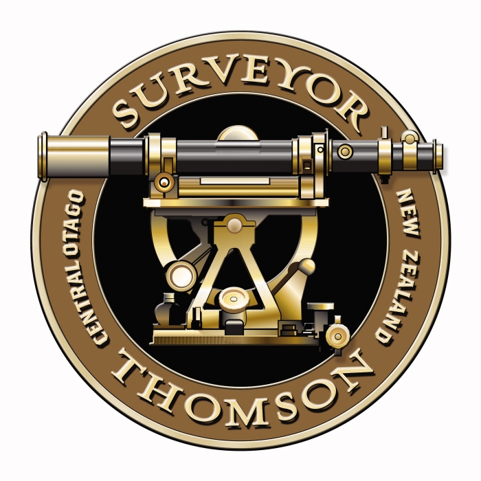
Surveyor Thomson - Logo Design - The founder of this vineyard is descended from the first person to survey large tracts of New Zealand, and specifically the wine growing Central Otago region. His theodolite is still at the Otago Museum, I had great fund drawing this many years ago in Freehand. The brand is in the form of a medal, so gives great credibility to the label, combined with some nice clean classic typography the finished effect is a very refined label that communicates a real feeling of quality.

Tall Trees - Logo Design - All I had to go on with this brand was the name of the house, I had been playing around with a wine label design that did not come to fruition, the base element of this was a golden Poplar tree on a white hill. I really liked this graphic and knew that someday I would find a fitting use for the idea. I modified the graphic for the new client and adding the wording in the fitting type style. It turned out to be very fitting, with the house sitting amongst a golden landscape under deep blue skies.

The Loose Box - Logo design - It turns out that a loose box is where you feed horses, this property is built in an old refurbished stable building. Visiting the building the first I noticed was the high standard of the accommodation, quite luxurious - this was a message to get across. I figured if we could attack the name head on with the logo we could turn it into a positive. The end result is a gentlemanly horse sitting in an easy chair with its feet up having a drink, faithful dog next to him. Clients loved the logo

Restaurant Taquet - Logo design - This Philadelphia restaurant was once described by Wine Spectator as the best restaurant in the U.S. outside of New York. The owner is a famous French chef, he likes simple elegance with a hint of the quirky and his classical restaurant has a set of Dali prints on one wall. I designed the logo to capture this blend of old and new. One side of the T looks like it has been squeezed out of the brush of Dali, the other classical timeless form. The two sides also form the initials of the owner.

Groovelane Music - Logo design - Groove Lane is a small start up music company who are in the process of doing some ground breaking things in the music industry. The company logo needed to be made up of two components that could be used together or separately as the logo will often be just a stamp on another artists material.

Connectabus - Logo design - This innovative small town bus company with many regular services to maintain, is constantly striving to get more people out of their cars and onto buses. The logo is based on the time honored style of the London Underground map.

Professional Touring - Logo design - The logo was designed to appeal to the upmarket bus traveller. It is timeless and simple. The graphic is a play on a precious piece of jade in the abstract shape of our iconic Lake Wakatipu.

Milford Sound Select - Logo design - This new coach company taking visitors from New Zealand's tourist mecca, Queenstown, to the iconic Milford Sound, had to make a good mark in this very competitive market. In this case the key was coming up with the name, which both positions it as an upmarket option and a call to action.

The Barn at Moonlight - Logo design - The Barn at Moonlight Country is Queenstown only privately owned farm conference venue. The main headline has existed for many years, what I sought to do here was wrap it up in a way that looks like a cultured upmarket brand. The elegant green colour and the use of a classic serif font for secondary information give the whole thing a timeless simplicity.

Mondillo Wines - Logo design - Mondillo's owners have a history in graphic design and hospitality knew they needed an impressive brand to be competitive. We consciously played down the name and went for a very strong icon on the basis that we did not want the market to think that this is Italian wine. The icon is a strong curved M with a koru shaped vine giving it a New Zealand feel.

Wood Engineering Technology - Logo design - This company had patented a new way to get more, and better timber out of logs. for this logo I chose a techno font that is clean and strong. the icon features the end of a log showing the cuts to get the maximum amount of timber. Instead of bark the shape is surrounded by a gear highlighting the fact that this is a technology company.

The Postmasters House Restaurant - Logo design - This restaurant is situated in an old Postmasters House. The logo reflects the two faces of this region, the lush greens of spring and summer, whilst the brown reflects the colours of winter and autumn. This brand was one of two I created that were chosen for a book on cutting edge branding in 40 countries worldwide published by Rockport in association with ICOGRADA. My own and a large agency in Wellington were they only studios to be included in the New Zealand section.

Carrick Unravelled - Logo design - This logo was created as a second tier brand for Carrick wine, the Unravelled name gave me some latitude to come up with something unique. I wanted to develop the style of the original logo I did for Carrick. Using the idea of a rope unravelling I created graphic that looks like a cross between a fern and a set of vine tendrils. To add visual impact I added a bright red background.

Desert Heart Seduction - Logo design - This is a second tier brand for Desert Heart it features their logo heart with an arrow through it. This was also produced as a removable tatoo.
gLike
Logos
A business website has three equally important target clients, obviously it must work for the client, representing him in the best light, working 24/7 as a relentless salesperson. Secondly the website must engage visitors, with intuitive paths to tuned information that will convert them into clients by convincing them to make contact. And most importantly, the website has to be found instantly on a search engine - this is the formula for a great website