
BarkingAds--Magazine Spread - The issue I addressed is a more effective way to promote a business using man’s best friend. BarkingAds helps promote businesses by putting advertisements on dog apparel. There are millions of dog lovers in the United States, and what is better than having your four-footed friend help you sell your business? People will become aware of or reminded of businesses when they see advertisements on dog apparel. (cont.)
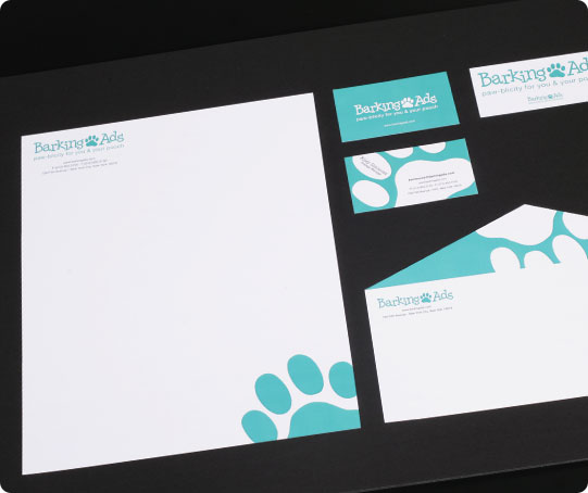
BarkingAds--Stationery - The purpose of the Senior Project is to demonstrate that my topic addresses a significant design problem to use my skills and knowledge to successfully solve a problem. The project had to be completed according to my proposed methodology and completed within the proposed timeline. (cont.)

BarkingAds--Brochure - The final collateral includes a billboard, labels for items, t-shirts, outdoor sign, brochure of services, and a stand to hold them.

BarkingAds--Inside of Brochure

BarkingAds--Mailer Card - I replaced what is put on dog clothes, hats, shoes, collars, leashes, treats, etc., with business logos and advertisements. All elements are pre-made. I used labels and iron-ons for this project for the 3D part of it. For promotional purposes, I created a billboard design, outdoor signage, and a brochure/holder combination to display at the businesses and other retail outlets such as Petco, Petsmart, Wal-mart, Kmart, and Target. (cont.)

BarkingAds--Price List - Posters, mailers, and a price list, along with three separate businesses who promoted their businesses on dog items and more collateral, are part of the project. My goal was to integrate the promotion of business with dogs’ luxuries and necessities. (cont.)

BarkingAds--Billboard - My main goal is to show that dogs can safely be used as walking advertisements for anyone’s business.The current design and tag line of the product is BarkingAds: paw-blicity for you and your pooch. Our company claims to advertise businesses on dog apparel. This company is different from others because it is another way to promote a business rather than standard environmental graphic design (e.g., billboards, flyers, magazines, newspapers, posters). (cont.)

BarkingAds--Advertisement Sign - The pricing is affordable; however, the more you buy, the lower the cost. The items can be purchased 24/7/365; there is no preference to seasons. This company is for dog lovers to have a new way of promoting a business. (cont.)

BarkingAds--Merchandise - The company name uses a serif font and the tag line is sans-serif. I chose a blue-green color. The stationery uses abstract views of a paw in the logo, using the corporate colors. The first three collateral pieces include a magazine ad, a postcard, and a price list. (cont.)

For my final project in Environment Design, I created a quarter scale set of three introductory panels for the Smithsonian’s National Museum of Natural History’s fossil exhibit. Panels contain brief introductory information relating to the objects or collection on display. These panels would be displayed at the entrance or as close to it as possible. The design of each panel functions as an introduction to an area of an exhibit that relates to a certain time period of fossils.


Hot Topic Corporate Manual and CD - Hot Topic is a store that sells different types of music, punk/emo/gothic clothing, shoes, and accessories. Guns N’ Roses, Def Leppard, and Bon Jovi were #1 on the charts, and hair scrunchies, bolo ties, and aviator sunglasses were everywhere. A ton of junior accessory and apparel chain stores filled shopping malls, but there wasn’t a cool accessory store for both guys and girls. Then came Hot Topic; there are now five hundred stores nationwide in almost all major shopping malls. (cont.)

Hot Topic Stationery - I was assigned to create a new logo, along with stationery, a website, promotional materials, and packaging. Every element in the manual has the same grungy persona as the logo. (cont.)

Hot Topic Products - I came up with many different concepts for the new logo and decided to make the letters look as if they were bleeding at the end points to give it a grunge- look to go well with the company’s persona. Since the company is all about music and the apparel/accessories that go with them, the company used a skull with two guitars as its crossbones. The skull image is inside a star that resembles that of the type used in the logo. For the star, I used the warp tool on its points in Illustrator. (con.)

Hot Topic Website - The manual includes of background information, the creation of the existing logo and new logo, use and abuse of the logo, corporate colors, typography, stationery (business cards, letterhead, and envelope), packaging (shopping bags, gift cards, and price tags on products), promotional materials (pins, postcards, and T-shirts), and website views (home page, second level, and third level).


Eternal Moon Cookbook - I created a Japanese Cuisine cookbook for my multi-page project. I find the Japanese culture to be very intriguing, and I am simply fascinated by their language, style of clothing, cuisine, and artwork. (cont.)

Eternal Moon Cookbook--Cover page - The Japanese culture can be both contemporary and traditional, I decided to use the typeface Gill Sans for the text body and the typeface Express for the headings. One is a traditional typeface while the other is of a newer generation. I believe I have correctly portrayed the two typefaces within my cookbook. (cont.)

Eternal Moon Cookbook--TOC - After choosing the cookbook theme, I looked up different authentic Japanese dishes. The contents of the book consisted of traditional Japanese lunch, dinner, and dessert. I searched numerous sites for the best examples of authentic Japanese cuisine and came across one site that had a wide selection of dishes. I arranged a new layout for the recipes in Adobe InDesign and choose two typefaces that went with the oriental content. (cont.)

Eternal Moon Cookbook--Spread - The paper for the book pages were cut individually for the preferred size. I believe the textured paper adds a “traditional-yet-modern” touch.

Raw Design Magazine - This assignment was for creating a design magazine for The Art Institute of Washington. The idea was to conceptualize and design the magazine around a strong concept—raw, unrefined artwork. My magazine, Raw Design is targeted to the student population at any design school/college/university, to exhibit contemporary designs styles, colors, graphics, and treatments. My personal work is incorporated throughout the magazine.

Raw Design Magazine--Interview with a designer - *my original artwork

Raw Design Magazine--How-To instructions - *my original artwork

Raw Design Magazine--Interview with Spring 2009 Grads - *my original artwork

The Advanced Print Production project was to create a DVD box set for one of PBS’s many programs. From the list, I chose Evolution—which talks about how life on Earth developed and where it is going. I am very interested in prehistoric life and how humans and animals came to be in this world. It shows that people are broadening their horizons by taking proof of the past and discovering new life forms and theories. (cont.)


Serendipity--Book and CD

Serendipity--Created Typeface

Serendipity--Magazine Ad

Serendipity--Book and CD

Serendipity--Inside Spread

Kiss Me Dead Cosmetics - I created a fictitious brand, product name and logo for the final assignment of Package Design. I made a counter top point of purchase display and nine individual packages for my display. As in previous projects, the package.
Before I began designing for my package and P.O.P., I did some research on similar products. The specific target market was female, ages 15–30, priced between $7 and $11, and sold in an environment like Hot Topic or anything like it.

Kiss Me Dead Cosmetics - Once I determined my target market, I did some research on my competition (possibly Target or Walmart). Based on this research, I developed a branding and logo.
I had the name of the cosmetics to relate with the persona of Hot Topic. Hot Topic’s audience is mainly goth/punk/alternative persons. I decided on the name KiSS ME dEad with the first two words in a script/ playful look while the last word is more like caution letters.

Kiss Me Dead Cosmetics - The name is on a vector image or pursed
lips. The main colors are black, red, and white. The cosmetic is featuring a collection of purple. I chose a rectangle boxes for my cosmetics (mascara, lip gloss, eye shadow).
The P.O.P. holds 9 cosmetic boxes. The back has the logo, the collection name, and the names of the individual products. The curve on the back of the P.O.P. is contrast to the angular boxes.

Kiss Me Dead Fragrance

Kiss Me Dead Fragrance

Kiss Me Dead Fragrance
The Art of Nature--Cover - *original photos used
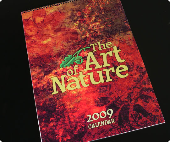
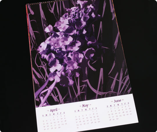
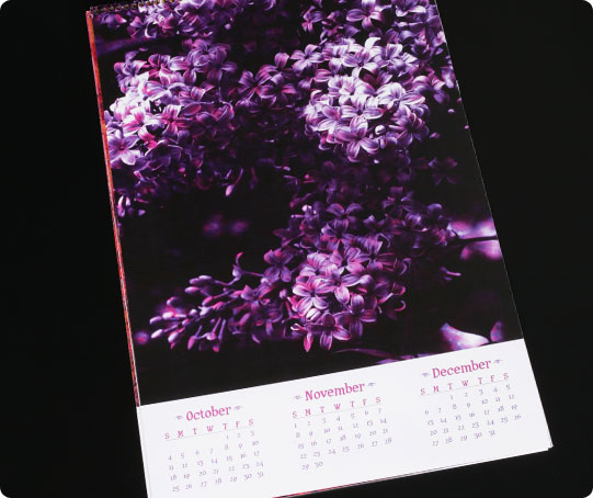
This six-piece calendar uses pictures of different kinds of flowers that I took in my yard. The colors are vibrant and the images are at a high resolution. These compositions are my own creation. (cont.)
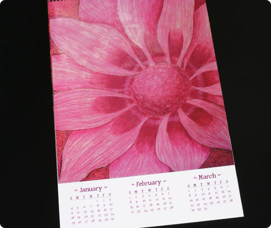
The Art of Nature--Prisma Colored Pencils - The project required that four main images be used in separate or combined programs, one of which had to be hand-rendered. I created the lilac bush in Corel Painter, the butterfly bush in Illustrator, the red lily in Photoshop and Illustrator, and the pink flower was hand-rendered. Each illustration is the main focus for a single page which features three consecutive months of a practical working calendar for 2009, titled The Art of Nature (flower images used in art programs). (cont.)
The Art of Nature--Illustrator - I also designed the front and back covers, which contain the pricing and publication information. After the images were created, I imported them into a page layout program.
From among the four layout suggestions, I chose to have a portrait page with the image on the top and the months on the bottom. This layout seemed to work well with the images I had selected for this project. (cont.)
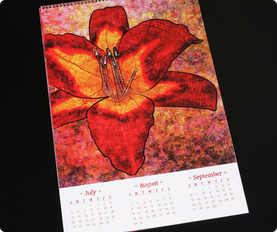
The Art of Nature--Illustrator & Photoshop - A few of the techniques that I used in my illustrations were unity, texture, brush strokes, and collage. The month colors were made up of the same pigment that was used in their respective image. The front and back covers are a collage of the four images on a textured background. The butterfly bush has different brush stroke weights in the background. The red lily has texture within the petals and in the background. (cont.)
The Art of Nature--Corel Painter - The lilac bush is made using different brush strokes. In addition to the tools that make images look like they were hand-rendered, I also used watercolor paper for the printed piece. I believe this gives the image an even more textured look.
This was a challenging project because in addition to finding a theme and making the images work, I also had to use a program with which I was not too familiar. This was my first time using Corel Painter.
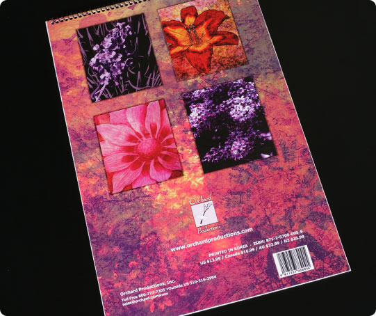
The Art of Nature--Back
gLike
Art Institute of Washington Projects
Done while attending The Art Institute of Washington 2006 - 2010.