
Positive/Negative Logo Design - Please note these logos were all done by hand. No computer was used to manipulate the images you see. The assignment was to choose 3 letters, look closely at the negative space of the letterforms and find an image that naturally fits the negative space. The images are based on a select company. For this assignment I chose "Farmers Market" for my image inspiration.
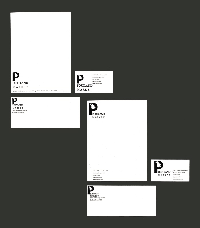
Stationary - Tight Roughs - The assignment was to design stationary and a business card for a fictional company using the most successful positive/negative logo from the previous assignment. I had to brainstorm ideas for the company name and then used alignment to design ten thumbnails. Above are 2 of the most successful tight roughs chosen. The third is my final.
gLike
Graphic Design School Projects