
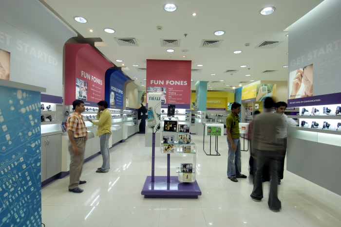
M-PORT - A high end mobile store for the CONVERG M group. This store was designed to showcase seamless convergence of technologies, across products ranging from mobile phones, printers, gaming consoles and computers.
This store won the "Best store design" award in the Technology stores category at the 2008 VM-RD retail design awards.
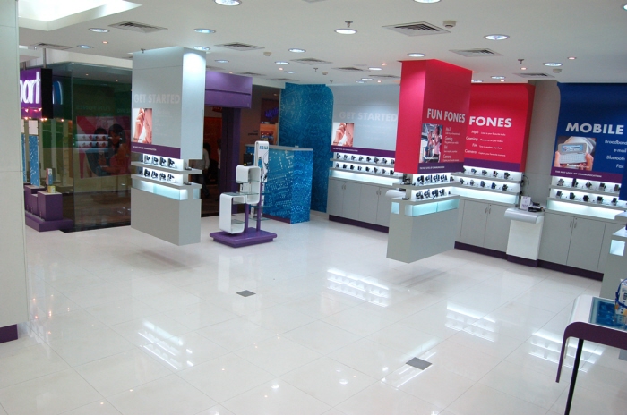
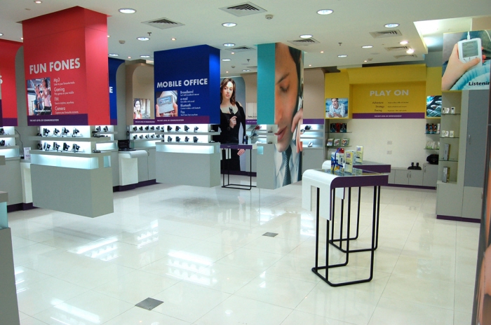
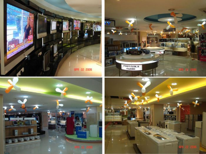
Retail Design - Ezone - Design of a retail outlet dealing with the latest electronic goods.
The project involved design and development of the brand and the corresponding stores.

HELIOS watch store - An high end multi-brand watch store by Titan industries in Bangalore.
A very challenging project which involved countless iterations, material explorations and prototypes.
Was great fun working on new fixtures to display watches. Small details, but refreshing in the end.

HELIOS watch store - An high end multi-brand watch store by Titan industries in Bangalore.
A very challenging project which involved countless iterations, material explorations and prototypes.
Was great fun working on new fixtures to display watches. Small details, but refreshing in the end.

HELIOS watch store - An high end multi-brand watch store by Titan industries in Bangalore.
A very challenging project which involved countless iterations, material explorations and prototypes.
Was great fun working on new fixtures to display watches. Small details, but refreshing in the end.

HELIOS watch store - An high end multi-brand watch store by Titan industries in Bangalore.
A very challenging project which involved countless iterations, material explorations and prototypes.
Was great fun working on new fixtures to display watches. Small details, but refreshing in the end.

HELIOS watch store - An high end multi-brand watch store by Titan industries in Bangalore.
A very challenging project which involved countless iterations, material explorations and prototypes.
Was great fun working on new fixtures to display watches. Small details, but refreshing in the end.

HELIOS watch store - An high end multi-brand watch store by Titan industries in Bangalore.
A very challenging project which involved countless iterations, material explorations and prototypes.
Was great fun working on new fixtures to display watches. Small details, but refreshing in the end.

HELIOS watch store - An high end multi-brand watch store by Titan industries in Bangalore.
A very challenging project which involved countless iterations, material explorations and prototypes.
Was great fun working on new fixtures to display watches. Small details, but refreshing in the end.

A unique Retail format for 3M Carcare. A quality car interior and exterior detailing outlet; an organised venture into the huge detailing market, bringing truly international standards to the indian customer. The space had to be built on the premises of a 'workshop' given the nature of work while yet had to have the finesse and detailing of an art gallery in reflection of the quality of work carried out.

A unique Retail format for 3M Carcare. A quality car interior and exterior detailing outlet; an organised venture into the huge detailing market, bringing truly international standards to the indian customer. The space had to be built on the premises of a 'workshop' given the nature of work while yet had to have the finesse and detailing of an art gallery in reflection of the quality of work carried out.

A kiosk concept with the option for taking it on as a store for the quirky gifting and accessory brand CHUMBAK. The idea was developed from one of their own products, a household accessory; the small tin box. This was developed into a kiosk and later adapted into a store concept. The store design takes on the same quirky level as the brands products. Using an actual fridge door to display magnets, a quintessential post box to display products; while still maintaining a high product display count making the store fun as well as functional.

A kiosk concept with the option for taking it on as a store for the quirky gifting and accessory brand CHUMBAK. The idea was developed from one of their own products, a household accessory; the small tin box. This was developed into a kiosk and later adapted into a store concept. The store design takes on the same quirky level as the brands products. Using an actual fridge door to display magnets, a quintessential post box to display products; while still maintaining a high product display count making the store fun as well as functional.

A kiosk concept with the option for taking it on as a store for the quirky gifting and accessory brand CHUMBAK. The idea was developed from one of their own products, a household accessory; the small tin box. This was developed into a kiosk and later adapted into a store concept. The store design takes on the same quirky level as the brands products. Using an actual fridge door to display magnets, a quintessential post box to display products; while still maintaining a high product display count making the store fun as well as functional.

A kiosk concept with the option for taking it on as a store for the quirky gifting and accessory brand CHUMBAK. The idea was developed from one of their own products, a household accessory; the small tin box. This was developed into a kiosk and later adapted into a store concept. The store design takes on the same quirky level as the brands products. Using an actual fridge door to display magnets, a quintessential post box to display products; while still maintaining a high product display count making the store fun as well as functional.

A kiosk concept with the option for taking it on as a store for the quirky gifting and accessory brand CHUMBAK. The idea was developed from one of their own products, a household accessory; the small tin box. This was developed into a kiosk and later adapted into a store concept. The store design takes on the same quirky level as the brands products. Using an actual fridge door to display magnets, a quintessential post box to display products; while still maintaining a high product display count making the store fun as well as functional.

A kiosk concept with the option for taking it on as a store for the quirky gifting and accessory brand CHUMBAK. The idea was developed from one of their own products, a household accessory; the small tin box. This was developed into a kiosk and later adapted into a store concept. The store design takes on the same quirky level as the brands products. Using an actual fridge door to display magnets, a quintessential post box to display products; while still maintaining a high product display count making the store fun as well as functional.

A kiosk concept with the option for taking it on as a store for the quirky gifting and accessory brand CHUMBAK. The idea was developed from one of their own products, a household accessory; the small tin box. This was developed into a kiosk and later adapted into a store concept. The store design takes on the same quirky level as the brands products. Using an actual fridge door to display magnets, a quintessential post box to display products; while still maintaining a high product display count making the store fun as well as functional.

SHOEXPRESS is a multi-brand footwear outlet in Pune. Having started as a local brand in the mid 2000s, the company decided to put in place a proper brand identity and design language with this 5000 sft store on FC road, Pune in 2012. A second store with the established design language was opened in the phoenix market city, Pune in 2013. The store banks on a semi retro american design language, with a lot of dynamic graphic and clever display methods to catch the imagination of youngsters; the target customers. Quirky symbolisms of adventure and fun by means of nautical design cues and sporting elements give the store a very lively feel. Strong visual demarcation of zones further enhances the shopping experience.

SHOEXPRESS is a multi-brand footwear outlet in Pune. Having started as a local brand in the mid 2000s, the company decided to put in place a proper brand identity and design language with this 5000 sft store on FC road, Pune in 2012. A second store with the established design language was opened in the phoenix market city, Pune in 2013. The store banks on a semi retro american design language, with a lot of dynamic graphic and clever display methods to catch the imagination of youngsters; the target customers. Quirky symbolisms of adventure and fun by means of nautical design cues and sporting elements give the store a very lively feel. Strong visual demarcation of zones further enhances the shopping experience.

SHOEXPRESS is a multi-brand footwear outlet in Pune. Having started as a local brand in the mid 2000s, the company decided to put in place a proper brand identity and design language with this 5000 sft store on FC road, Pune in 2012. A second store with the established design language was opened in the phoenix market city, Pune in 2013. The store banks on a semi retro american design language, with a lot of dynamic graphic and clever display methods to catch the imagination of youngsters; the target customers. Quirky symbolisms of adventure and fun by means of nautical design cues and sporting elements give the store a very lively feel. Strong visual demarcation of zones further enhances the shopping experience.

SHOEXPRESS is a multi-brand footwear outlet in Pune. Having started as a local brand in the mid 2000s, the company decided to put in place a proper brand identity and design language with this 5000 sft store on FC road, Pune in 2012. A second store with the established design language was opened in the phoenix market city, Pune in 2013. The store banks on a semi retro american design language, with a lot of dynamic graphic and clever display methods to catch the imagination of youngsters; the target customers. Quirky symbolisms of adventure and fun by means of nautical design cues and sporting elements give the store a very lively feel. Strong visual demarcation of zones further enhances the shopping experience.

SHOEXPRESS is a multi-brand footwear outlet in Pune. Having started as a local brand in the mid 2000s, the company decided to put in place a proper brand identity and design language with this 5000 sft store on FC road, Pune in 2012. A second store with the established design language was opened in the phoenix market city, Pune in 2013. The store banks on a semi retro american design language, with a lot of dynamic graphic and clever display methods to catch the imagination of youngsters; the target customers. Quirky symbolisms of adventure and fun by means of nautical design cues and sporting elements give the store a very lively feel. Strong visual demarcation of zones further enhances the shopping experience.

SHOEXPRESS is a multi-brand footwear outlet in Pune. Having started as a local brand in the mid 2000s, the company decided to put in place a proper brand identity and design language with this 5000 sft store on FC road, Pune in 2012. A second store with the established design language was opened in the phoenix market city, Pune in 2013. The store banks on a semi retro american design language, with a lot of dynamic graphic and clever display methods to catch the imagination of youngsters; the target customers. Quirky symbolisms of adventure and fun by means of nautical design cues and sporting elements give the store a very lively feel. Strong visual demarcation of zones further enhances the shopping experience.

SHOEXPRESS is a multi-brand footwear outlet in Pune. Having started as a local brand in the mid 2000s, the company decided to put in place a proper brand identity and design language with this 5000 sft store on FC road, Pune in 2012. A second store with the established design language was opened in the phoenix market city, Pune in 2013. The store banks on a semi retro american design language, with a lot of dynamic graphic and clever display methods to catch the imagination of youngsters; the target customers. Quirky symbolisms of adventure and fun by means of nautical design cues and sporting elements give the store a very lively feel. Strong visual demarcation of zones further enhances the shopping experience.

The new store design identity for FLYING MACHINE was aimed at giving the store more spunk and an international feel. The concept approach was to give it a more rugged feel without losing out on quality and finesse.
The use of simple yet effective display techniques married to tough looking materials such as powder-coated MS and concrete textured wall paneling give the store a tough yet young and international feel. Flexibility and mutlifunctionality was a concept thought that served as the basis for the design as it was also a reflection of the brands merchandise.

STREET SOUL is a niche accessory and apparel store in Mumbai. Having operated as a boutique store initially, they decided to make a brand due to the fast growing popularity of their quirky merchandise.
The core concept for the StreetSoul store was to build a space with a sense of drama. Overstating and understating elements in selective portions to heighten the experience. It had to be a store that would immediately stand out as a unique train of thought. This would be crucial as it would very quickly establish the genre of products and secondly it would ensure that the target clientele engage with it instantly.
To this end, a totally dark space was visualized. A space that would hold information visible only when you are looking for it. The dark pockets would mean a discovery at every turn, every step. The store would reveal portions of its secrets at the front and then hold the rest of them back tantalizingly, urging you to explore further.

Jashn is a brand that caters to the fashion statement of a modern day woman. It is a brand that puts emphasis on style and trends while still basing its roots in the cultural ethnicity of an indian way of life. It is a blend of the classic with the contemporary. A contrast in styles that find harmony in their differences.
The design concept for the saree store borrowed from this philosophy. The store design represents the brands approach to apparel, in spatial and aesthetic terms; harmony in contrast.
The design language for the store would be essentially clean, with straight lines and geometric forms. These lines are for the most part symmetric and the colours flat. Thus bringing into sharp contrast the design shift in the merchandise, which is classic, with organic forms and laden with fresh colours. This contrast in styles is what reinforces the design philosophy and hence the concept.
gLike
Store design