
Boulder Museum of Contemporary Arts, Gallery Guides - Boulder Museum of Contemporary Art,
Matter
The project involved a series of materials featuring three gallery guides for The Boulder Museum of Contemporary Art 2002 season.
The guides were designed in Illustrator and made into plates for the letter press.
Once made into plates 300 gallery guides for each gallery were produced on a manual letter press. A second run of each guide were completed after the opening.
* Featured in PRINT Magazine 2002 Regional Design Annual

Cooking Caravan Logo/Look and Feel

Cooking Caravan Logo/Look and Feel

Cooking Caravan Logo/Look and Feel


Beer labels inspired by Colorado - In process...except for Chasin' Mudd which was for a local home brewer.

Beer labels inspired by Colorado - In process...except for Chasin' Mudd which was for a local home brewer.

Beer labels inspired by Colorado - In process...except for Chasin' Mudd which was for a local home brewer.
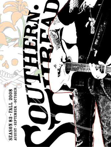
Southern Thread 83 Catalog 2008 - This B2B catalog was the third seasonal offering for Southern Thread for 2008. Main Objective: To ensure a high standard and consistent and creative look for ST, continuing to push the brand main stream while maintaining a western channel following. This catalog was the brand's showing at Denver Market. Design: The inspiration for the spring catalog was continuing to evolve the brand and continued to focus on the brand's roots in music.
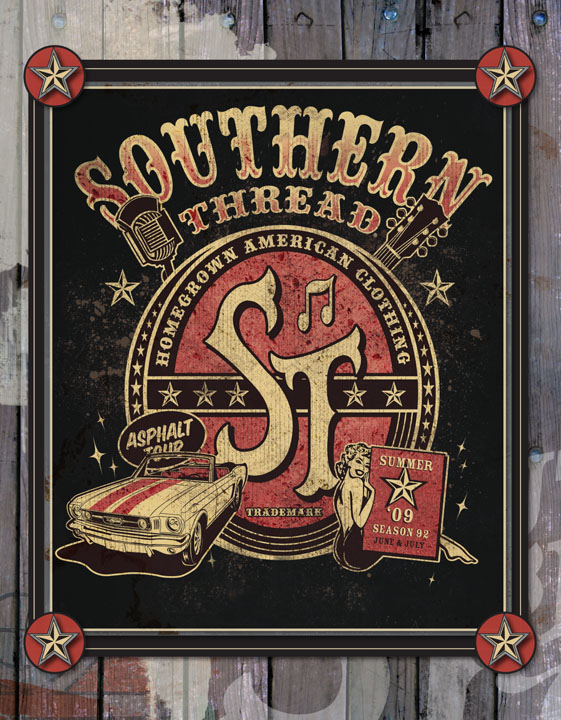
Southern Thread 92 Catalog 2009 - SOUTHERN THREAD, RMCC, DENVER, CO 2008; This B2B catalog was the second seasonal offering for Southern Thread for 2009. The summer catalog was a continuation in the evolution of the brand look and feel and continued focus on the brand's roots in music.


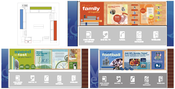
Qwest Retail BTS Change-out - Qwest, McClain Finlon
The project involved the back to school seasonal change out for Qwest retail stores. Objective: To conceptualize a consistent and creative look for Qwest, conveying seasonality and product promotion. Design: The inspiration for the BTS set was traditional back to school elements while weaving in promotions for services and products. Considerations: small case sizes, different atmospheres, balance between information, product display and message.
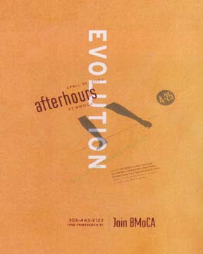
BMOCA Afterhours poster - Boulder Museum of Contemporary Art,
Matter
The project involved a series of posters for events and speakers at The Boulder Museum of Contemporary Art during the 2002 season.
The posters were done in Illustrator printed and cut apart. I was able to play with the design by hand. Once I had settled on the design they were silkscreened on over sized heavy poster stock in three colors.
* Featured as a Merit Winner in HOW Magazine 2004 International Design Annual

CBCA System - CBCA, Matter
The project involved a series of materials featuring stationary system and Culture Counts Brochure for Colorado Business Committee for the Arts.
The inspiration for the system was based on a visual representation of the business world meeting the art world.


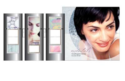
Ebel Corp. - Ebel, Landor Associates
The project involved providing the first seasonal change out for Ebel Corp. cosmetic stores.
Throughout the design process: color, shape and photography choices were very important. The new product lines really drove a lot as far as color and shape. Model photography needed to be fresh and represent the brand line. Supporting background imagery: abstract, organic and natural, dealing more with your senses.

Cafe Bel Etage and Silver Garden logos - Silver Service, akLeiter design, 2006
The project involved a series of materials for a beverage distributor launching their own products.
Considerations: key ideas: high quality, organic, fluid, an experience all needed to be conveyed in the design.
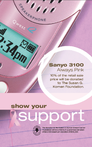
Qwest/Sanyo-Susan G. Komen Program - Qwest, McClain Finlon
The project involved a partnership/donation program during the launch of the Sanyo 3100 at Qwest retail stores. Objective: To tie in with the existing creative for the 3100 while conveying a breast caner awareness.
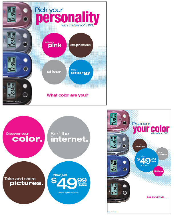
Qwest/Sanyo 3100 launch - Qwest, McClain Finlon
The project involved launching the Sanyo 3100 in an exciting fun way for Qwest retail stores. Objective: To conceptualize a consistent and creative look for Qwest, really promoting the phone and leveraging the color (personality) and technology.
gLike
Design work
Design and Art direction from 2005-2012
Work freelance (*Violet Hive Design: my company, Landor Associates, Matter, McClain Finlon Advertising and Rocky Mountain Clothing Co.)