
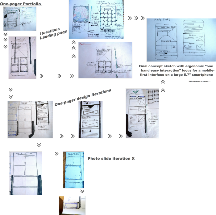
2016 | Inspiration taken from an earlier project - an Android re-design app - 1st and 2nd iteration of the "One hand easy use" Mobile-first concept.
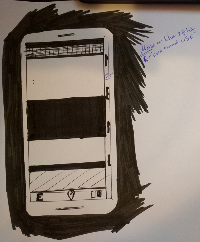
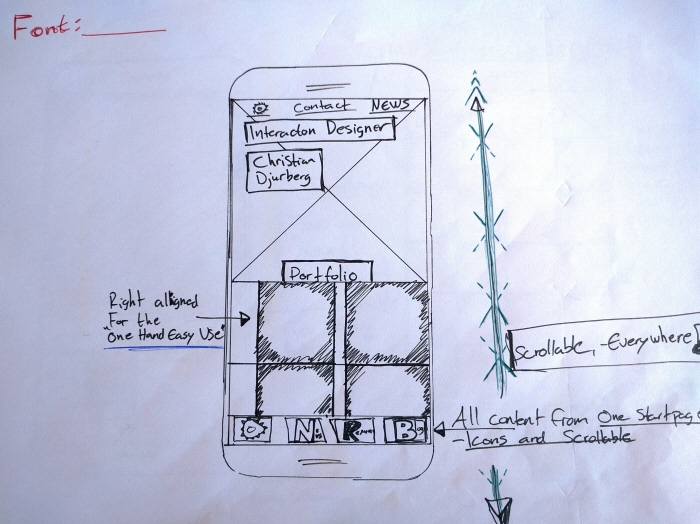
2016 | Inspiration also taken from another sketch concept, the Omni channel design GUI - Here's an Android 1st iteration app sketch. Focus is on the smallest devices, in my case a smartphone but with a big 5,7" display and therefor focus on my "One hand easy use" GUI. I always design and implement my interface sketching with the physical ergonomics importance in mind...
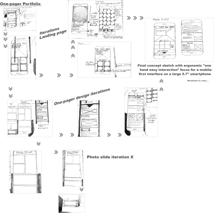
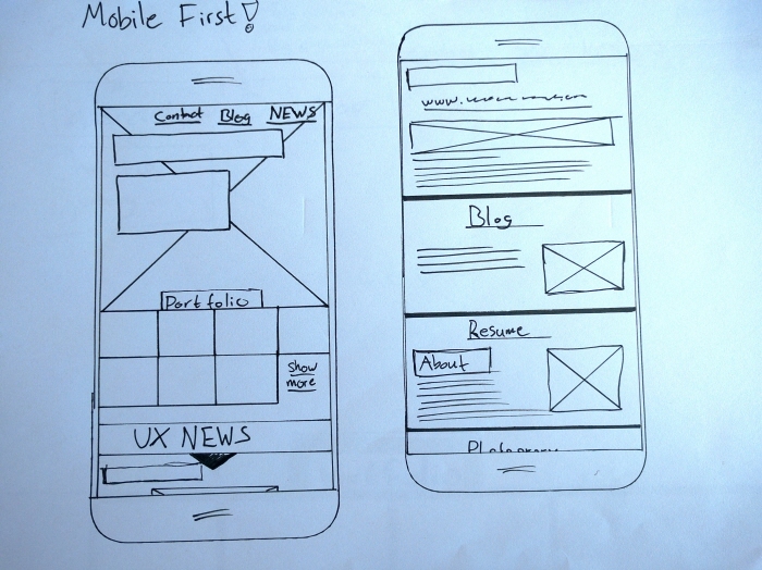
Mobile-first! Responsive portfolio web page design | Concept sketch iterations with ergonomic "one hand easy interaction" focus for a mobile-first interface on a large 5.7" smartphone
Mobile First! Responsive portfolio web page design | Omni channel design - Here's an Android 1st iteration sketch. My focus is on the smallest devices, in my case a smartphone but with a big 5.7 " display and therefor with my "One hand easy use" GUI in mind. I always design and implement my interfaces and sketching with the physical ergonomic impotence in mind...
Mobile First! Responsive portfolio web page design | Omni channel design - Here's an Android 2nd iteration sketch. My focus is on the smallest devices, in my case a smartphone but with a big 5.7 " display and therefor with my "One hand easy use" GUI in mind. I always design and implement my interfaces and sketching with the physical ergonomic impotence in mind...
Mobile First! Responsive portfolio web page design | Omni channel design - Here's an Android 3rd iteration sketch. My focus is on the smallest devices, in my case a smartphone but with a big 5.7 " display and therefor with my "One hand easy use" GUI in mind. I always design and implement my interfaces and sketching with the physical ergonomic impotence in mind...
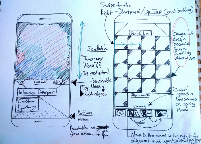
Mobile First! Responsive portfolio web page design | Omni channel design - Here's an Android 2nd and 4th iteration sketch. My focus is on the smallest devices, in my case a smartphone but with a big 5.7 " display and therefor with my "One hand easy use" GUI in mind. I always design and implement my interfaces and sketching with the physical ergonomic impotence in mind...
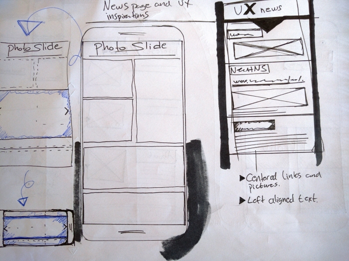
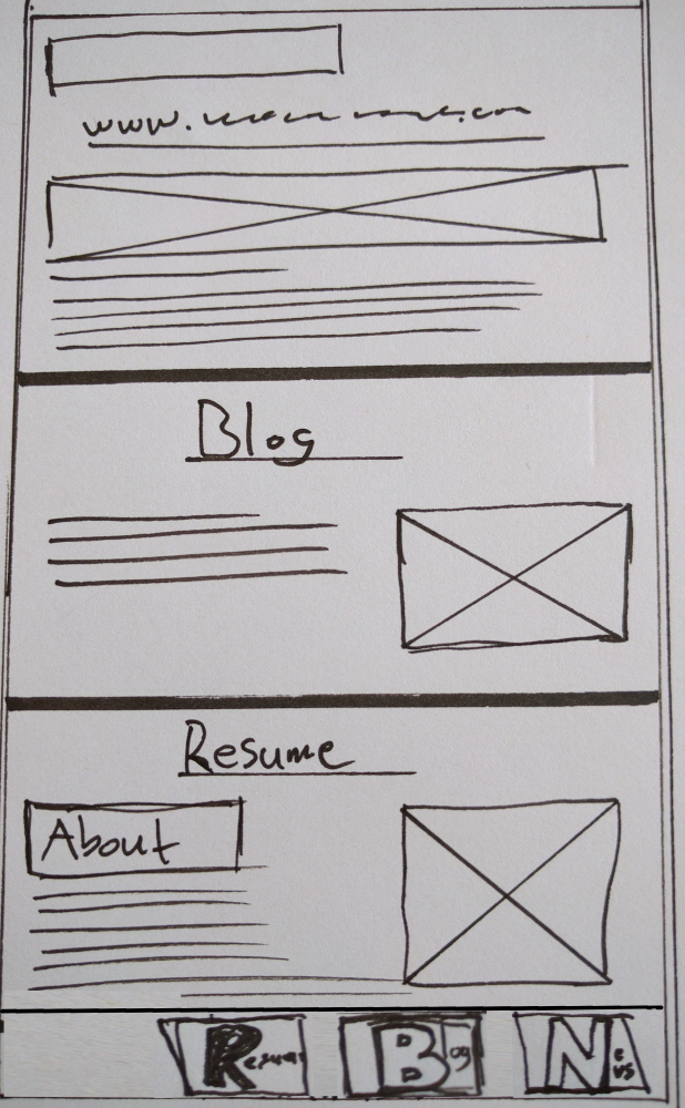
Mobile First! Responsive portfolio web page design, display of pictures an blog posts | Omni channel design - Here's an Android 2nd iteration sketch. My focus is on the smallest devices, in my case a smartphone but with a big 5.7 " display and therefor with my "One hand easy use" GUI in mind. I always design and implement my interfaces and sketching with the physical ergonomic impotence in mind...
Mobile First! Responsive portfolio web page design, display of pictures an blog posts | Omni channel design - Here's an Android 3rd iteration sketch. My focus is on the smallest devices, in my case a smartphone but with a big 5.7 " display and therefor with my "One hand easy use" GUI in mind. I always design and implement my interfaces and sketching with the physical ergonomic impotence in mind...
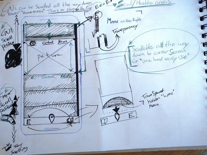
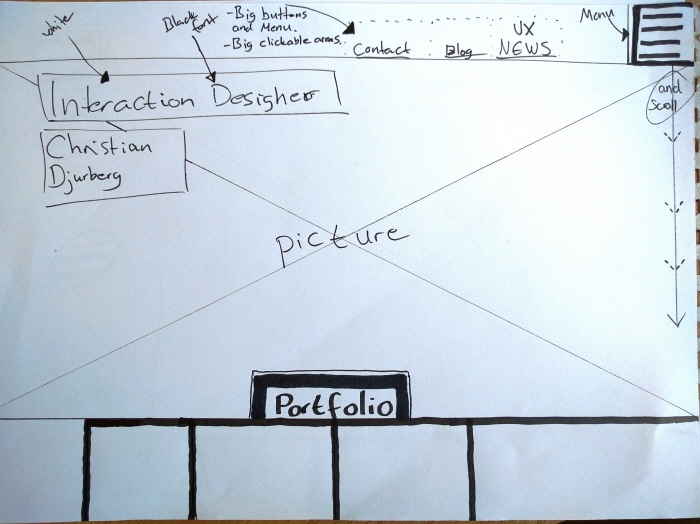
Mobile First! Responsive portfolio web page design | Omni channel design - Final Android iteration sketch. Interaction buttons, links and other areas are placed on right side of the display for right hand users. There's also a popup choice of a mirrored interface for left hand users displayed the firs time page is reached from new devices. I always design and implement my interfaces and sketching with the physical ergonomic impotence in mind...
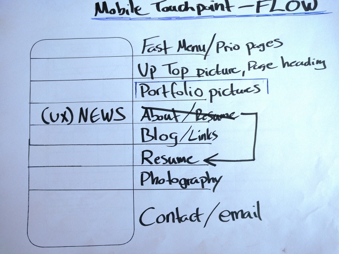
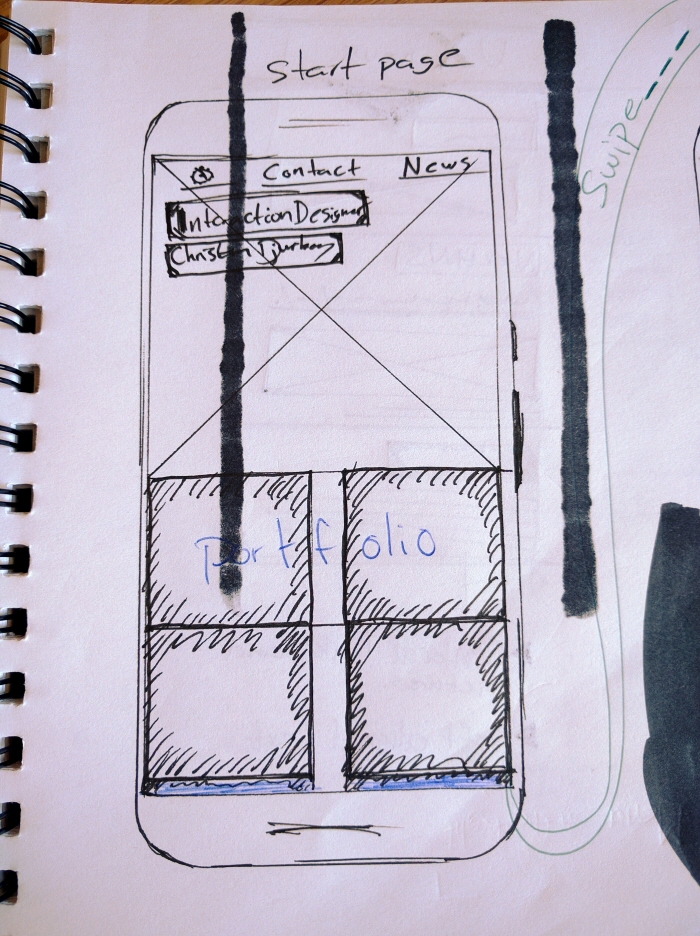
Mobile First! Responsive portfolio design flow | Omni channel design - This is the final flow/ hierarchy of the one-pager design for my new private portfolio page. The concept is a regular mobile first strategy with easily reachable anchore-links from a two-way menu concept.
Mobile-first! Responsive portfolio web page design | Concept sketch iterations with ergonomic "one hand easy interaction" focus for a mobile-first interface on a large 5.7" smartphone
Mobile First! Responsive portfolio web page design. Landing page, lower menu open
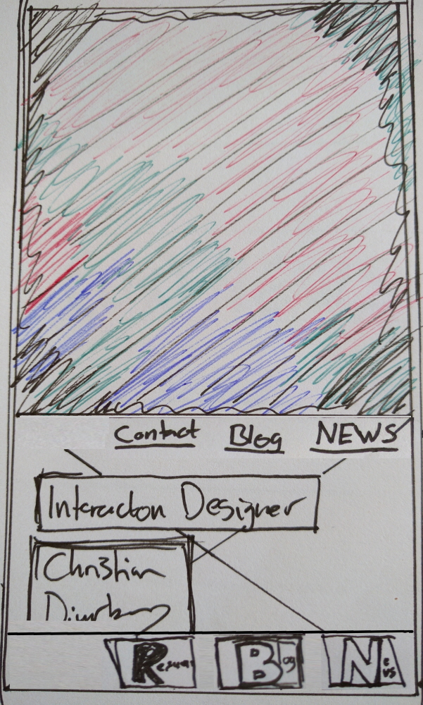
Mobile First! Responsive portfolio web page design. Landing page scrolled all the way down, lower menu visible. -Always give the user "multiple" Options!
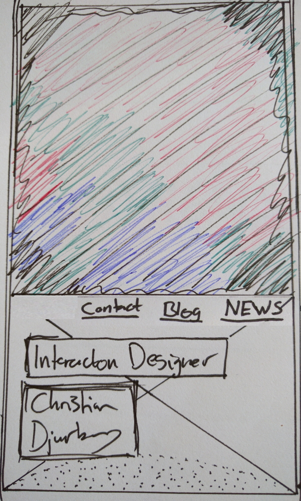
Mobile First! Responsive portfolio web page design. Landing page scrolled all the way down, lower menu not open
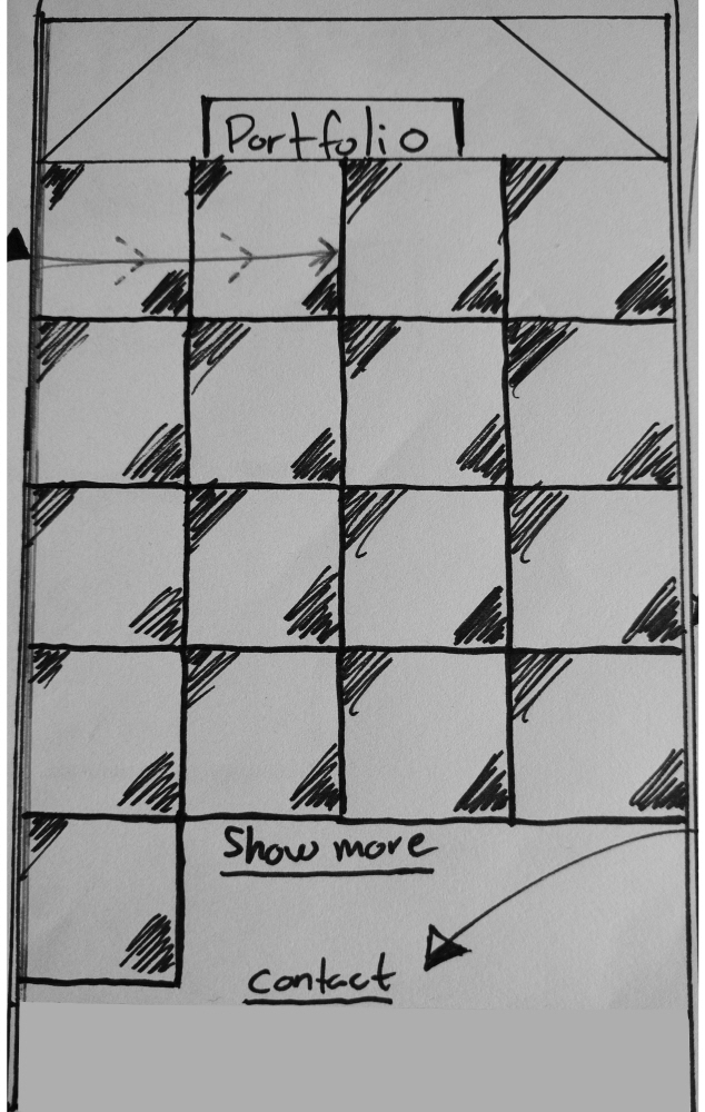
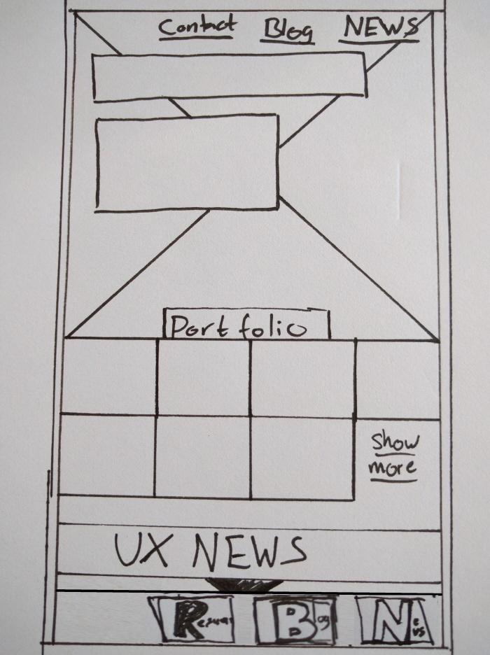
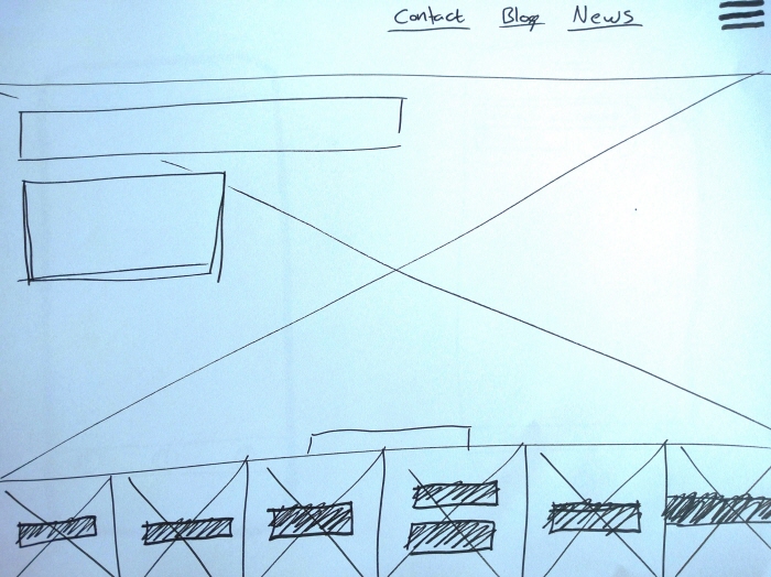
Mobile First! Responsive portfolio web page design. Display of portfolio/ pictures, lower menu not open
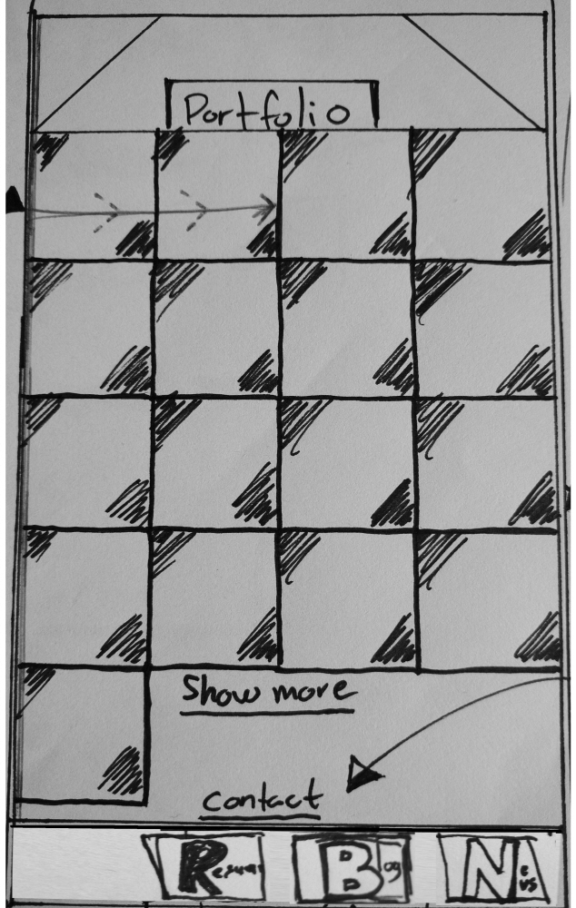
Mobile First! Responsive portfolio web page design. Display of portfolio/ pictures, lower menu visible
Mobile First! Responsive portfolio web page design. Lower menu visible
Mobile First! Responsive portfolio web page design | Omni channel design - Desktop GUI iteration
Mobile First! Responsive portfolio web page design | Omni channel design - Desktop GUI iteration
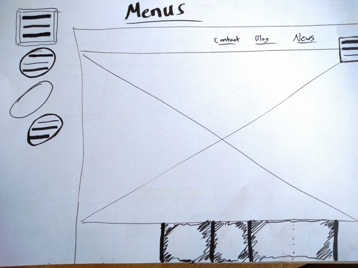
Mobile First! Responsive portfolio web page design | Omni channel design - Desktop GUI menu iteration
gLike
Mobile-first Portfolio project
Mobile-first! Responsive portfolio web page design | Concept sketch iterations with ergonomic "one hand easy interaction" focus for a mobile-first interface on a large 5.7" smartphone
View Website
Available
Freelance
Christian Djurberg, Interaction...
A creative and innovative mind with entrepreneur skills
Stockholm, Sweden