
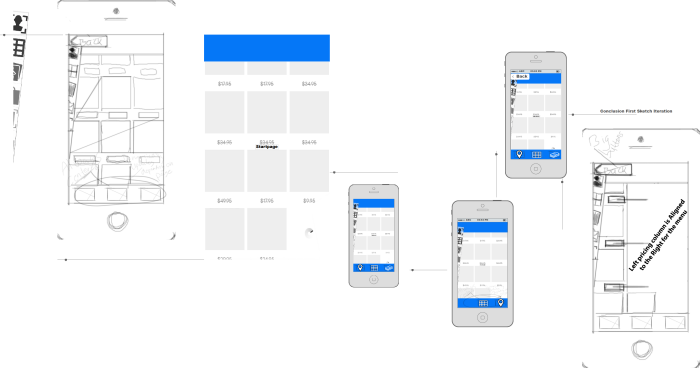
2016 | iOS sketch. Visualization of a more intuitive and user friendly mobile web/ app menu. From first brainstorming ideas to the iteration steps that followed. A redesigning an intuitive mobile web/ app menu for large smartphones (right handed persons) -One hand navigation is the scope
2016 | Redesigning an intuitive mobile web/ app menu for large smartphones (right handed persons) -One hand navigation is the scope
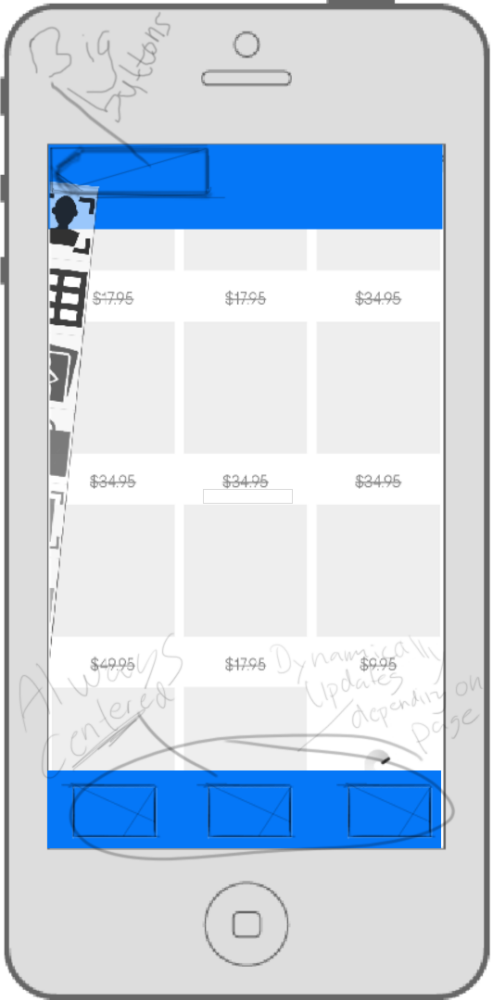
2016 | Conclusion, end of 1st iteration re-design app. Visualization of a more intuitive and user friendly mobile web/ app menu. From first brainstorming ideas to the iteration steps that followed...
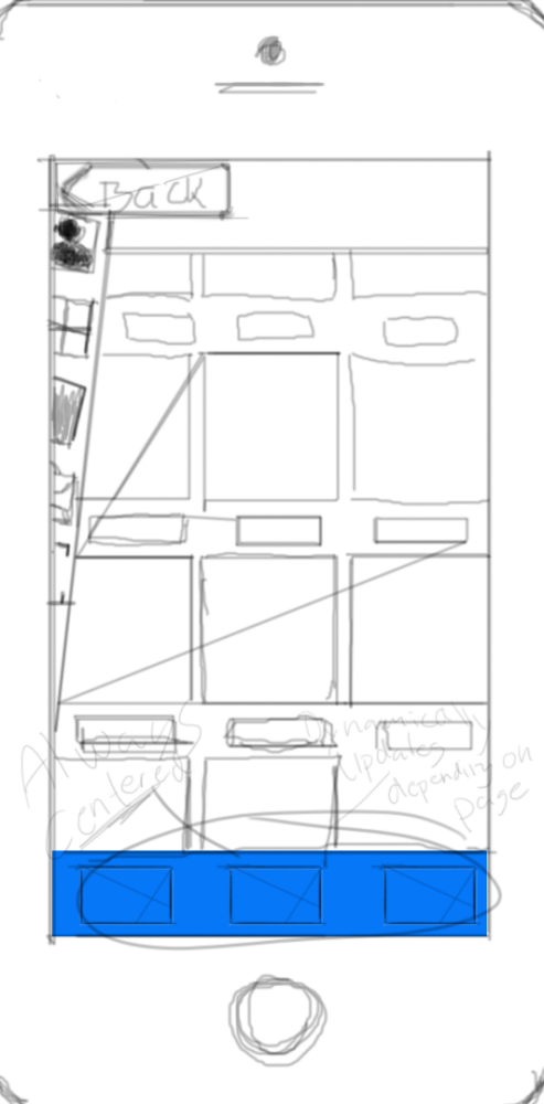
2016 | iOS. Visualization of a more intuitive and user friendly mobile web/ app menu. From first brainstorming ideas to the iteration steps that followed...
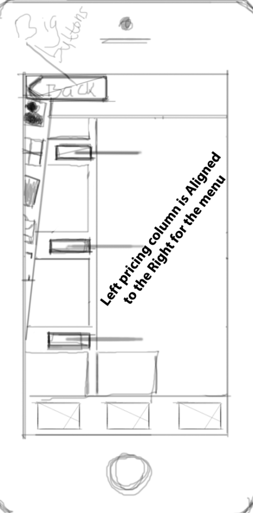
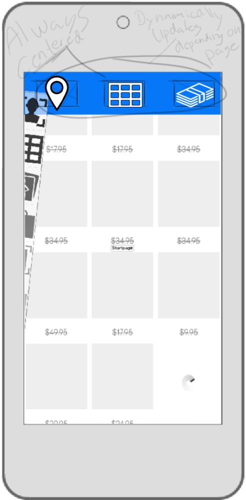
2016 | iOS 1st iteration. Visualization of a more intuitive and user friendly mobile web/ app menu. From first brainstorming ideas to the iteration steps that followed...
2016 | Android version. Visualization of a more intuitive and user friendly mobile web/ app menu. From first brainstorming ideas to the iteration steps that followed...
2016 | Android 2nd iteration. Visualization of a more intuitive and user friendly mobile web/ app menu. From first brainstorming ideas to the iteration steps that followed...
2016 | Android version. Visualization of a more intuitive and user friendly mobile web/ app menu. From first brainstorming ideas to the iteration steps that followed...
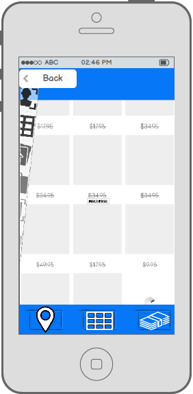
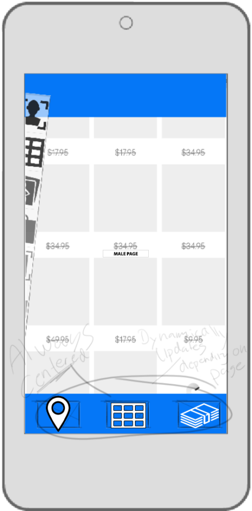
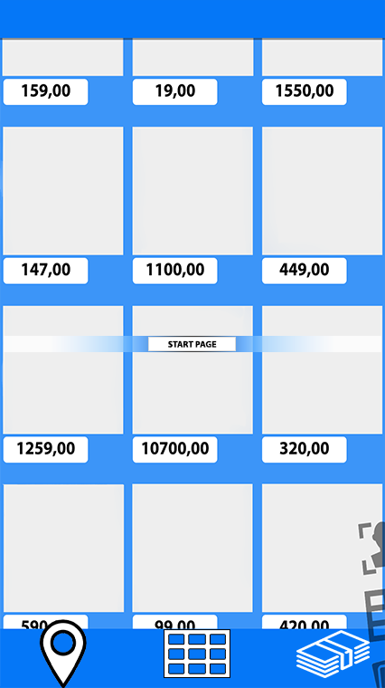
2016 | Mockup Android 3rd iteration redesign app - Change of menu placing for "one hand easy use" and prices left aligned not to be covered by the menu
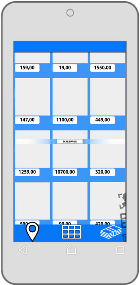
2016 | Android 3rd iteration redesign app - Change of menu placing for "one hand easy use" and prices left aligned not to be covered by the menu
2016 | iOS end of 1st iteration re-design - Visualization of a more intuitive and user friendly mobile web/ app menu. From first brainstorming ideas to the iteration steps that followed...

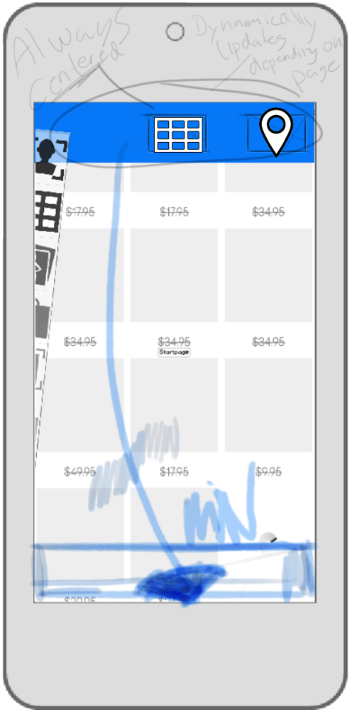
2016 | 2nd mobile web menu iteration. Menu on the right
2016 | 2nd mobile web menu iteration. Menu on the right

2016 | 3rd mobile web menu iteration, change of menu placing

2016 - 3rd mobile web menu iteration | app re-design
2016 | Android 3rd iteration redesign app. Change of menu placing for "one hand easy use" and prices left aligned not to be covered by the menu
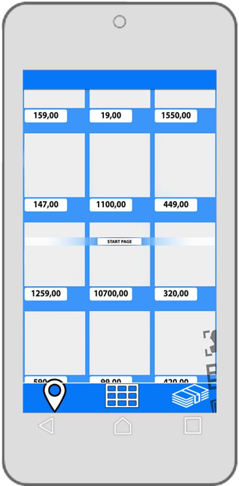
2016 | Android 3rd iteration redesign app. Change of menu placing for "one hand easy use" and prices left aligned not to be covered by the menu
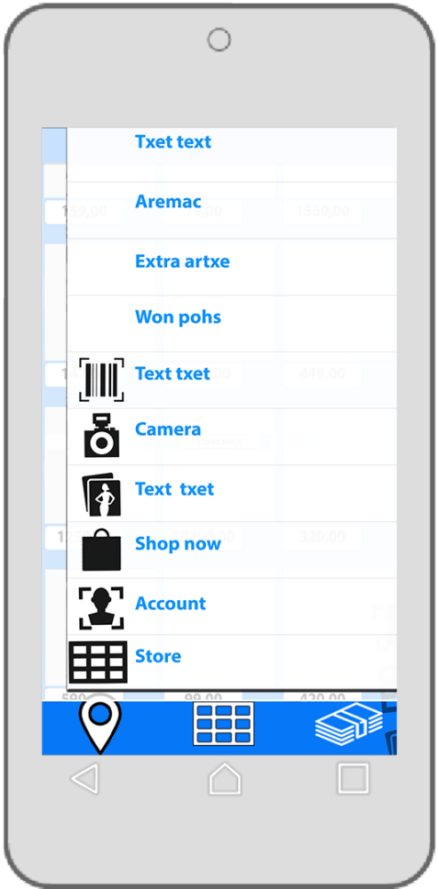
2016 | Android 3rd iteration redesign app - "One hand easy use" menu open. Menu located on the right
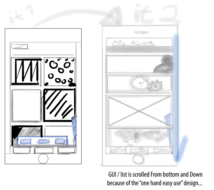
2016 | My account page. Android redesign app - 1st and 2nd iteration of the "One hand easy use" sketch of my account page.
-Focus is on the biggest-small devices. In my case a smartphone with a big 5,7" display and therefor the concept of my "One hand easy use" UI. I always design and implement my interface sketches with the physical ergonomics importance in mind...
gLike
Redesign - One hand mobile navigation
Omni-channel with a "one hand navigation" focus on bigger smartphone screens - an intuitive mobile web/ app menu and online sales pages
View Website
Available
Freelance
Christian Djurberg, Interaction...
A creative and innovative mind with entrepreneur skills
Stockholm, Sweden