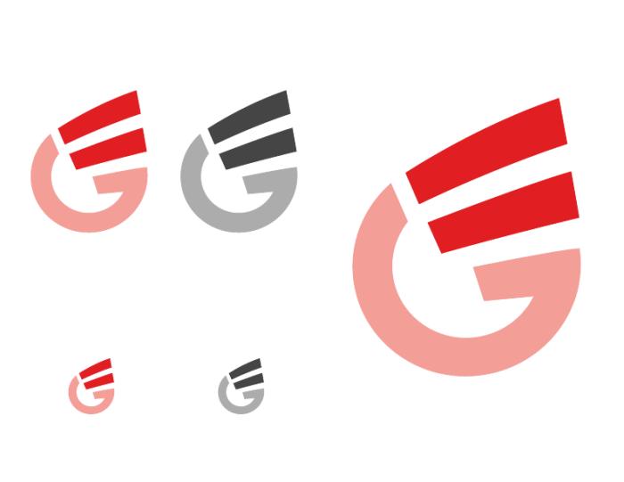
This logo design was for Genetic Equity and it was a combination of the "G", "E","=", in the shape of a drop of blood.
View PDF
View PDF
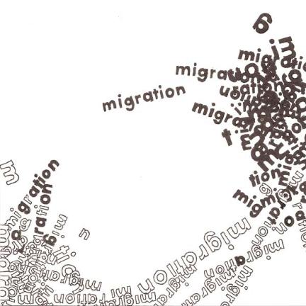
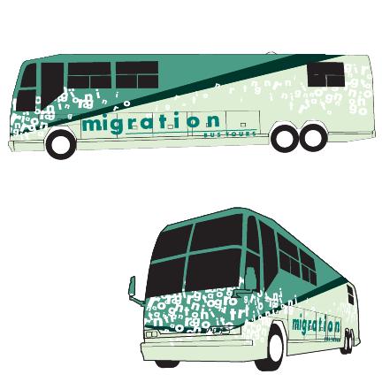
Migration - Migration is a study of the word migration. The initial composition explores its quality of time and space. Time and space is then incorporated into the logo mark. Lastly the logo is then branded on an object again describing the qualities of time and space.
View PDF
View PDF
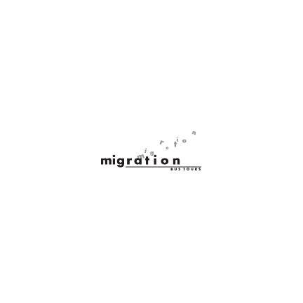
Migration - Migration is a study of the word migration. The initial composition explores its quality of time and space. Time and space is then incorporated into the logo mark. Lastly the logo is then branded on an object again describing the qualities of time and space.
View PDF
View PDF
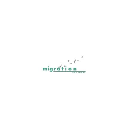
Migration - Migration is a study of the word migration. The initial composition explores its quality of time and space. Time and space is then incorporated into the logo mark. Lastly the logo is then branded on an object again describing the qualities of time and space.
View PDF
View PDF
Migration - Migration is a study of the word migration. The initial composition explores its quality of time and space. Time and space is then incorporated into the logo mark. Lastly the logo is then branded on an object again describing the qualities of time and space.
View PDF
View PDF
A identifying mark derived from my initials. This logo plays with the interaction of complementary colors as well as a gravitational pull.
View PDF
View PDF
gLike
Logo Design