Adobe Glass Icons - Done for myself. I simply wasn't satisfied with CS3's icons so I spruced 'em up.
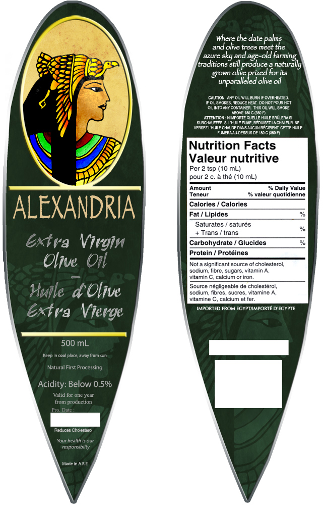
Alexandria Olive Oil - Front & Back.
The label was designed to fit the unusual planes of the bottle.
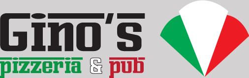
Gino's Logo - The final version of Gino's Pizzeria & Pub (not to be confused with Gino's Pizza)
The client wanted his name to be the dominant element with heavy Italian influence (seen in the colours and Ferrari-esque font).
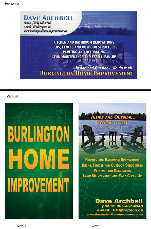
BHI Cards - Two business card concepts for BHI.
The client was set on having the picture of the chairs at the lake included in the card design. They ended up going with the double-sided vertical design (which I very much agree with).
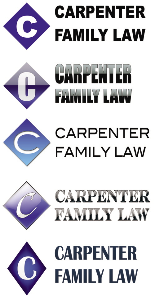
CFL Logo Ideas - Concepts for a lawyer's logo. They came to me with the words: blue diamond, white C, sans-serif font. (#4 was just a font experiment.)
In the end they went with a plain look similar to #1, with Garamond (a serif font).
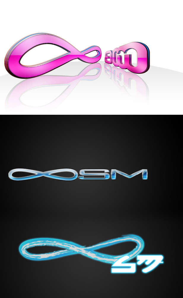
Infinite SM - My concept here was to use the infinity symbol in place of the word, so it would still read "InfiniteSM" without actually having to write it out.
The client was really taken with the colour blue and "bubbly", so I made sure to include it, and the project manager wanted to see a look with a Japanese-pop feel.
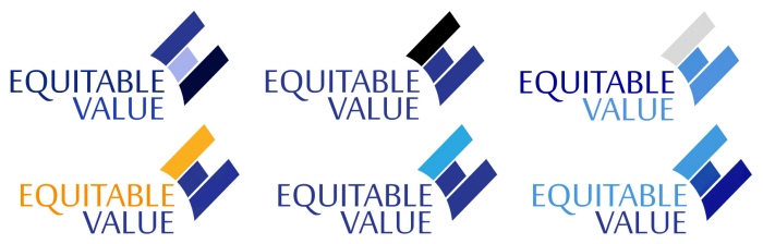
Equitable Value logo colour scheme - After I redesigned their logo (created the flag to be both an E with the V inside) the client wanted something that used the deep indigo, so presented a variety of options.
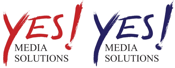
YES! Media logo - Logo created in Illustrator, client really wanted that exuberant "yes". They couldn't decide between the two colours in the final stage so...picked both.
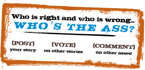
WtA transparent banner - Simple instructional made for their social website: http://whostheass.com/
gLike
Labels Logos and Icons