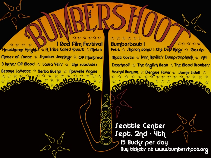
This concept was a play on the meaning of "bumbershoot", which is umbrella. Summer colors were mixed with fall colors to show the season of Labor Day in a playful way.
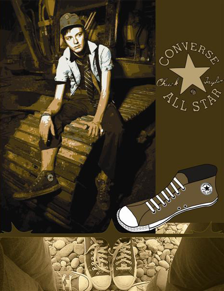
This is a magazine ad comp for Converse. The concept was to convey the D.I.Y. attitude that is associated with the identity of the classic "Chuck Taylor" shoe.
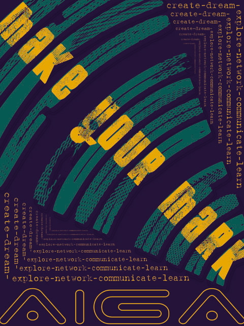
This is a promotional poster to be displayed at A.I.G.A (American Institute of Graphic Arts) events. The concept was to reflect both sides of the graphic design. Structure and creativity.
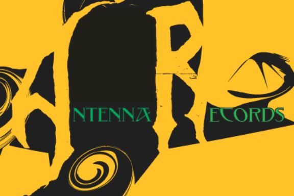
This is a promotional postcard for Antenna Records. The concept was to reflect the typography in an insect-like way. The letters A & R burrow through the black shape like an underground anthill. The shape on top of Records reflects an antenna.
View PDF
View PDF
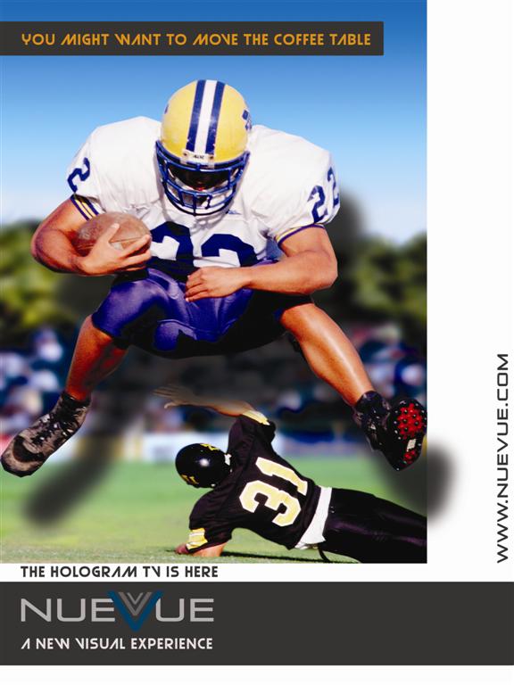
This is an ad for a hypothetical hologram tv company called "NueVue" that I made up for an ad campaign. The concept for the campaign was to give the viewer a sense of a holographic visual experience, as if they were watching a NueVue tv.
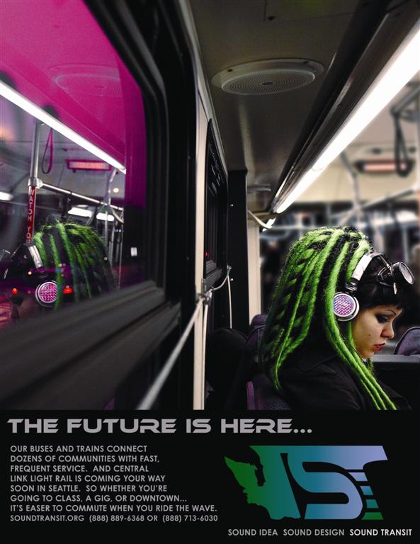
This was a group project for the "Sound Transit" ad campaign. I came up with ads that would be featured in "the Stranger" and "Seattle Metropolitan". The concept for this ad was to appeal to a younger audience by using strong imagery to create a cyber-punk, metropolitan setting.
gLike
graphic design