
gLike
Student Project: Royal Oak Identity
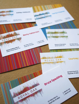
Royal Oak Identity - Royal Oak’s vibrant community of residents and commuters alike come
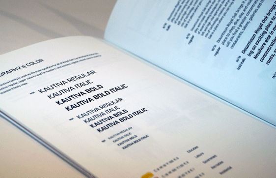
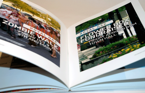
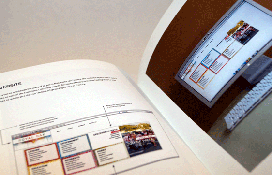
together to create a breathing, rhythmic, energetic atmosphere for all walks of life to enjoy. The objective of the identity is to reflect the various aspects of the community: blue for government, red for leisure, yellow for education, pink for residents and green for recreation. These colors are always displayed in a rhytmic mark to reflect the overlapping of all aspects.