
trucking company logo - Logo for trucking company in Canada. They were looking for simple but eye-catching.
ellemmell logo revision - I wanted a new logo for my freelance business. This logo represents creative design "thinking" ellemmell. This design also allows for variations for banner ads, etc. as shown without compromising the design elements and the message.

ellemmell logo revision - I wanted a new logo for my freelance business. This logo represents creative design "thinking" ellemmell. This design also allows for variations for banner ads, etc. as shown without compromising the design elements and the message.

Logo Comps - These are comps submitted to update and reposition the company. The goal was to get something clean and modern but that could be used for long-term without being trendy.
Identity suite - This client wanted elements of the flag incorporated into the logo. Concept, graphics, layout.
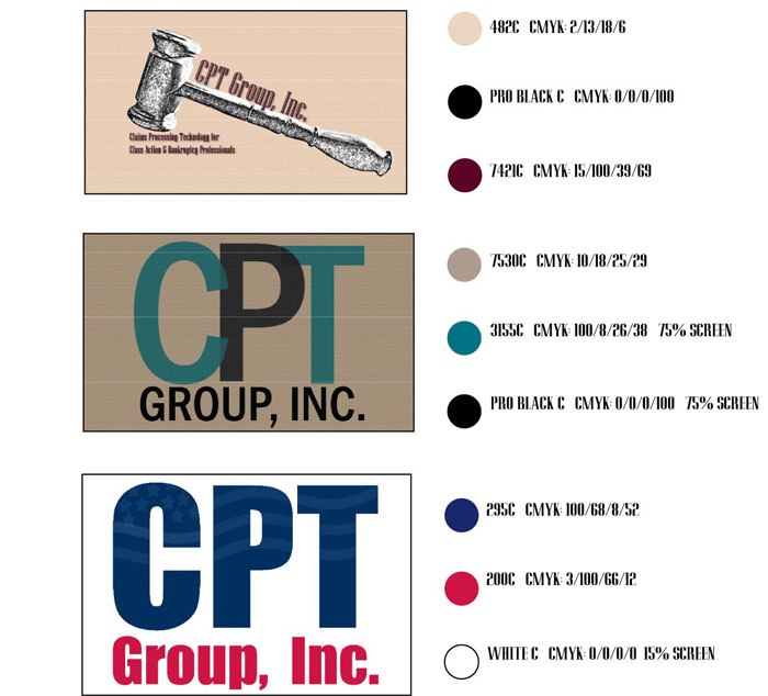
Logo Comps - These were comps submitted; the client wanted a sense of strength and stability. They had been using multiple logos that were not the look they were after. Ultimately, they made some revisions to the 3rd choice and its final version is shown separately here. They wanted to incorporate the flag into the logo to coordinate with the legal system.
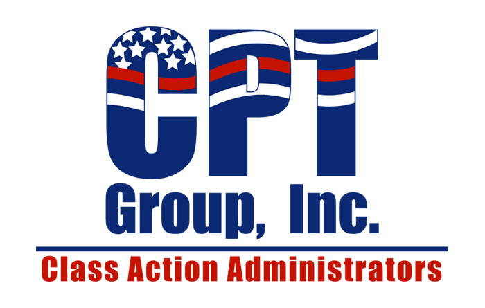
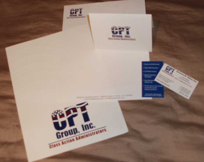
CPT logo - A firm that works with attorneys, the CEO wanted something with a flag motif. I've created their identity suite, presentation folder, single fold brochure, tri-fold mailer & ads.
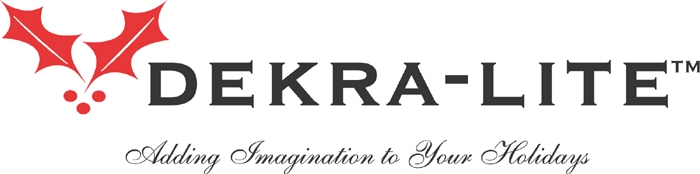
Dekra-Lite logo - Company supplies commercial holiday decorations to cities, shopping centers and commercial properties across the country. They wanted an upscale yet simple logo. The tag line needed to somewhat describe what they did. I wanted something that would also work with their printing division (see next logo) so there would be a cohesiveness to their branding and marketing collateral.
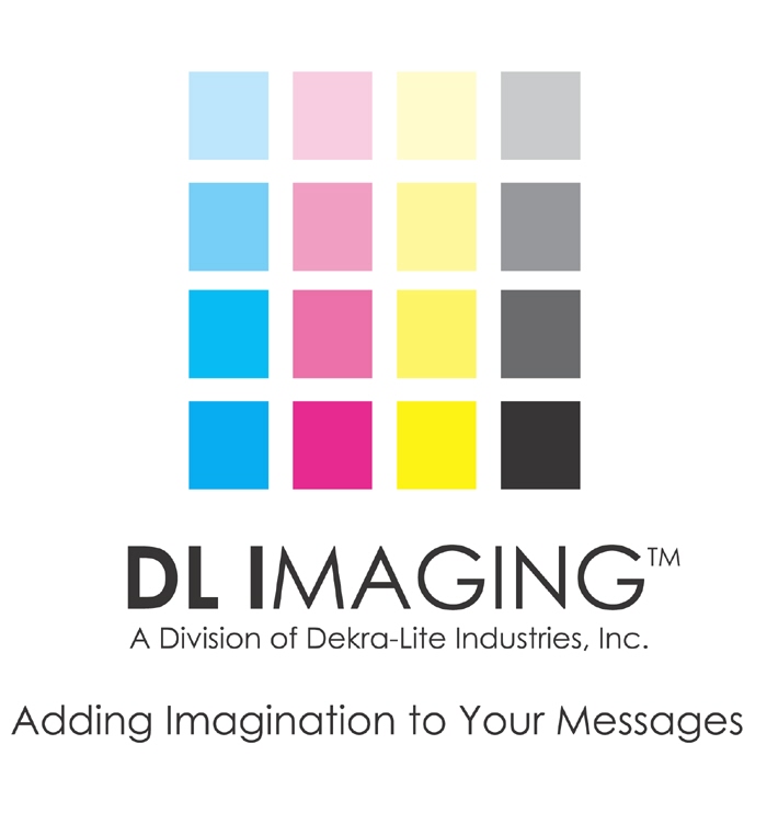
DL Imaging logo - Company designs, prints and installs banners and large-format printing for cities, shopping centers and commercial properties across the country. The colors and squares represent printing. Because they offer design services, they do more than just print and I wanted that to come across in the identity. This is a separate printing division to the company and although colors and feel would be different, the tag line helped bring a cohesiveness to their branding and marketing collateral.
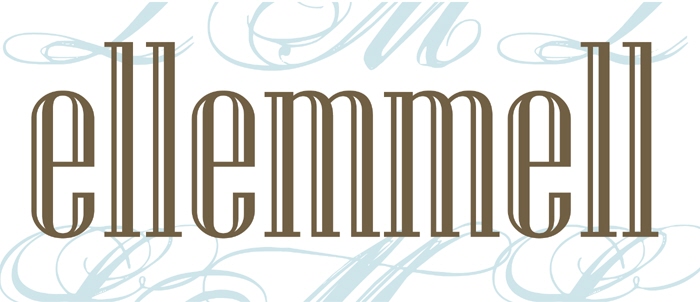
ellemmell logo - My name and logo is derived from my initials, LML (ellemmell, get it?). For the complete identity suite, see next sample. I wanted something classic yet modern, clean yet not cold.
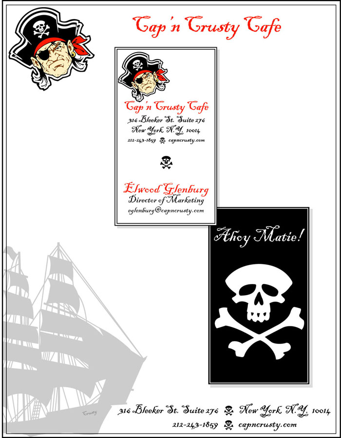
Cap'n Crusty Cafe identity - This was my submission for a design competition. They give us a creative brief and an image to work with and we go from there.
The "cafe" needed letterhead and a business card and was a casual place to eat for young urban families. Link: http://www.graphics.com/modules.php?set_albumName=album487&op=modload&name=Gallery&file=index&include=view_album.php
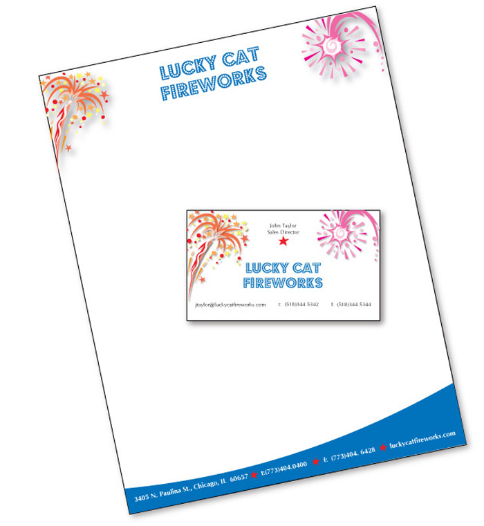
Lucky Cat Fireworks - This is a submission for the graphics.com web site
They give us a creative brief and some graphics & copy to use and it's up to us to create the identity as per the instructions. Link: http://www.graphics.com/modules.php?set_albumName=album532&op=modload&name=Gallery&file=index&include=view_album.php
concept logo submission - He had specific ideas on what he wanted; bold but a bit soft, as his clientele is primarily women.

concept logo submission - This company wasn't too sure what they were looking for, but their audience is older people and they wanted their tag line used.

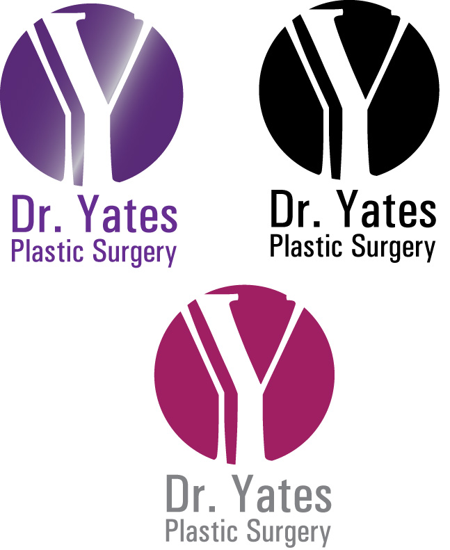
concept logo submission - She was definite about using pink and wanted a clean, sophisticated look.

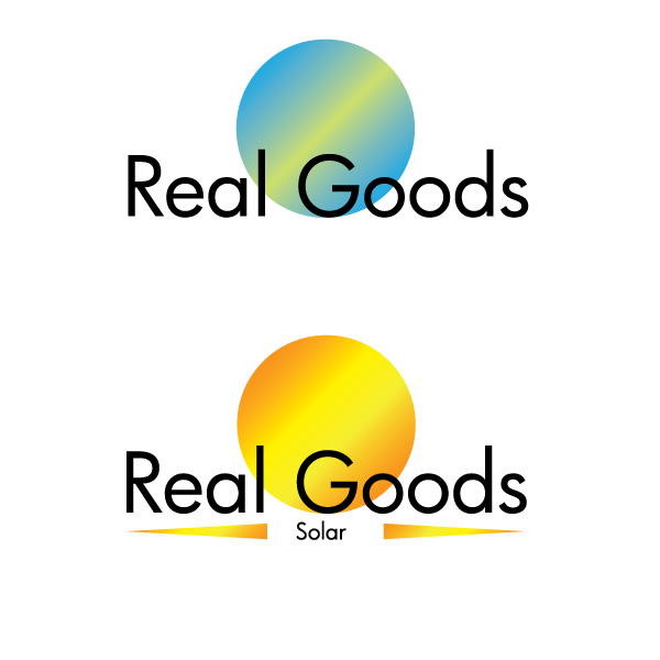
concept logo submission - This company wanted an updated look, with two divisions. I showed them they could use these either separately or together.
concept logo submission - Another option for the company.
gLike
logos & identity