
Type Composition - The main goal of this composition was exploring relationships between type elements, and incorporation visual concepts in an abstract way. It started from simple elements, three letterforms, Q from Futura, g from Bodoni and R from Century Expd BT, and became a process of identifying abstract comcepts as they became visualized.
In this picture, I’m showing how can type composition be used of as a street art.
September~December, 2010
Book Dimension: 8.5(W) x 8.5(L)”
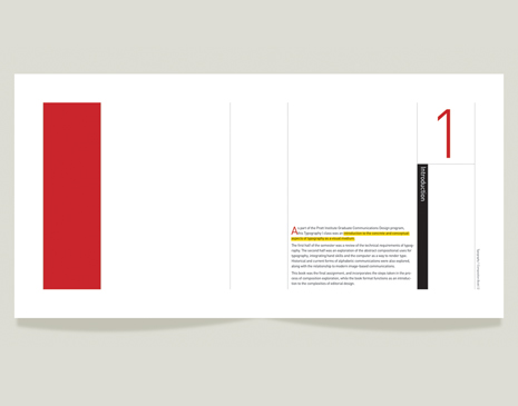
Type Composition - This book was the final assignment, and incorporates the steps taken in the process of composition exploration, while the book format functions as an introduction to the complexities of editorial design.
Above images are spreads of final type compositition book. Layout design was inspired by Mondrian that has the same structural quality with each typeface. I used Q from Futura, g from Bodoni and R from Century Expd BT.

There Goes a Dokkaebi - [Medium] Watercolor, Pen, Color Pencil, Adobe Illustrator, Photoshop
[Date] 2009
The original work was done in 2002, in my undergraduate, and I redesigned in 2009.
[Dimension] 450*270mm
Dokkaemi is a Korean traditional ghost who wants to be a friend with human, and it's kind of stupid so is easy to be fooled by human.
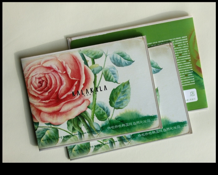
Brand Image Brochure ; cover - Brand image brochure design for KALAKALA.
[Demension] 165*120mm, 16p
[Medium] Water color, Adobe Illustrator, Photoshop, InDesign
[My Work] Concept idea, Illustration, Photographs, Design

Brand Image Brochure
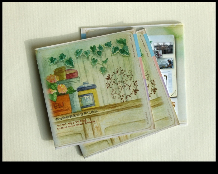
Product Brochure ; cover - [My Work] concept idea, illustration, design
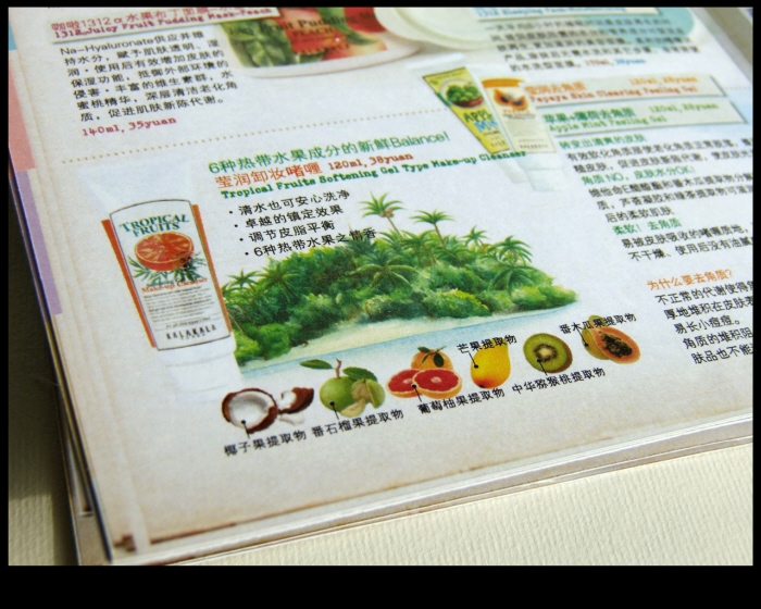
Product Brochure
gLike
Typography Editorial Design