
Baulscape (Book Cover for RandomHouse) - Bauls are mystics from Bengal who reach a state of trans through music. They are nomads and their beliefs transcend religious barriers of Hinduism and Islam. The word "Baul" is sanskrit for the wind. The title is inspired from this connection as well as the music that they create wherever they go.

I Witness
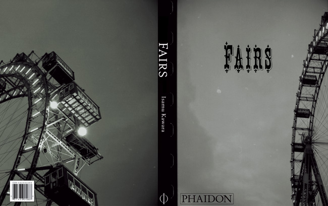
Fairs (Book Cover proposal) - Fairs are something all of us can relate to. This book is about the nostaligia of Fairs. How, when and why they started and whether they are going to die out or not? These are the oldest Ferris wheels in Austria and were even featured in Orson Well's, The Third Man. The typography reflects the nostalgia of those bygone days.
This cover was featured in the 2006 Graphis New Talent Award book.

Celebrating Freedom: 12151791 (Book Design) - This book, celebrates the launch of the Freedom Museum in Chicago. 12151791, refers to the date—December 15, 1791, when the Bill of Rights was ratified. We based the book design on the main installation in the museum, which consists of letter-size metal plates with quotations on freedom die-cut through it.
In the same spirit, I decided to emphasize this dimension of the plates, by using a dotted line throughout the book, with die-cuts appearing on the cover and the section dividers.

Same-Sex Love in India (Book cover proposal for Penguin Books) - Using the gay flag in conjunction with the Indian tri-color (organge. white and green), completes the metaphor of Same-Sex Love, and, India.

Typeface for Biedermeier: The Art of Simplicity

Trueso Poster

NY Stories: Aaron and I - A project for a class by Maira Kalman. The purpose of the project was to tell the story of a nursing home resident. At the end of the 3 months, I used graphic design emphasize aspects that were common to Aaron and me.
This work is about both of our experiences with ballet. Aaron took ballet lessons and I used to photograph ballet classes.
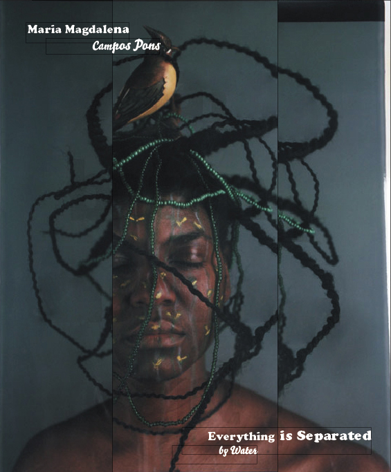
Everything is Separated by Water (book cover) - A book cover proposal for the artist Maria Magdelena Campos Pons. The idea here is to emphasize her ritualistic and often fractured work.

Oberoi Hotels E-newsletters

Indian Mountaineering Foundation Posters

Lolita (book cover) - Humbert Humbert and Dolores Haze are complete opposites of each other. While Lolita is fragile, nubile and coy, Humbert Humbert is masculine, strong and determined. The cover shows this contrast by using a heavy typeface for Vladimir Nabokov (who like Humbert hails from Russia). And in the same "playfully perverse" nature of the book, Lolita's name is constructed from pubic hair.

Negative (magazine) - Negative is a quarterly photography magazine that focuses on one theme per issue. Themes can include product photography, architecture, stock, poverty, nostalgia etc. The demographic for this magazine would include graphic designers, stock agencies, ad agencies, galleries, museums, libraries and of course photographers.

Oberoi Hotels

Canon Leaflet

Illustrations for Guinness Beer - llustrations for the cover of the Global Guinness Brand Book. This book was used to promote
a consistent nature of what the Guinness brand is about...it's about celebrating greatness, both global and local.
Art Director: Bridget de Sociox.

New York Stories: Origins - A project for a class by Maira Kalman. The purpose of the project was to tell the story of a nursing home resident.
At the end of the 3 months, I used graphic design emphasize aspects that were common to Aaron and me.
This piece is about both our origins--where our family comes from, and all the cities we've lived in, until we met in Manhattan.

Sadak/Street (poster) - Sadak means street in Hindi. This poster was done for one of my street photography shows in Delhi.
This poster uses the Indian vernacular "Bollywood" style and was literally stuck all over the streets of Delhi.

Vivre (catalog spread)

The Corporation (book cover concept) - "The Corporation" uses the WHO (World Health Organisation) definition of a mentally sick person and applies that definition to Corporations (from corpus or body) and proves that Corporations are "sick". The cover illustrates the same by placing "The Corporation" on a patient’s table.
Won the 2006 :Output Foundation Award (Germany/Netherlands)

Tortoise (magazine concept)

Dekho Dekho (magazine) - Concept for Dekho Dekho which means "look look" in Hindi, hopes to be India' first visual arts magazine.

Brothers, layout and illustration for Plazm
gLike
Print & Editorial