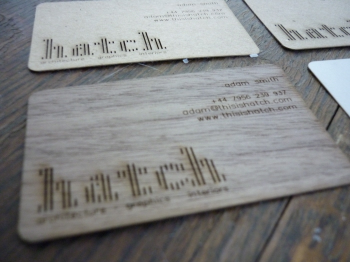
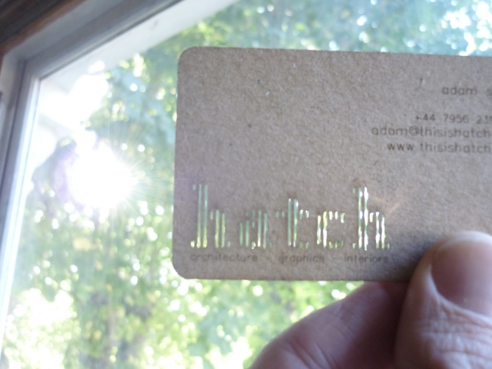
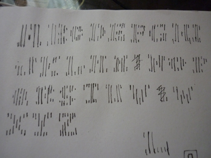
These are some early examples of a font I've designed (and which will be available to buy shortly). It was born out of my recurring desire to laser cut text for projects, but never really wanting to use a stencil font. As far as I can tell, this is the first font designed specifically for use with cnc.
The very simple idea for the font came to me in a flash on a lawn bowling green! Originally I was sketching the font as sans-serif, but as soon as I experimented with a serif h, it was clear that was what it wanted to be.
The font has a classic feel while being unmistakably contemporary. The approach I took was to make it neither retro nor futuristic. I saw the process as simply designing a font for a new media, in much the same way fonts designed in the digital age are different than steel cut.
Because of the way the material is removed, the final product remains very structurally stable, and can be bent and shaped without creating tabs the way most stencil fonts would.