
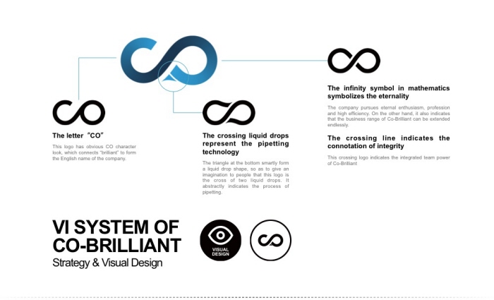
This is a VI system I designed for Co-Brilliant Company. It includes basic part and application part. This logo includes different levels of connotations. Judged from the letter of CO, we could give it three core connotation: 1. Cooperate to create the prosperity; 2. Keep going beyond; 3. Advantage in pipetting. The simple and symmetric design, flat style and geometric shape make the whole design up-to-date and offer a sense of technology. The color is the blue, the symbolic color for hi-tech enterprises and the color for liquid, so as to indicate the company’s major business.
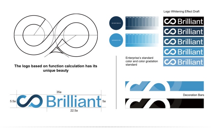
The sense of accuracy meets the image of hi-tech enterprise. Meanwhile, it offers cross, parallel and symmetric sense as well as perfect line ratio relationship. These parameters are calculated from software, which adds sublimation of precision to artistic inspiration.
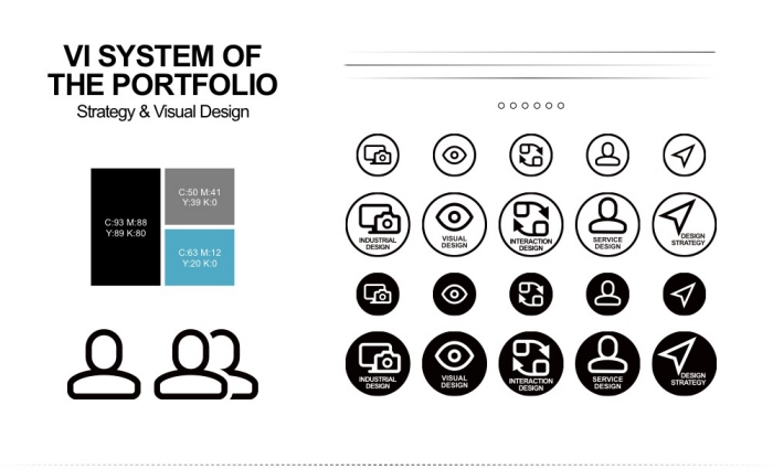
Before making this Portfolio, I first designed a simple VI system for it to standardize the color, font, spacing and line as well as design a specialized icon. Collections on display are the works of different periods and their styles are quite different. But by way of this VI system, the visual effect of the entire portfolio is still very unified.
gLike
VI System