
Poster for a botanical artist.

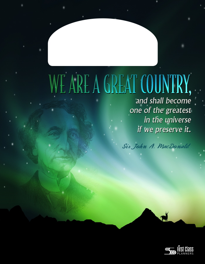
School agenda cover design celebrating Sir John A. McDonald.
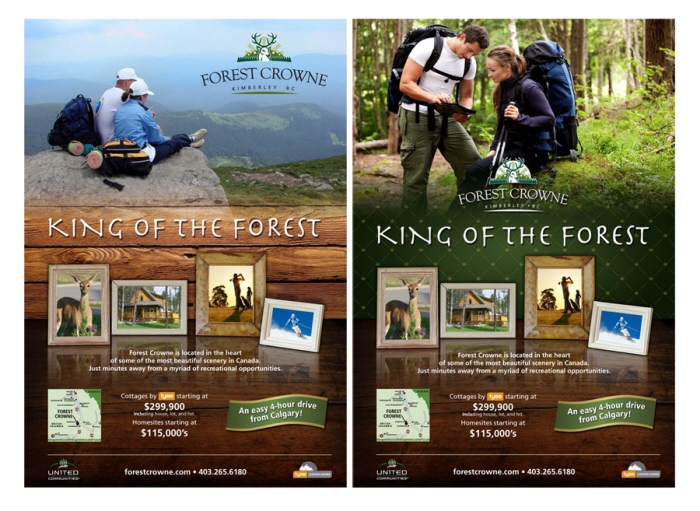
Forest Crowne Ads - Created concept "King of the Forest" and design for this ad.

Care for the earth agenda cover design.

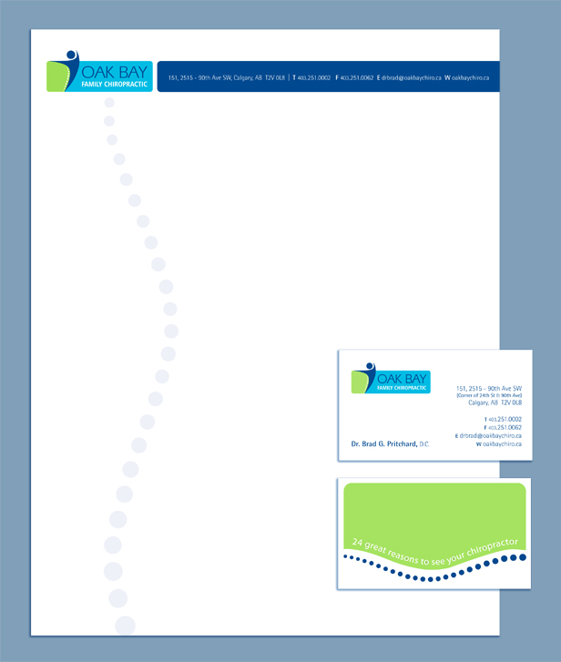
Oak Bay Chiropractic - Logo & stationery design

Geoff Wilkings Photography - Logo design and business card layout. The client was looking for a 2 color logo comprised of simple shapes that could be easily replicated on merchandise. He also wanted the graphic to have the feel of an icon which could be used on its own without any wording that would in time become recognizable by itself.

Unicom 2007 Calendar - Complaints of not enough room to write important dates and appointment reminders were met by this year's weekly format calendar/day planner.
Each page contains a quirky Canadian fact, because you never know when you will need some formidable facts to impress a date or to interject into an awkward moment of silence; or maybe to use as a conversation starter around the office water cooler.

CD cover design for country music artist.

Xposure 2007 - This is my winning submission for X92.9's Xposure 2007 CD graphics contest. A compilation disc of local Calgary bands.

Sailor Jerry style illustrated ad for Realtors Kim & Doug Hayden.
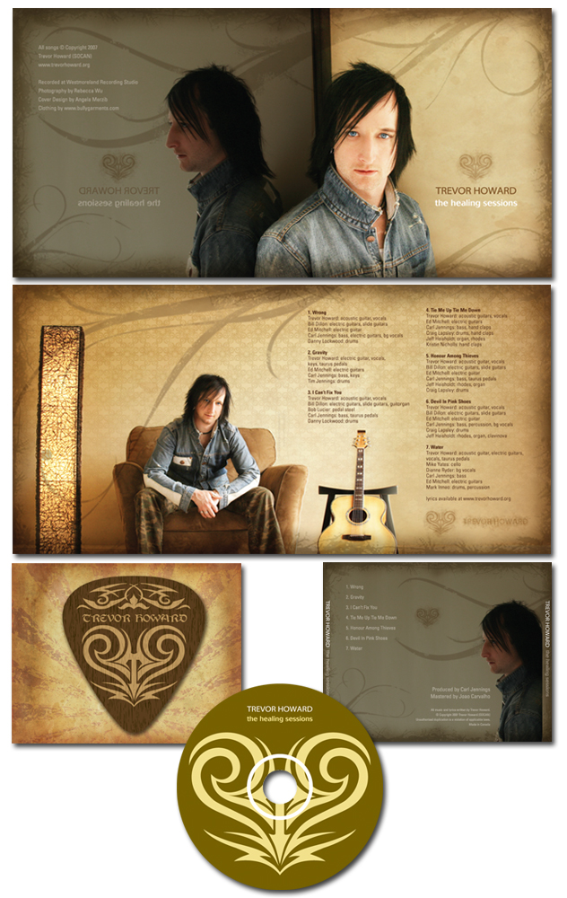
Trevor Howard CD - The Healing Sessions CD folder, tray card and disc imprint design.

ATB Currency Sheets - These handouts needed desperately to be updated and the whole look to fit with their new corporate image. I used more modern looking icons to represent each party in the flow charts rather than a square block that didn't really say much.

Lydian Studio - This client wanted an item she could give to children to whom she taught music, that they could take home. I created a maze game and fun illustration of cello and bow. This could also be used as a bookmark in order to cover the wide age range of students she teaches. Contact info for parents was printed on the other side.

Greyhound Posters - These were large scale poster designs that were going to be used in bus stations in Toronto and the surrounding area encouraging people to use Greyhound's special commuter fares to commute to work. They didn't give me much direction other than this. The concept and copy writing were left completely up to me.
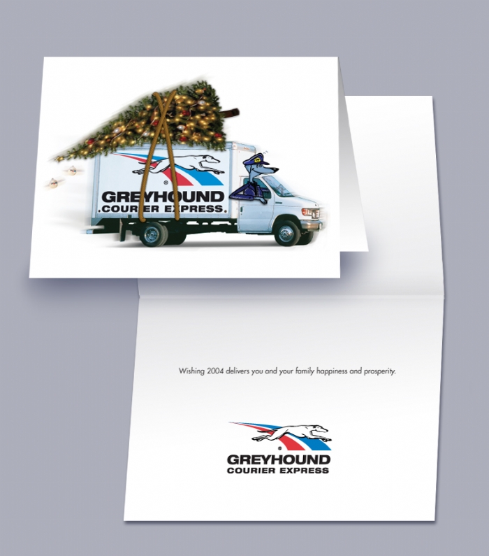
Greyhound - Christmas cards.
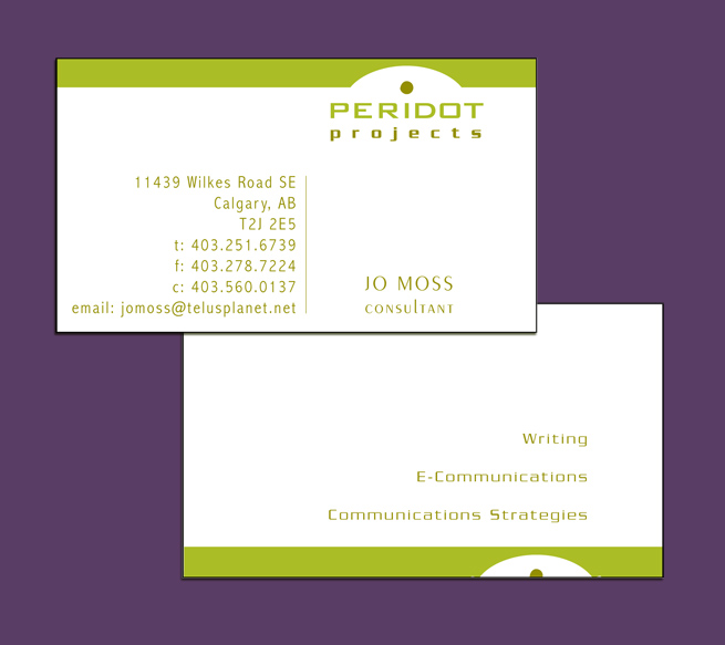
Peridot - Logo and business card design.

Unicom 2007 Christmas Card - This print shop wanted to make known the fact that they had become an FSC certified printer, and went with an environmental theme for their Christmas cards. Two interlocking trees can be punched out of the card to create a desk ornament,. There is also some copy regarding recycling old cards, and a website link to find more tips on holiday recycling. The card was printed on FSC certified paper.

Arriva Christmas Card - Arriva Condos wanted a simple Christmas card design utilizing their 2 colors. After gazing at their logo for a while the "V" started to look like an upside down tree shape. So I went with it, and a Christmas card was born!
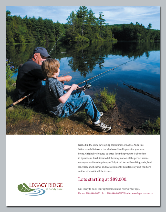
Legacy Ridge Ad - Ad and logo design created for Opulence Magazine.

Valencia Denim - A logo and package design for a friend's marketing class project.
This is an investor's information package for a fictitious denim company that specializes in manufacturing custom jeans.

Realtor Business Card - Copper and black duotone printed on "Curious Touch" stock with MaxWell logo in clear foil.
I created the tag line "Feel The Difference" as a play on the unusual texture of the stock and to describe Margaret's business style.
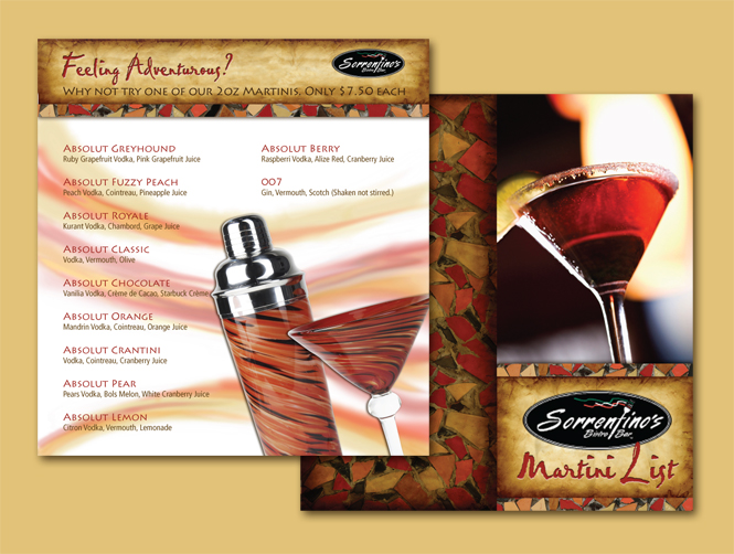
Sorrentino's Martini List
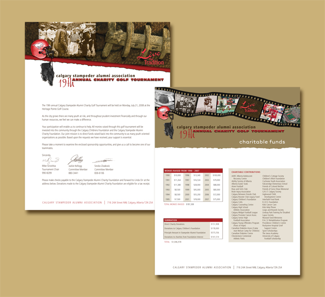
Stampeder Alumni Association - Letterhead and Golf Package redesign.

ILU Book Design & Binding - This client wanted to make a fairytale type of book containing the story of how he and his girlfriend met which he could use to 'pop the question'...you know she's going to say yes when she sees this!
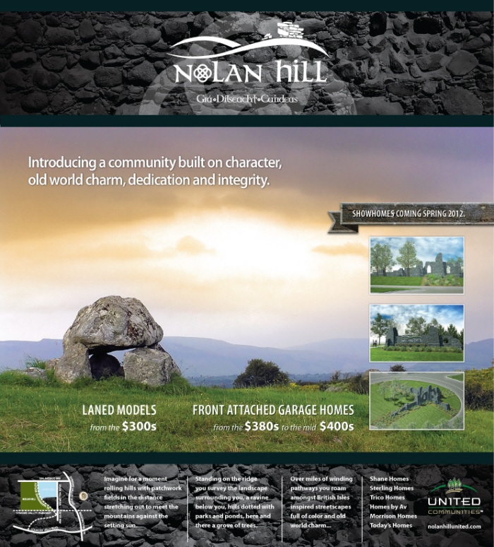
Nolan Hill Ad
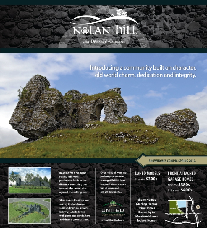
Nolan Hill Ad

Elevation Roofing - Logo and stationery design for roofing company.

Leukemia Poster - The poster they had in the past was fairly bland and they wanted to give it a new look.

Voyager Energy Annual Report - The old world design here was inspired by the fact that Voyager would be starting exploration in the Caribbean, therefore, a "sunken treasure/treasure map" theme was used throughout. The masthead and footer for all the sections was done in a duotone to match the feel of the old worn map on the covers, and we thought too many bright colors might make the concept look too gimmicky.

Off-Campus Housing Bookmarks - To help make post-secondary students aware of fire safety & potential hazards when looking for off-campus housing.
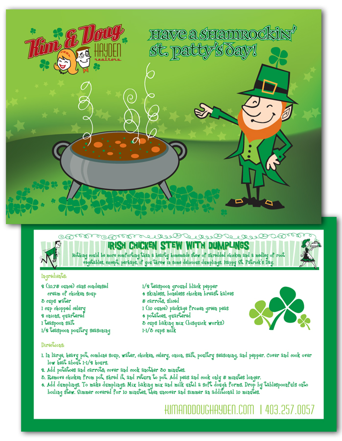
St. Patrick's Day Recipe Card

I Do Decorations Bookmark - Bookmark for a wedding fair.

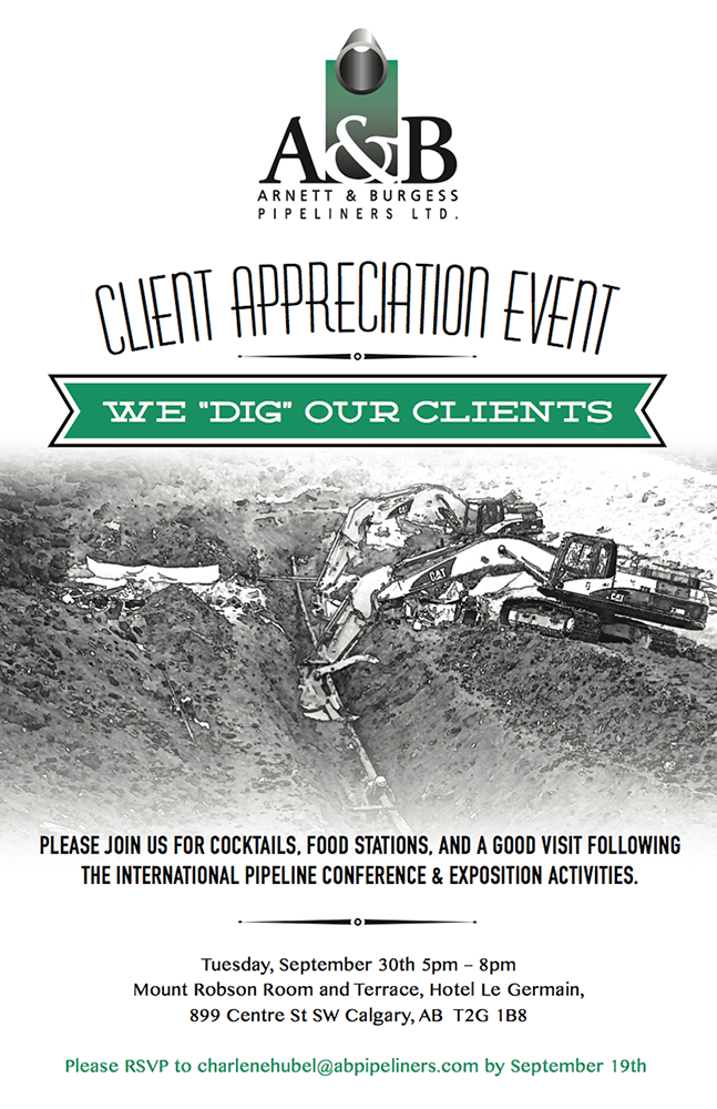
Arnett & Burgess Company History Book - The client wanted a book that she could add pages to fairly easily, so we went with a 3 hole punched chicago screw binding which could be undone and a standard 3-hole punched page could be added.
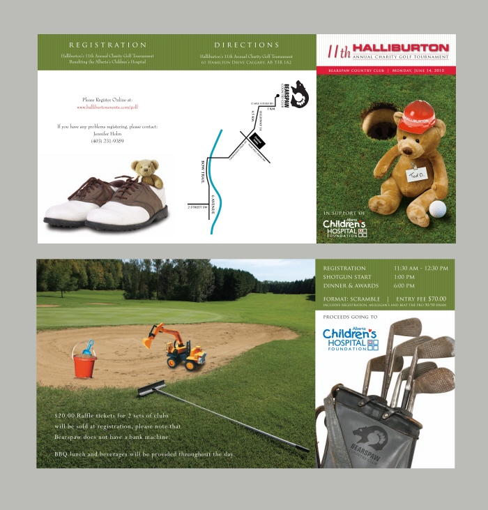
Halliburton Charity Golf Invite - A different teddy bear/children's toys theme meshed into the golf theme has been used each year as it is In support of the Children's Hospital.
This invite accordion folds in 3 panels.
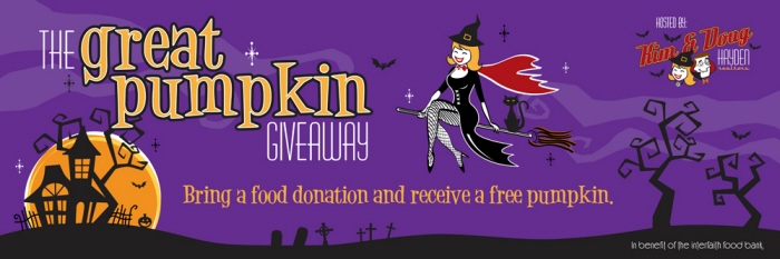
Pumpkin Giveaway Banner

Calgary Roller Derby Ad
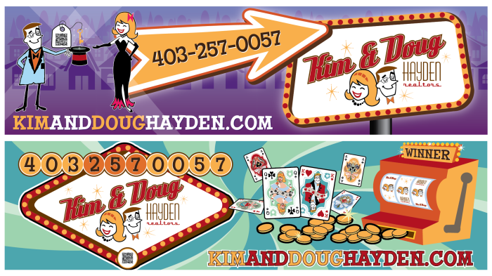
Kim & Doug Bench Ads - Real estate client wanted "Vegas" themed bus bench ads.

Servpro Billboard

Kim & Doug Newspaper Ad

Flintstones style Bus Bench design for Kim & Doug Hayden (realtors).

Promotional Stickers - Promotional stickers for Kim & Doug Hayden.
gLike
Print Design