
Iams Dog Food - This is a full page magazine ad for Iams. The image used is stock photography. I developed the concept, copy, and layout.
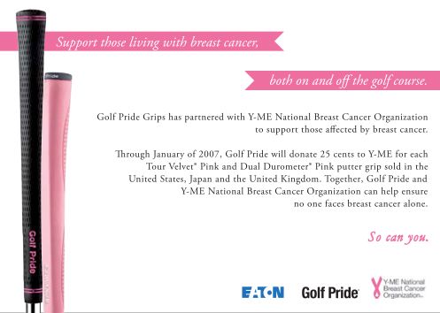
Golf Pride/Y-ME Tent Card - This is a tent card I designed for Golf Pride to promote support for breast cancer research through the purchase of specific golf grips. I designed the layout of the card. The photography and copywriting was done by others.

Rockford Health Physicians - Outdoor board for Rockford Health Physicians. I designed the layout; the photography and copywriting was done by others.

Center Stage - This is a display font design. The base font used is Garamond. The outlined silhouettes are meant to keep the font delicate. The touch of pink on the dancers' shoes helps maintain a classic ballet feel.

Guardian Angels: Center for Battered Women - This is a poster advertisement for a fictitious center for abused women. It is meant to inspire hope and comfort in receiving help. The lyrics are from the song "I'm OK" by Christina Aguilera. The photography is my own.

David Lance Goines Tribute - This is a tribute poster to the artist. It is meant to emulate his style, while only using type. This proved to be a challenge because his work is very graphic driven.

Ambience Electric - This is a corporate identity for a company that sells dimmer switches. The target audience is male and female "do-it-yourselfers" from the ages 28-52.

POP mobile - This corporate identity is for a cell phone company.
The target audience is male and female college students.

Breakdance Tutorial (1 of 2) - This is a 14 page tutorial on breakdancing. There is a "Brief History" page so that the user knows a little about the style of dance. The other pages have step-by-step instructions on some of the most popular breakdance moves. Keep it funky.

Breakdance Tutorial (2 of 2) - These are some sample pages (inside cover, toprock, and nike) from the tutorial. The move that is described on the page is popped out in a color silhouette. Keep it funky.

Versace: Who We Are - This is a brochure/self mailer for the company, Versace. It is meant to be mailed to new customers after their first purchase. There is a brief timeline of the company, as well as a list of boutique locations. The fashion illustrations are my own.

Organic Orange - I created this postcard/flyer to promote Karim's Organic Orange natural makeover. She works out of Pratima Ayurvedic Skincare Clinic and Spa in Manhattan's Soho district. This flyer is meant to be both high-class and organic.
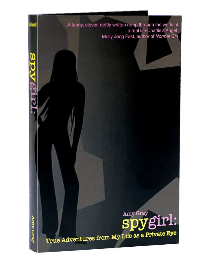
Spygirl (1 of 2) - This is a bookcover redesign.
Amy Gray "reveals the slightly sordid life of a contemporary sleuth, she gets under the skin of the dating game, and she nails office politics."
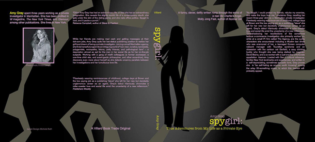
Spygirl (2 of 2) - This is a bookcover redesign; full layout. This design is meant to illustrate the balance between being a sophisticated, modern woman and the danger of being a private eye.
gLike
College Work