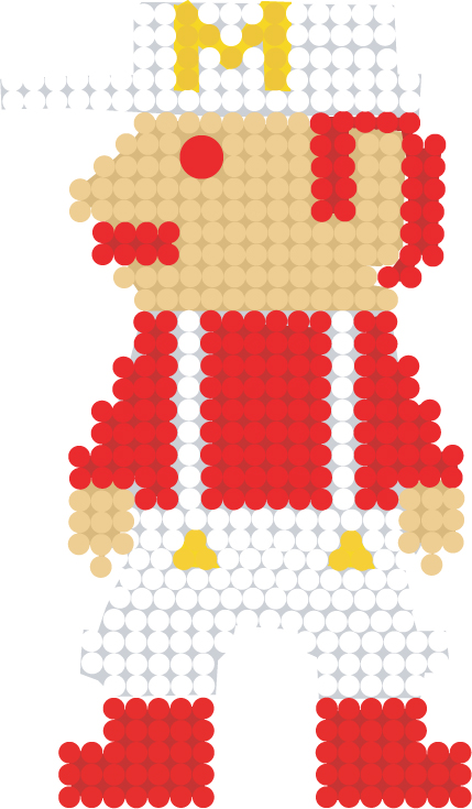
Mario - In this project, I designed Mario using white, yellow and red circles of the same size and shape. I added colored areas behind the circles to bring everything together more evenly.
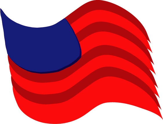
Flag - For this flag, I used a few simple shapes, adding a 3D effect to the red curve and multiplying them to create the stripes. The blue area is made from a curved box, also with a 3D extrude effect applied.

music button - This is a music button I designed, where I went for a web button style. Adding a gradient to the inner circle along with a transparent shine at the top, I added a red ring around the edge and a solid red music note on the inside to complete the piece. This logo gives off a 3D feel without having any 3D effects applied.
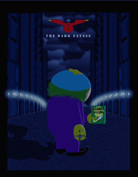
"South Park" meets "The Dark Knight" - South Park’s Eric Carman meets Batman’s Joker in this piece. I used a few highlights and sharp shadows to imply a light source to the right. Two rows of outer glow street lamps give a sense of curved depth to the road, along with the blurred and tilted buildings on either side of the street. A few dark clouds and a blue tint over the entire work help to create an overall sinister feel to the picture.
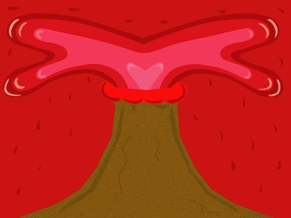
volcano - For this volcano design, I created a basic volcano shapes and added vector style details, mainly geometric shapes and thin lines. For the lava, I created and resized multiple copies of each level of lava, changing the hue with each level, and later added highlights to the edges. Finally, I added a red background and red lava raindrops, along with a film grain filter on the volcano itself.
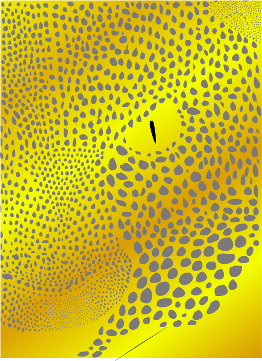
Leopard - Here, I outlined a close photo of a leopard, then filled the outline with differing sizes of spots to accentuate different areas of the cat's face. Later, I removed the outline, allowing the spots alone to unify the work.
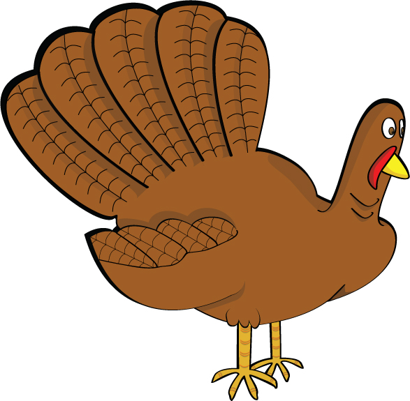
turkey - Here, I drew a vector turkey in a cartoon style. After drawing the basic shape of the bird, I went back to add feathers, a beak and a gobbler. Additionally, I added slight shadows to the spaces between feathers, as well as the feathers beneath his neck to make the turkey pop a bit more.

Jack - Here I went for a creepy Halloween theme. I created a jack-o-lantern using sliced pieces of an oval, allowing for slightly offset gradients in each division of the pumpkin. I added a light source within the pumpkin to illuminate the facial features, and created a shadow between the pumpkin and the eyes, bringing the eyes out in a more sinister fashion.
mix - This was a random mix of colors and swirls. No real aim was set, I just used a few mixing effects and came up with an interested blend of color and shape.

character 1 - My first real attempt at drawing a cartoon character. I tried to keep things simple, only using a handful of colors. A few smooth shapes in darker tones provide the shadows, giving a slight sense of depth to the character. Many curves throughout the clothes give a sense of weight as well.
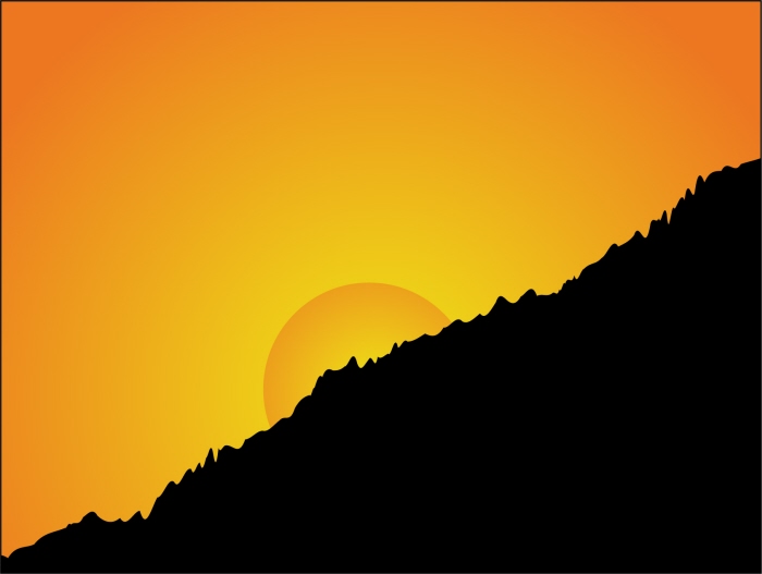
Sunset - In this sunset scene, I used the warp tool to create ridges on the mountainside. I added a light gradient in the background, along with a radial gradient on the sun to give a feeling of sunset.
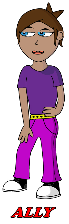
Ally - The third in a set of characters, “Ally” is themed with shades of pink and purple throughout. The skin is toned darker to match the dark brown hair and small details in the pants give more emphasis than in previous character designs. Shadows add a little extra detail.
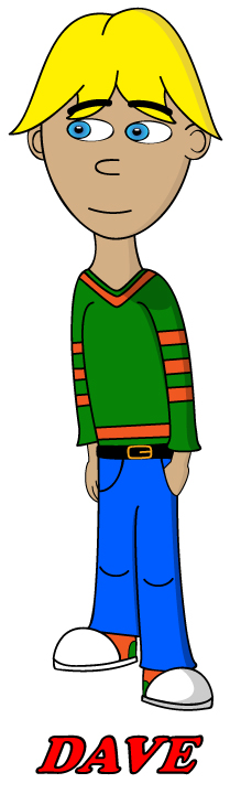
Dave - The second in a series of character designs, “Dave” featured vibrantly noticeable blonde hair and a toned down center area, finishing with a mid-toned blue for the jeans. The shirt style is somewhere between a long sleeve shirt and a sports jersey, including some areas of orange to compliment the vast areas of green. Shadows were added to give a little extra detail.
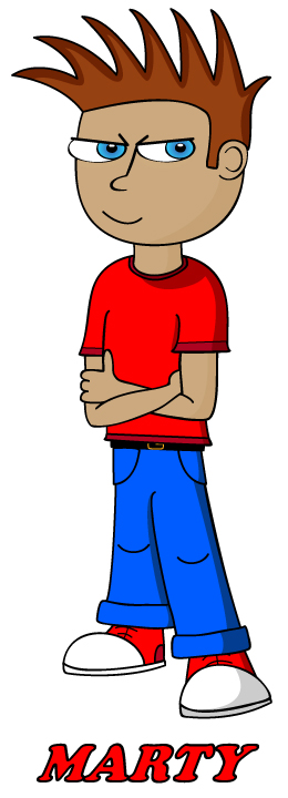
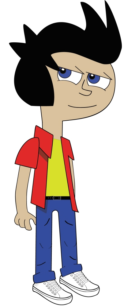
Marty - The first in a set of potential series characters, “Marty” was inspired by a number of animated sources. The familiar spiked hair comes from many cartoon characters throughout television, as well as the simplified shoe design with large white areas on the top. Keeping things simple yet adding small details such as shadows and highlights was the overall goal.
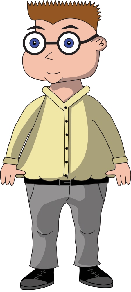
Character 2 - A more detailed character, I drew this one in harsh lighting, emphasizing the bends and ruffles in the clothes.

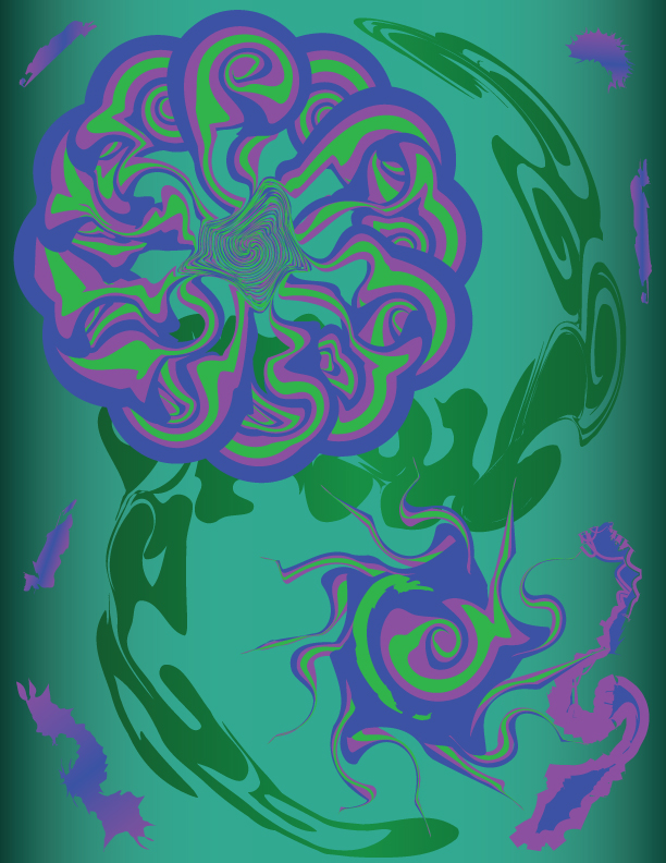
Flower - Here, I designed a flower from 1 petal design. Each petal has 2 gradients, one on each side. The flow of the loose petals gives a feeling of movement upward and outward from the main flower.
Character 3 - For this character, I went with a more simplified and cartoon styled design. I used as many smooth shapes as possible, keeping things relatively simple throughout. The vibrancy of colors and the difference between the red and yellow made for the center of the work to pop a bit more than any other area.
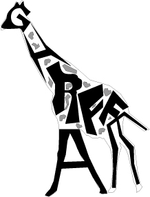
Giraffe - In this piece, I bent the letters of "giraffe" into the shape of the animal, and added a few spots to unify the entire piece.

MPL Productions - This was a logo I designed for my non-existant production company back in college. The "M" is modeled after jesters and the "P" and "L" are just creepy smiling letters.

PerryDice - A Phineas and Ferb based play on words.


CoasterDusk - In this work, I created a calm evening scene near an amusement park, contrasting the excitement of the park with the calm of the evening. I kept things fairly simple, only using dark black silhouetted objects and solid orange for the highlights. Using Gaussian blurs on plain white shapes, I was able to create subtle clouds across the gradient sky. Finally, I added a blurred highlight on the foreground to imply a few hills.
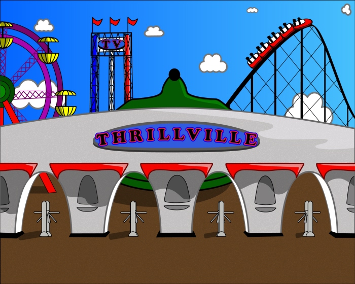
The entrance to an amusement park is inspired by a web series idea I have been planning for some time. Featuring a few ride designs in the background, all rides appear at varying distances from the viewer. Shadows and highlights give a sense of a sunny day at the park.
gLike
illustration