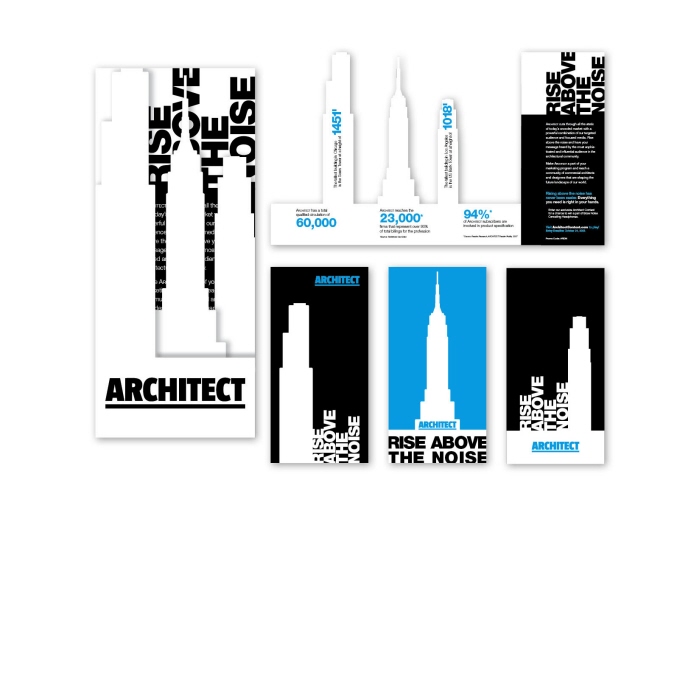
Architect Contest Brochure and Postcards - This series was designed with bright colors and bold shapes to get the viewers attention. The brochure is dynamic and interactive with a custom die-cut to display the buildings as they move out from an accordion fold. The text is set up to mimic the shape of the buildings and carry the theme through all of the pieces.
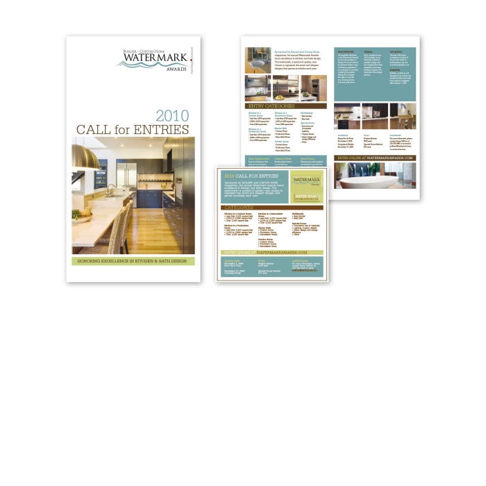
Watermark Brochure and html Email - This brochure is a showcase for the past awards winners and presents the details for the next year's contest. All of the information is presented clearly and in an organized fashion. The palette was kept simple in soft tones to complement the colors in the photography.
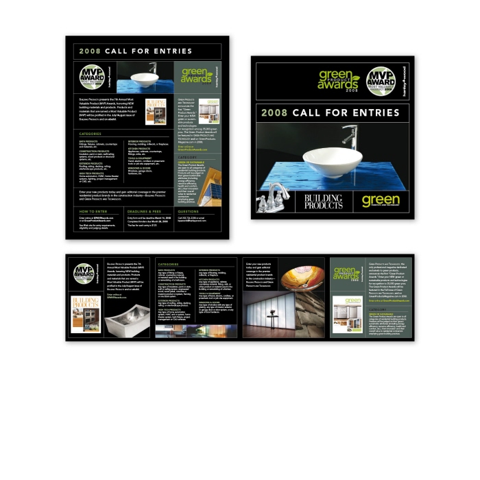
Most Valuable Product Brochure and Ad - The black background in this campaign contrasts with the bright green and white to make this piece stand out. The grid helps organize the information and keep the visual hierarchy. The square accordion fold brochure creates a unique, interactive feel.
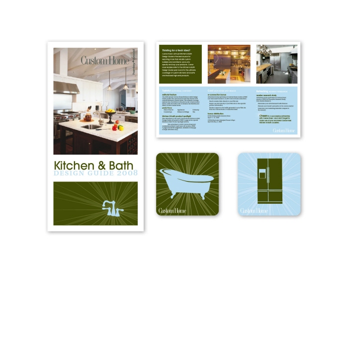
Kitchen & Bath Brochure and Coasters - The Kitchen & Bath Issue of Custom Home magazine was promoted with a box mailer containing the advertising brochure and two-color illustrated coasters. The imagery was meant to be fun and lighthearted, showcasing featured products.
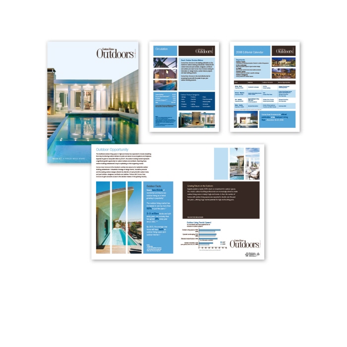
Custom Home Outdoors Media Kit - This Media Kit folder complemets the feel of the magazine by using big pictures and a bright simple color palette. The images are broken up to develop the grid and create visual intrest. Clean lines and bold shapes organize the information so it is presented clearly.
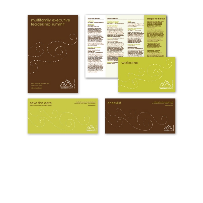
Multifamily Executive Leadership Summit 2008 - This campaign consisted of a series of postcards, a brochure and two thank you cards. The look of each piece is made to reflect the fun and casual feel of the event. The colors and design are bright and playful, printed with two colors on a premium uncoated paper.
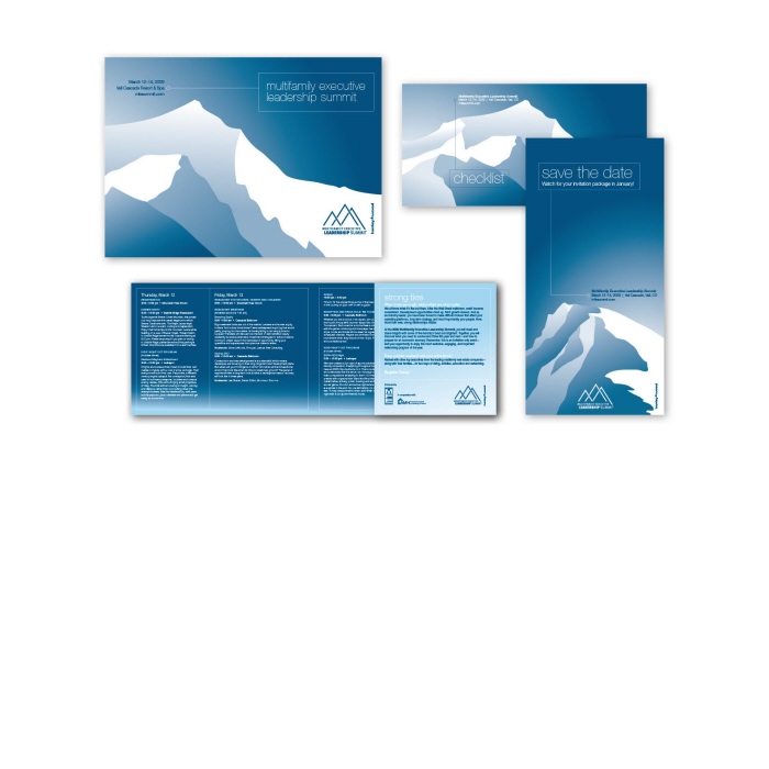
Multifamily Executive Leadership Summit 2009 - The illustrations on the brochure and postcards are stylized in a clean, modern manner to complement the fun feel of this high-end ski-themed event. The palette was kept simple in shades of blue which popped on the bright-white uncoated paper.
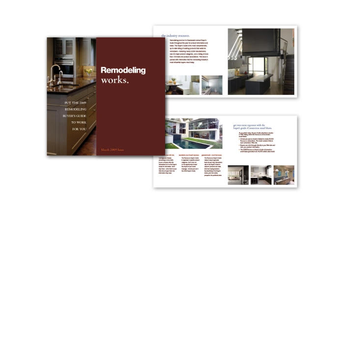
Remodeling Magazine Brochure - This square brochure features a short fold on the cover with full page pictures and clean typography. The ample use of white space helps present the information in an easy to read manner. The palette uses a rich chocolate brown and a deep red with pops of light blue to complement the high-end designs in the photography.
gLike
Campaigns