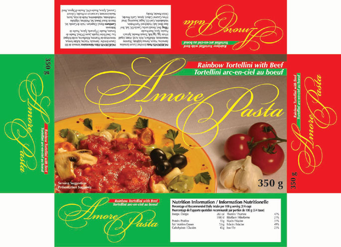
Amore Pasta - Amore Pasta is a new line of fresh pasta for a company already creating a line of dry bulk pasta. The client wanted something elegant with a European feel. The photo and propping, the style and color of the plate, were chosen to reflect the mediterranean heritage of pasta.. The colours of the side and end panels, red and green, are the colours of the Italian flag and of course address the company owner's heritage.
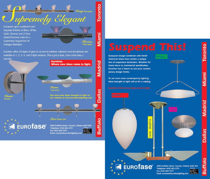
Eurofase Lighting - These are just two of a series of trade ads for Eurofase Lighting. The challenge was to reinforce the brand and the international scope of the operation while showcasing their many product lines over the course of a year. Consistent items were the logo, address and the red bar highlighting the locations of their international show rooms. The font of the body copy was another consistent element. The headline copy was chosen to reflect the theme of the ad. I designed the ads, wrote copy and art directed photography.
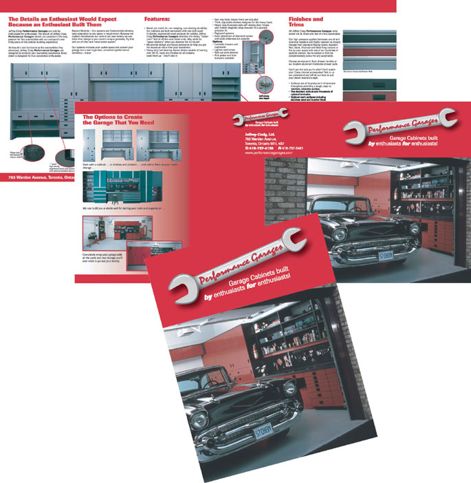
Performance Garages - The owner of Performance Garages also owns a custom furniture company and the '57 Chevy on the cover of the brochure. Being the owner of a custom car he has a circle of friends who own them too. They don't just own the cars; they work on them. They need somewhere to store parts and tools. They need custom cabinetry for home mechanics.
I provided the creative direction for the brochure and, in conjunction with my creative team, we named the product line and co-wrote the copy.
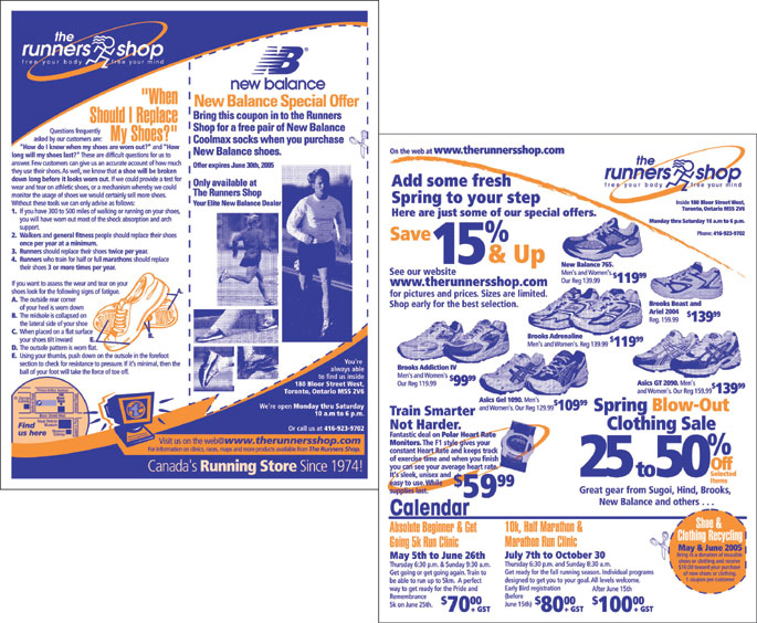
The Runners Shop - The Runners Shop is one of the oldest running specialty stores in Canada. Over the last thirty years they have built a very loyal clientelle. The Runners Shop has built a dynamic mailing list which they use to update and remind their customers of new products and events of interest to runners. My job was to create a fresh look within a limited budget. I use a two color palette and try to organize information into clear understandable areas of information.
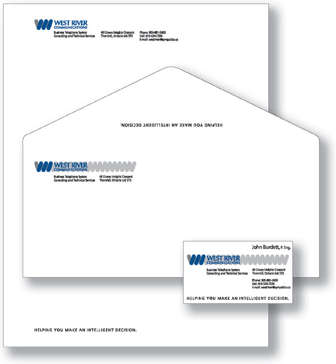
West River Communications - West River Communications is a small consulting firm specializing in phone systems.I chose to use the phone cord as an overall symbol, separating three loops of the cord in a second color to emulate the "W" of West River. Another intriguing element of the project is the slogan. The owner kept saying, "I want to help people make an intelligent decision." I felt that because it was such an intensely important to him that it should be part of his marketing strategy.
gLike
Portfolio