
VC100 Wall-e Project - This was a project done in my Visual Communications class. The purpose here was to introduce us to the program Adobe Illustrator by having us use simple shapes and the pen tool to replicate this famous Wall-e picture.

VC100 Monopoly Project - This was the project for week 2 in my VC100 class. The objective was to replicate the board using precision measurements, copies, and reflections. In addition to the base board, we could also design our own themed board for extra credit.
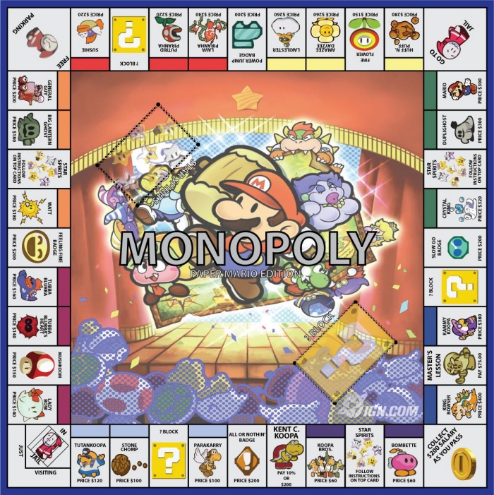
VC100 Monopoly Project Themed Board (Extra Credit) - This was my themed monopoly board. As the theme I selected was Paper Mario, all of the images used on the board save for the middle come from Super Mario Wiki. The middle of the board is from IGN.com. To make all the pictures look similar, I used the Livetrace feature.
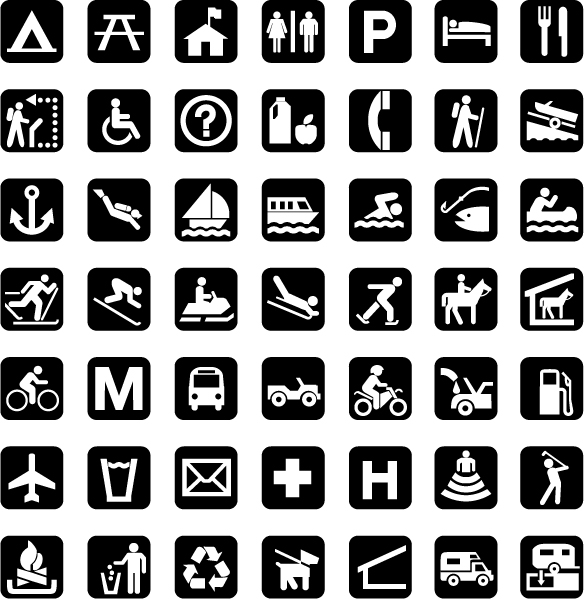
VC100 Pictograms Project - In this assignment we had these 42 pictograms to copy. The object of this lesson was to familiarize ourselves with the pathfinder tool in Illustrator, and so we were limited to that, basic shapes, and the pen tool. In addition to the main assignment, extra credit pictograms were offered to create.
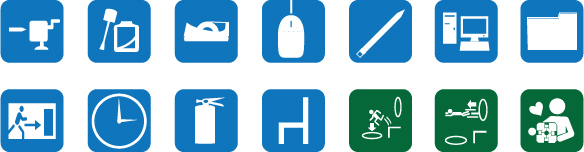
VC100 Pictograms Project Extra Credit - An addition to the Pictograms project, where we were given words and asked to make a design based upon those. The words given are the pictures in the blue boxes, which I attempted to make stylistically similar to the ones in the assignment. To make the whole thing even, though, I added in some icons from the game Portal, and put a green background for them. All the pictures used in this project were taken from Google.

VC100 Icons Project - The assignment this week was to take 9 fantasy football team icons and trace them using the pen tool. Through this, we became acquainted with some of the finer features of Illustrator's pen tool.

VC100 Icons Project Detail - Even though the assignment was only to trace the outline of the team logos, I went ahead and had some fun with the program. Since we're doing this part of the assignment next week, I'll upload what I did now and change it next week if I learn ways to improve the icons.

VC100 Vector tutorial - Just a simple tutorial for the curve mechanics of the pen tool.

VC100 Character Illustration Project - This week we were to do a detailed character illustration. I chose this Mouse Guard picture, originally drawn by (findnamehere). Though this was pretty much just a continuation of last week's introduction to the pen tool, we were also taught how to use gradients and tools to make backgrounds. I decided not to use gradients in the project as I felt it looked better this way. For the background I just used a simplified version of the background in the original work.

VC100 Character Illustration Backgrounds - Since we were given two weeks for this project, we were expected to do multiple backdrops for the project. This one was just a night-time backdrop.

VC100 Character Illustration Backgrounds - Since we were given two weeks for this project, we were expected to do multiple backdrops for the project. This was just a gradient background, inspired by the boss fight at the end of Kingdom Hearts.

VC100 Object Poster 1 - This week we created object posters with the instruction to keep it as simple as possible. In this first poster I did just that, only the product and the company. As with all the other posters I did, the product itself was done up using the livetrace tool in Illustrator, and the company name/logo with the pen tool and a small number of shapes.
This first poster is just Chick-Fil-A's famous chicken sandwich. I left in a little of the original background there to give it a small highlight.

VC100 Object Poster 2 - This poster is of the well-known dog toy maker Kong along with their most recognizable product. I still tried to keep it simple, but added in the "bouncing" shape, as if the kong toy were in motion.

VC100 Object Poster 3 - Yet another object poster, used legos. Added in the gradient to accentuate the blocks.

VC100 Object Poster 4 - This one I was a little concerned about, but in the end I felt the character and series were well known enough to fit in with the assignment. Due to the position of the character, I decided to have him overlap the logo as if it were a bench. Gradient in the back added to draw out the character.

VC100 Object Poster 5 - Final poster I did, this one for flare guns made by the safety company Orion. I wasn't sure if people would recognize the product as a flare gun right off, so I added in the triangle shape and gradient to replicate a flare. In an effort to create some hierarchy and flow, I dimmed everything but the gun a little, hopefully making the gun more noticeable. Then from the gun the flare, which explodes and brings the eye to the company.

VC100 Week 9 Extra Credit Drawings - This week we were introduced to the LiveTrace and LivePaint features in Illustrator. As extra credit, we were offered the opportunity to scan some of our own drawings into Illustrator and livepaint them. These are all doodles of characters I found while surfing the internet, so I don't claim to own any of these.

Week 11 Cards 1 - This week we were instructed to create our own stylized playing cards, with the focus on learning the brush and effects tools in Illustrator. We were also required to incorporate color schemes into the cards. We had to do the fronts and backs of three different sets of cards.
This first set is put together using different styles of batarangs. I used a near-split complementary scheme, with blues, violets and yellows. The font was chosen because it looks like the font used in TAS.

Week 11 Cards 2 - The second set of cards we had to do, this time created using pieces from the .hack series. I took some key parts of the designs of the Avatar models and worked with them, mostly focusing around that eye motif. The color scheme for this piece was supposed to be an analogous one using red, violet red and orange. I notice now that a little more yellow-orange crept in there then red-orange, but in messing with the coloring I couldn't make it look right anymore.

Week 11 Cards 3 - The third set of cards I've done, this time built using modified pieces of the logos of Metalocalypse and Dethklok. The color scheme for this one was a complimentary green and red, with white added in as an accent.
gLike
VC100 Adobe Illustrator