
Screamin'Yeti Designs - REVAMPED - With my 35th birthday rapidly approaching and my 10yr. anniversary of Screamin'Yeti Designs, I felt that it was high time for a rebranding. A departure from the original design, the new mark is both fresh and retro.
Recently won a Gold Award (overall) in AIGA Alaska's First Annual Design Show & Reception, 2010.
Screamin'Yeti Designs - Based off of a snowboard design that I did for a contest during my college era, the "Screamin' Yeti" was actually coined by one of the judges. I later had a custom board made and chose the name because of its uniqueness and the fact that it was the first bit of my design that actually became something tangible.

Winnipeg Jets - proposed logo - One of my life goals as a professional graphic designer is to create a logo for a NHL franchise. The recent relocation of the Atlanta Thrashers to Winnipeg, MB was music to my ears. I created a set of logos along w/some jersey concepts (assuming that the name would go back to the Jets - which later proved to be the case) and pitched it to the head offices. I was acknowledged for my efforts but that's as far as it went.
Recently won a Silver Award (overall) in AIGA Alaska's - The Big One, 2011.

La Bodega - Bodega Fest

Anchorage - Bike 2 Work 2011 - Recently won a Silver Award (overall) in AIGA Alaska's - The Big One, 2011.

Reyven Spirits, Inc.

AYK-SSI
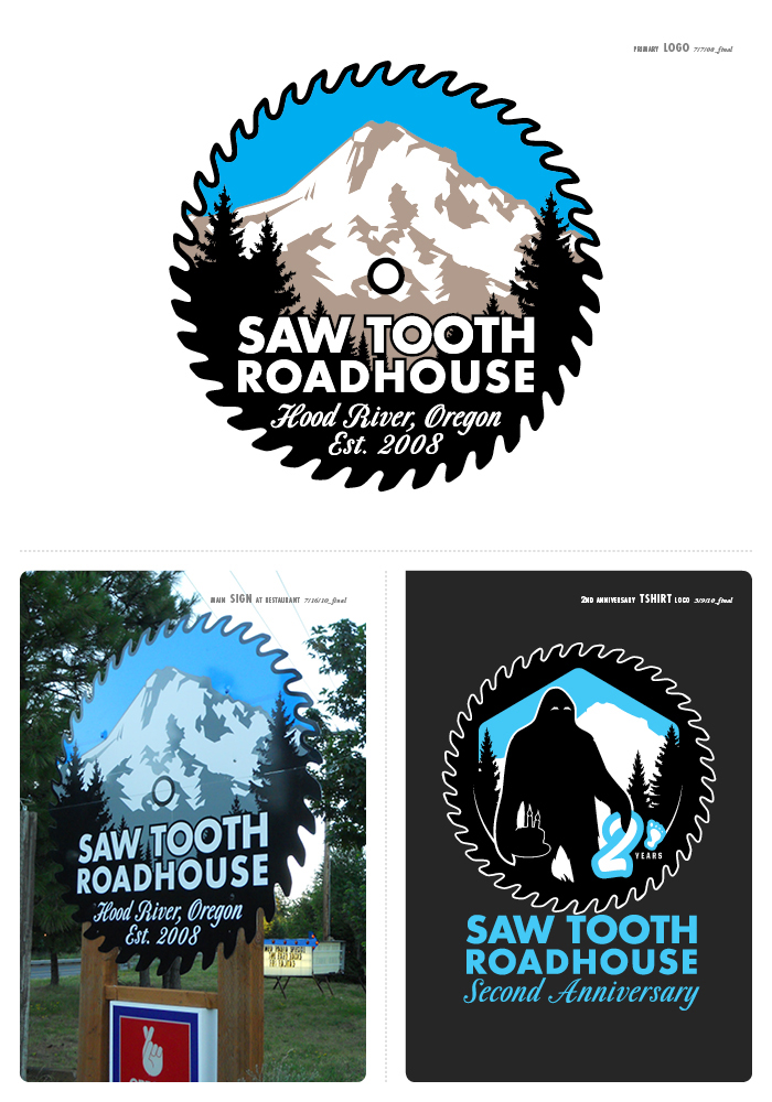
Saw Tooth Roadhouse - The primary logo for the Saw Tooth Roadhouse in Hood River, Oregon off of Hwy. 35. This view of Mt. Hood is right around the bend from the actual restaurant.

Mental Toss Flycoons - logo/jersey

Theme Blvd. - logo & avatar/badge

Liberty - CRI Team - I was commissioned by M-I Swaco (a subsidiary of BP) to create a mark(s) to identify a specific team of workers and their camp; operating in the North Slope of Alaska. Eventually these designs will be implemented in patches, clothing and on the side of a rig.
Recently won a Gold Award (overall) in AIGA Alaska's First Annual Design Show & Reception, 2010.

Copper River Knowledge Systems - (CRKS) - I was commissioned by Ecotrust to create a logo for one of it's subsidiaries. They wanted something that was simplistic, tied in with their existing logo and had a nod to the native peoples of the Copper River Watershed of Alaska.

Matanuska Creamery - ice cream label - The Matanuska Creamery was looking for an ice cream label for up to 8 different flavors, to be printed on transparent stock and utilized on translucent containers. I went several rounds before I came up with the above solution that appealed to the client's desire to have a modern, yet retro look. I'll post some pix of the actual items once they make it onto the shelves of local grocers.
Anchorage Bucs - Alaska Baseball League - I revamped and updated the logo for the Anchorage Bucs, a team in the Alaska Baseball League. Based off of the old design and polished to meet the look and feel of a more modern age.

The Alliance In Alaska - This one was a bit tricky due to the long name of the organization. Affiliated with American Legion Baseball but wanting a separate identity, The Alliance In Alaska commissioned me to come up with their brand. They also plan on branching into other sports in the near future and needed a mark that could easily be tweaked to represent that sport but still retain the basic identity of The Alliance.
Shoot For the Cure - A logo for an annual skeet-shoot, fundraiser to benefit cystic fibrosis. They wanted something that would be appealing to both sexes as well as incorporate guns, skeet and the rose (a symbol commonly associated with the cystic fibrosis foundation).
Blue Freedom Press - The brand for the Blue Freedom Press, an independent film company here in Alaska. Owner / founder Mike Jipping does most of his traveling / shooting via bicycle and wanted to incorporate that into his mark.

Service High Basketball logos - Service High Basketball was looking for a new mark that was fresh and little more aggressive than their old one. I was inspired by the new-retro logos of the NBA.

Kelly Vrem's Rough & Ready Guide Service

Beehive - Beauty Shop & Boutique

Dirt Girlz - The basis for an Alaskan exclusive, womens' moto-x apparel line.
No Limits Coaching - www.nolimitscoaching.com
My friend Norm started a business as a personal trainer & coach for a multitude of sports and activities. Instead of using the generic sport symbols you see prevalant to the Olympics, I based the image around the Eye of Ra. Both a symbol of power and healing, as well as one of Norm's tattoos, it provides the logo with a sense of deep intensity.

Moonshine Design - A little something I created for my wife's side business. She specializes in custom jewelry, mosaics, bead work, refinishing second-hand furniture, etc.

Pony Expressions - This was created for a silk-screen/embroidery shop in the small town of Valier in northwestern Montana.
gLike