
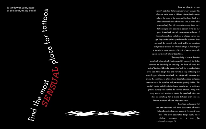
I designed a logo and tattoo magazine because the existing tattoo magazines seem to have no order and are very poorly designed. I created a tattoo like symbol which I tried to incorporate in all aspects of my magazine from the border on the front covers and table of contents to the tattoo symbol on one of my cover story spreads.

I designed a logo and tattoo magazine because the existing tattoo magazines seem to have no order and are very poorly designed. I created a tattoo like symbol which I tried to incorporate in all aspects of my magazine from the border on the front covers and table of contents to the tattoo symbol on one of my cover story spreads.

I designed a logo and tattoo magazine because the existing tattoo magazines seem to have no order and are very poorly designed. I created a tattoo like symbol which I tried to incorporate in all aspects of my magazine from the border on the front covers and table of contents to the tattoo symbol on one of my cover story spreads.

I used clean lines and a simple grid system to make my articles relate throughout the magazine even though they have diverse
subject matters and different design layouts. For my color palette I wanted to keep the type and backgrounds almost all black and white so that the color photographs of the tattoos popped off the pages and were the most prominent items in the magazine.
gLike
Tattoo Magazine
Got Ink?