


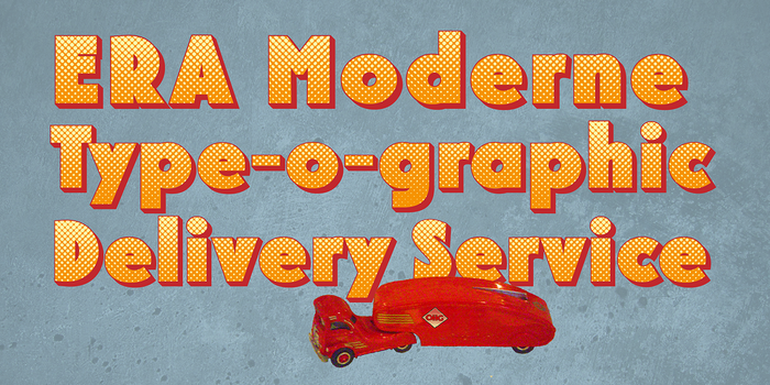
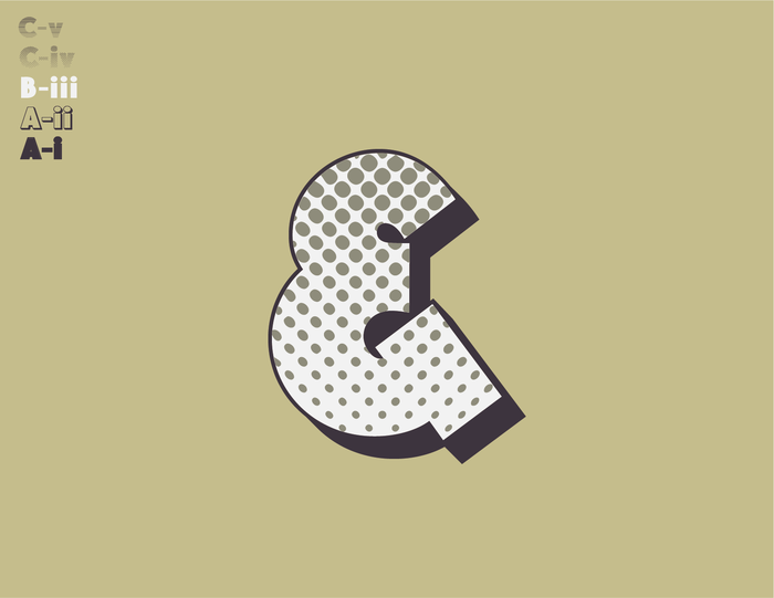
EraMax 123 is a 5-layered (stacking) geometric sans serif, meant to be set BIG, for large, colourful statements. It's the perfect face for packaging, posters & branding, where a strong, colourful voice is needed... Did I mention posters? The "Max" in EraMax comes from the ultra bold weight, but also, and mainly as a tip of the hat to Peter Max, the great designer of the sixties who's bold gradient effects in some of his posters were the inspiration behind the dotted and striped layers.
This face has a vintage look that truly stands out in a retro setting, but also has a modern flavour that lends it the flexibility to work well in a more contemporary context.
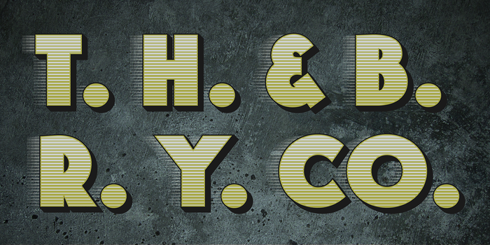
This typeface is based on the original hand painted signage found in the T. H. & B train station in Hamilton Ontario, an Art Moderne building, designed by the New York architectural firm of Fellheimer and Wagner for the Toronto Hamilton and Buffalo Railway line and completed in 1933. in 1933.