
bb-book A and bb-book contrasted are designed by Benoît Bodhuin and published by VolcanoType.
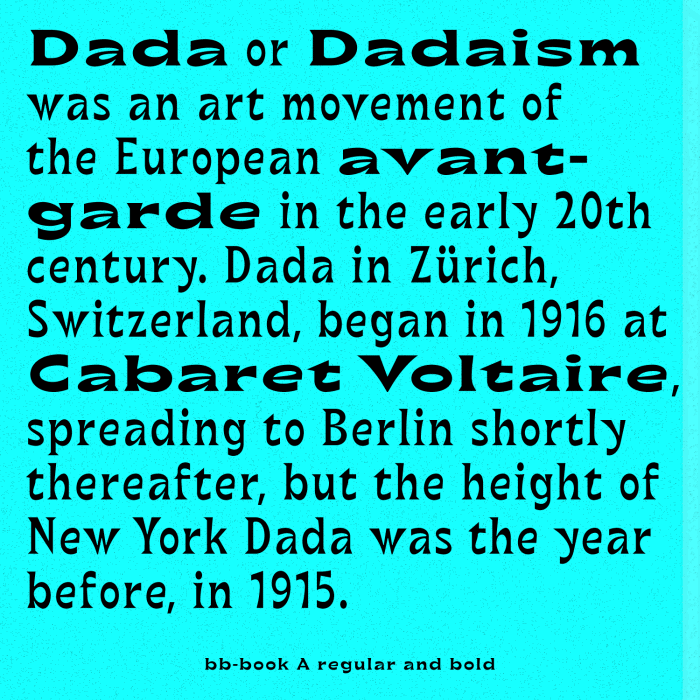
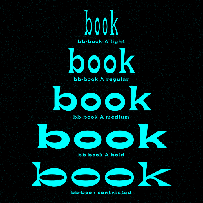
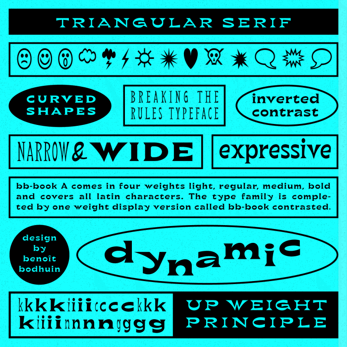
bb-book A is an expressive book serif type family. With its triangular and curved shapes the typeface has a dynamic appearance. Its range between width and contrast is typical for the design. The light weight is really narrow on the one hand side, the bold weight is really wide on the other hand side.
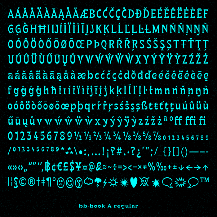
A kicking up weight principle. The inverted contrast of Benoît Bodhuin’s bb-book A stands in the tradition of Roger Excoffon’s Antique Olive. bb-book A comes in four weights light, regular, medium, bold, and covers all Latin characters.
The type family is completed by one weight display version called bb-book contrasted.
Website VolcanoType: www.volcano-type.de
Where to buy bb-book A: http://www.volcano-type.de/fonts/categories/text/bb-book_a
Where to buy bb-book contrasted: http://www.volcano-type.de/fonts/categories/display/bb-book_contrasted