
1/3, Innovative Renderings: The objective of this design was to showcase the content they had. The design had to stand on it own. The design rational for this website was to do something really different (then) move away from the "rich graphics"to a more, clean, precise, print like design to give the content the lift it needed.

2/3, Innovative Renderings. This page showcases a clean navigational paradigm, with emphasis on building clear cross links to help the visitor find both visible work and available services really quickly.

3/3, Innovative Renderings.

1/3 GIS. Here's a design for a large Geographical information Systems company. The design was meant to showcase their capabilities. To do this I decided to make the center piece of the design their Sat-Images. Along with this, big-bold fonts and very print-like design tie to whole thing together. For the icons though, I took a different route, juxtaposing big font with pixel icons, giving it a sense of laser like precision. Sound strange in words, but it works brilliantly on your screen!

Here's the design for the inner pages. Here the nuances and subtleties of colour and type comes clearly through the rich aqua marine blue drop-downs.

3/3 GIS. The drop-downs are also treated differently, with big informative menus which employees progressive disclosure to it's fullest.

1/3 eduSource. Here's a website designed to inspire the younger generation of India to study over seas. The website needed to be clean, simple and straight to the point. The viewers might be the youth, the people who finally need convincing are parents. This website was designed to appeal to both.

1/3 eduSource.


1/2, Golden Hues: This was a website for an employee consultant company. Here the focus was to make a vision the client had with bits of specifics, into a grand visual design for their organisation.

2/2 Golden Hues. Here's a feel for the contact page design.

Two flavors of the design for Dr. Boling's Website. They went with the second option.
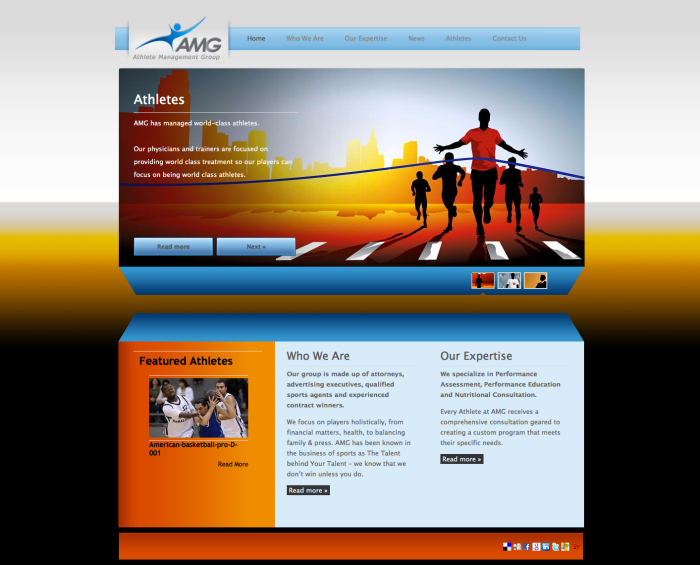
| Athlete Management Group: Homepage |
The design brief was to make a visually simple, but exciting website for an Athlete Management company. The design had to be agonistic to any particular athlete but emphasis on excellence should be clear. The Visual messaging of challenge, perseverance and success had to be obvious.
www.athletemanagementusa.com

| Athlete Management Group |
These are alternate visualisations used on the website. If you notice, these are stock illustrations. I really am not too particular that I should do all the illustrations, if a fellow designer has already created wonderful assets, I'm only happy to use them. In return, this designer also get his due :)
www.athletemanagementusa.com

| HenryDavis.Jr | |Here's a proposed website for Council Member Henry Davis Jr. The brief for this design was a clean, concerned and integral citizen who cares for his people.
Visually, I wanted to bring across a website that really didn't have a visible frame to it. The background and the controls seem to blend into each other give a sense of openness to the design.
This website isn't live.


Two flavors for Epitome
gLike
Web Design
Here are a few websites I've designed in the past.