
This is how the complete line would look set up in a retailer.
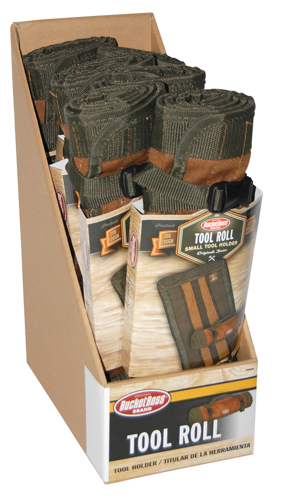
This is an example of a shelf tray to sell the product in retail stores. By putting the products in a shelf pack, instead of on a peg hook, the retailer can display more products in a better visual setting.
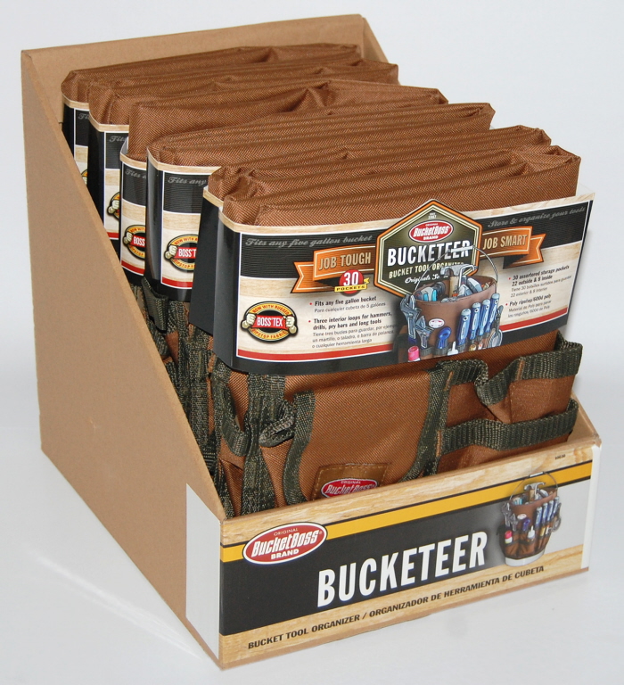
This is an example of a shelf tray to sell the product in retail stores. By putting the products in a shelf pack, instead of on a peg hook, the retailer can display more products in a better visual setting.
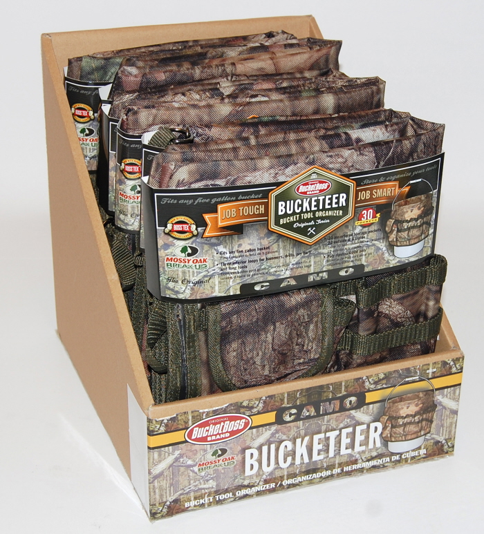
This is an example of a shelf tray to sell the product in retail stores. By putting the products in a shelf pack, instead of on a peg hook, the retailer can display more products in a better visual setting.
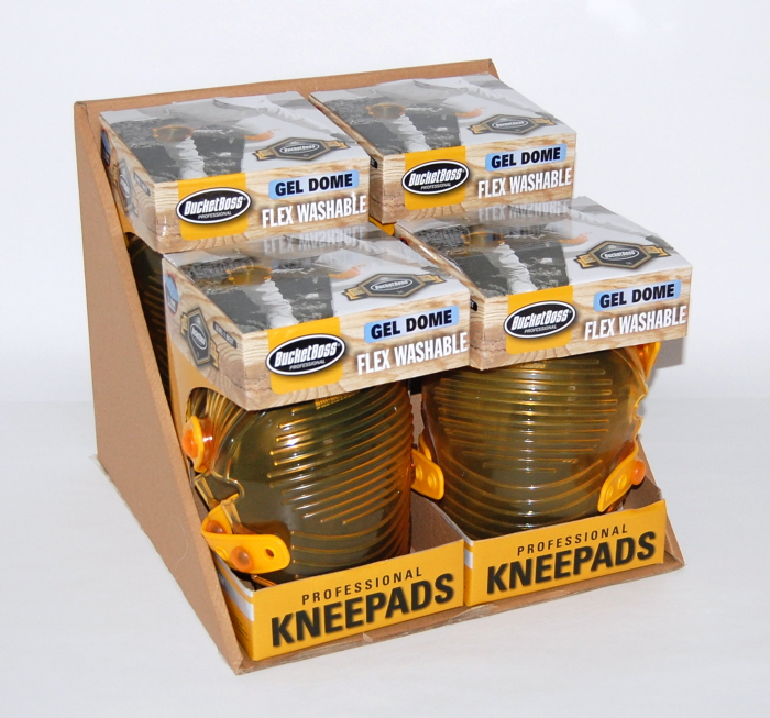
We decided to display the kneepads not only in a shelf tray, but also in a box. This would allow a customer to get as much information as possible about the product instead of on a typical smaller hang card. The customer can still physically touch the products.
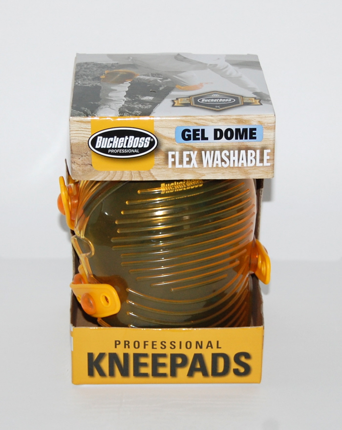
Front of the box:
We decided to display the kneepads not only in a shelf tray, but also in a box. This would allow a customer to get as much information as possible about the product instead of on a typical smaller hang card. The customer can still physically touch the products.
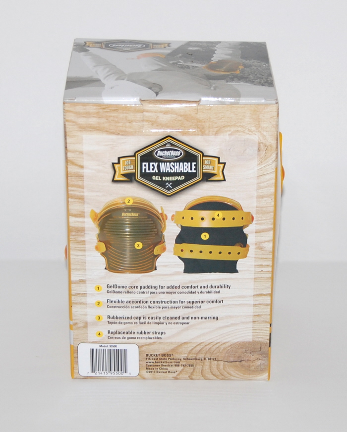
Back of the kneepad box:
We decided to display the kneepads not only in a shelf tray, but also in a box. This would allow a customer to get as much information as possible about the product instead of on a typical smaller hang card. The customer can still physically touch the products.
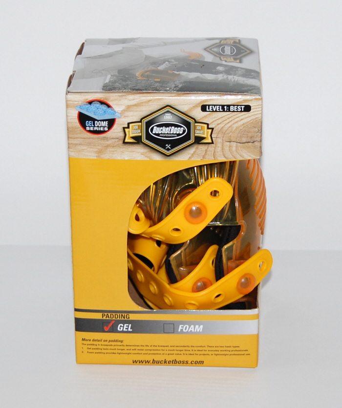
Side view of the box:
We decided to display the kneepads not only in a shelf tray, but also in a box. This would allow a customer to get as much information as possible about the product instead of on a typical smaller hang card. The customer can still physically touch the products.
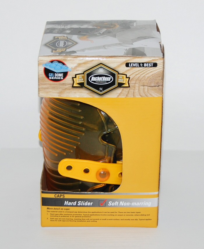
Side of the box:
We decided to display the kneepads not only in a shelf tray, but also in a box. This would allow a customer to get as much information as possible about the product instead of on a typical smaller hang card. The customer can still physically touch the products.
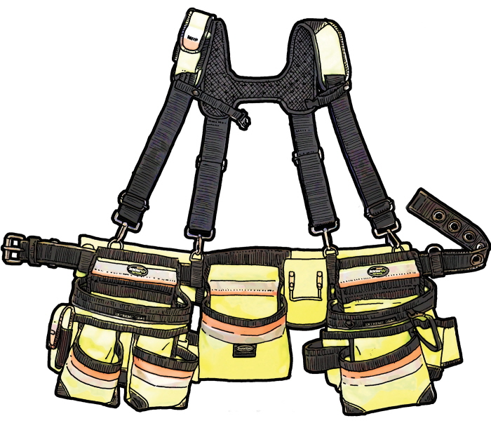
The product images have an illustration feel instead of a direct photo. This is a throw-back to the original Bucket Boss packaging.
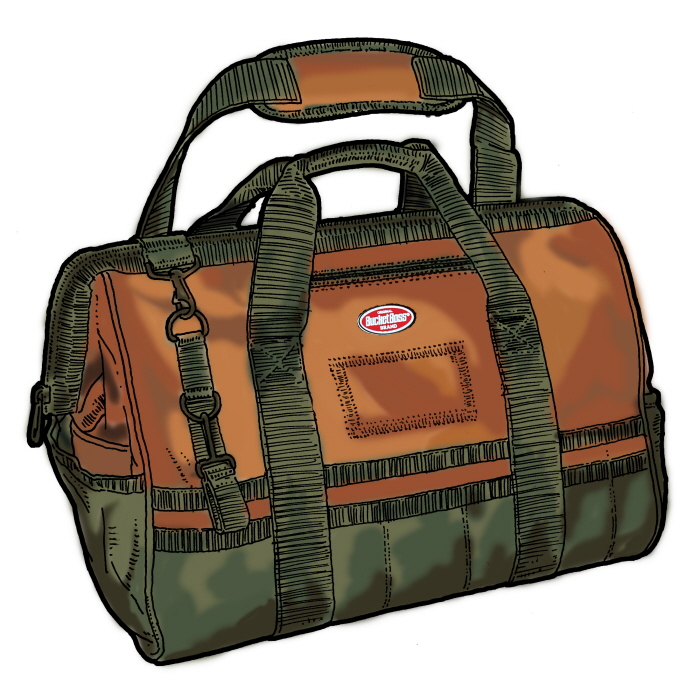
The product images have an illustration feel instead of a direct photo. This is a throw-back to the original Bucket Boss packaging.
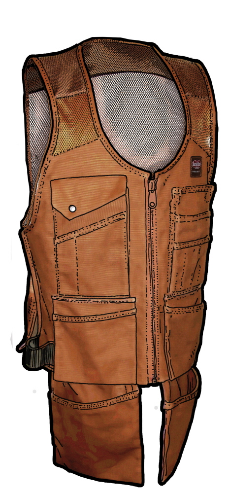
The product images have an illustration feel instead of a direct photo. This is a throw-back to the original Bucket Boss packaging.
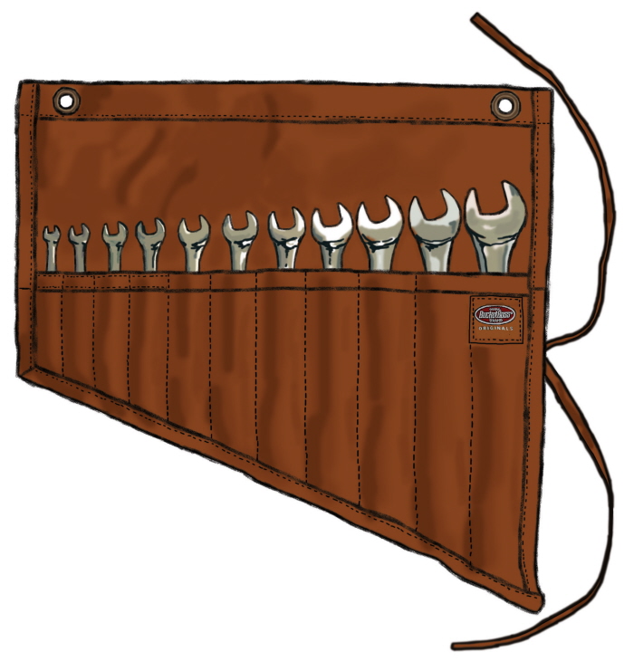
The product images have an illustration feel instead of a direct photo. This is a throw-back to the original Bucket Boss packaging.
gLike
Bucket Boss Brand Packaging Relaunch
In 2013 the Bucket Boss brand needed a relaunch to it's look. These images are examples of the the direction we took in the relaunch. We decided the product would be better suited to sit in a tray on a shelf instead of on a peg hook. By moving to a shelf tray we crafted a look that was more cohesive to selling the products as a whole instead of scattered on peg hooks. Most products required a hang card, or packaging wrap for product information, but the kneepads went in a different direction by being placed in a box.