
gLike
Agape srl Catalogs, Corporate Material and Showrooms
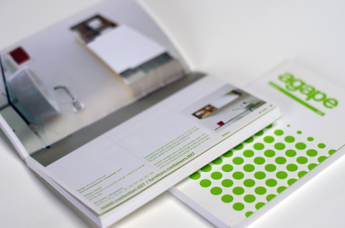
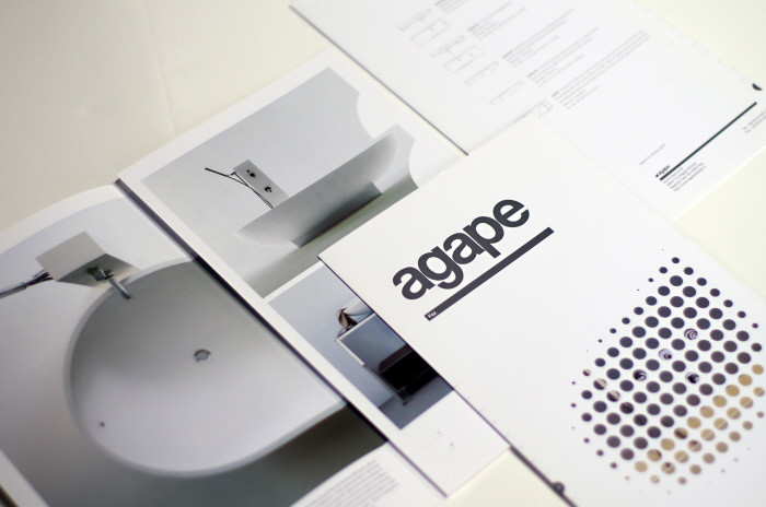
Agape is a bathroom product design company in Italy. In the early 2000’s its brand consisted of an orange water droplet formed out of the lower case “a” in its name.
I took the opportunity to make several proposals that extended the brand and transformed it from playful to sophisticated. The client was excited about the new interpretation of the brand and I designed marketing and corporate material to reflect this new path.
The new design was based on the grid system and I used careful typographic treatment to reinforce Agape’s meticulous design. Masking images and using a “screened” version of the water droplet became an important feature in all branded material.