
Voyageur is a travel & discovery website/app concept which provides an all-in-one travel planning experience. The goal was to design a centralized resource that provides all the information you need when planning a trip. This removes the need to visit several websites to gather information from booking your flight and hotel to planning the places of interest you plan on visiting.
The user can create custom travel plans for cities around the world and can
bookmark all the places they would like to visit and view them on a map. The places the traveler visits are then logged and the app creates a journal of their voyage(s). It was imperative to have a clean and intuitive interface so user's of all ages can engage in a great user experience, but also adding to the excitement of their travel plans.
Voyageur’s main target group are professionals of all ages, which are into technology, culture, design/arts, and have a sense for adventure, lifestyle, fashion and travel obviously.

Being a BMW ///M enthusiast and having a passion for technology and design, I was inspired to create a mobile app concept for the ///M brand. The idea was to create a premium user experience for fans, enthusiasts and owners. The vision is that this would lend itself well to the ///M community and possibly "///M dealerships" in the future. As an Industrial designer we tend to look at the meaning behind things and have a deeper appreciation and understanding for them. The ///M brand is defined by 3 colors which was derived from a partnership in the early days of M racing. In my eyes, this branding forms a triangle (unity) of strength, power and efficiency. I used this philosophy to create the design elements composed of geometric triangles. The tri-color branding is consistent throughout. Using the ///M series typography gives the Automobiles page a bold, sporty appeal. This multi-faceted architecture creates an overall dynamic that defines the spirit of the ///M brand.

Is skeuomorphic design, history? Currently, flat UI is the design trend in UI/UX, but I don't think skeuomorphism will be going away anytime soon. The inspiration here was to produce highly-detailed app icons based on personal interests etc. and to illustrate my UI design skillset. Whether it be a Sony PS3, Braun shaver, Canon camera, a KitKat or even something as nostalgic as KITT, they all have one thing in common...they are well-designed products. I definitely find the industrial design intriguing as it relates to the product design process as they also invoke an 'emotional' response from users.

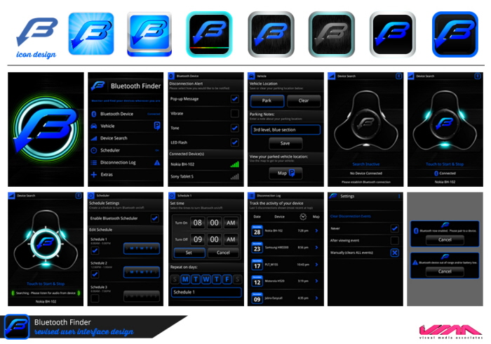
Website Design for Bluetooth Finder Mobile App - www.vmaworld.com
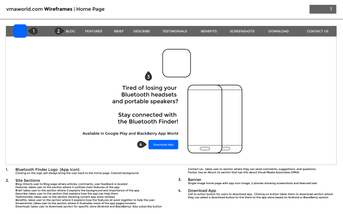
vmaworld.com Wireframes | Home Page
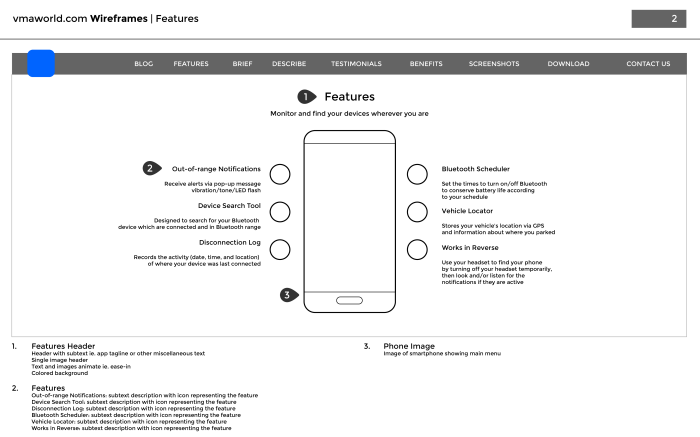
vmaworld.com Wireframes | Features
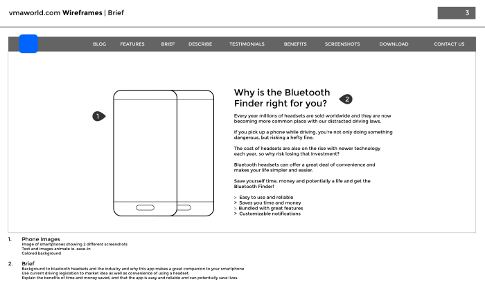
vmaworld.com Wireframes | Brief
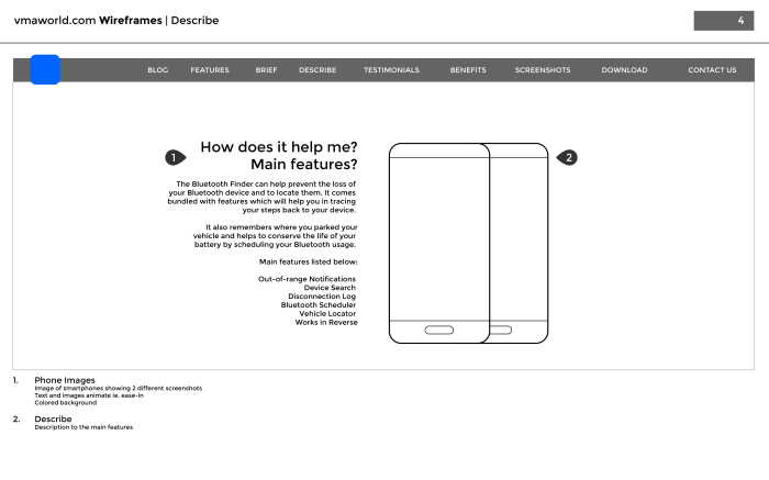
vmaworld.com Wireframes | Describe
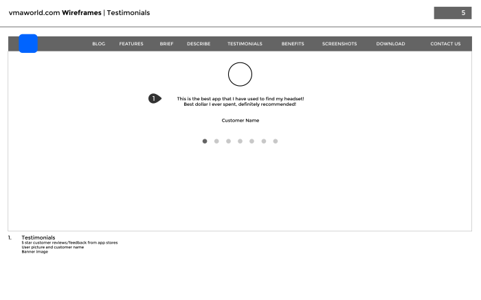
vmaworld.com Wireframes | Testimonials
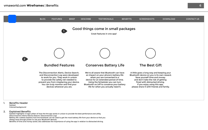
vmaworld.com Wireframes | Benefits

vmaworld.com Wireframes | Screenshots

vmaworld.com Wireframes | Download

vmaworld.com Wireframes | Contact Us

vmaworld.com Wireframes | Footer
Revised UI Design & App Icon Concepts

Mobile App Design & Branding | Bendigi Technologies Inc.
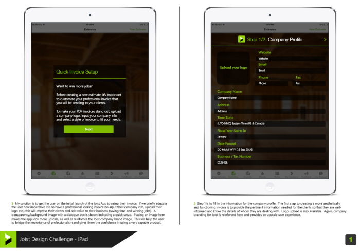
Friction Point:
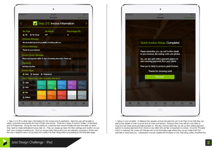
First time users typically start by attempting to create their first estimate. They then tap “done” and are lead to a .pdf preview screen that shows their final estimate in a .pdf format. This estimate is underwhelming to the first time user. It appears blank and does not contain any of the user's company information.
Challenge:
Provide a solution for the underwhelming .pdf document experience, by enabling the user to input their company information at some point in the first time user flow. This could be at the beginning, during, or after the user views the .pdf. The goal is to provide the user with an amazing & professional looking .pdf document when they reach this screen for the first time.
Friction Point:
First time users typically start by attempting to create their first estimate. They then tap “done” and are lead to a .pdf preview screen that shows their final estimate in a .pdf format. This estimate is underwhelming to the first time user. It appears blank and does not contain any of the user's company information.
Challenge:
Provide a solution for the underwhelming .pdf document experience, by enabling the user to input their company information at some point in the first time user flow. This could be at the beginning, during, or after the user views the .pdf. The goal is to provide the user with an amazing & professional looking .pdf document when they reach this screen for the first time.
gLike
UI/UX Design