
My First Garden - This was a pro Bono project for a friend who was pitching a product idea to a seed company. I was happy to help her as gardening is a hobby of mine.
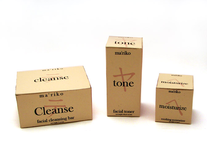
MaRiko Cosmetics packaging - This project was for packaging for a ficticious cosmetic company who sells their product in upscale department stores. I felt a clean, elegant look with an asian sensibility would work best for this project.

Mother's Garden Packaging - This packaging was designed for our Mother's Garden line. The flowers in the packaging are the same flowers used in the jewelry. Both the name and the tag line, "Where love grows," were my concept, as was the garden gate motif. I designed the display several months later based on the packaging design.
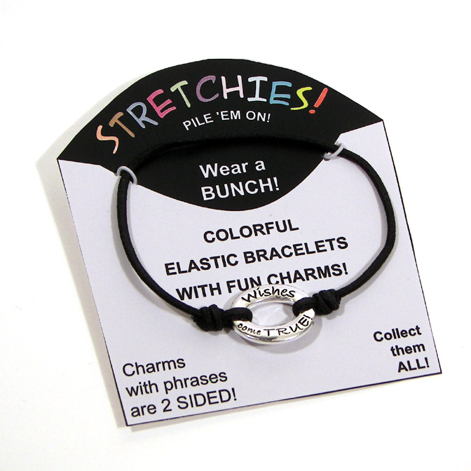
Stretchies Packaging - This is alternative packaging for an existing line of elastic stretch bracelets featuring colorful elastic, silver charms in several different shapes and oval and rectangular silver charms engraved with inspirational and funny phrases.The elastic comes in the 11 colors used in the word, " stretchies!" and in black.
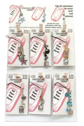
Cell Phone Charm Easel Display and Packaging - This is a mock-up of an easle display for our Cell Phone Photo Charms.
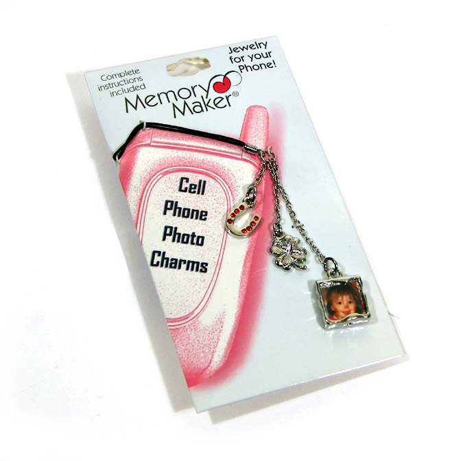
Cell Phone photo charm packaging - The basic structure of this packaging was pre-existing. I provided the graphics for this project.

Picture Pinz Spinner Display and Packaging

Picure Pinz Easel Display and Packaging
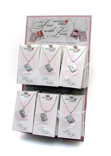
Sent With Love Easel Display - The packaging for this product was done by another designer. I drew my inspiration for the display from the package.

Mitsubishi custom packaging - This is a mock-up of packaging for a line of photo accessories to be sold in conjunction with the Mitsubishi Photo Developement Kiosks. I combined the colors of the Mitsubishi logo with the basic design of our standard company packaging. Prototypes have also been developed using colors and graphic elements of several other major photo developing companies pending contract negotiatons.

Sony Custom Packaging - This is a mock-up of packaging for a line of photo accessories to be sold in conjunction with the Sony Picture Station. I combined the colors of the Sony logo with the basic design of our standard company packaging. Prototypes have also been developed using colors and graphic elements of several other major photo developing companies pending contract negotiatons.

Eye Candy packaging - This packaging was designed to display the bracelets on an easle display. The line was called eyecandy because of the beads' resemblance to hard candy. The graphics on the packaging are photographs of hard candies which have been edited in Photoshop.

"Best Friends" bracelet set - This product was designed with "'tween-aged" girls in mind.The packaging is a mock-up. I chose simple flowers in bright colors on a black background to appeal to this demographic. The bracelets can be made in any color seen on the packaging and still coordinate well without having to change the packaging.
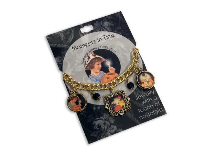
Vintage Halloween Charm Bracelet and Package - I designed the packaging for this line to the retailer's specifications regarding size and shape. They wanted something that would fit in with their chain of country stores/restaraunts. The graphic elements are from a collection of Dover Publications vintage clip art.

Country Breakfast charm bracelet - This package was designed for a chain of country stores/restaurants. The bracelet was designed to reflect the experience of visiting and dining in one of their stores. I wanted to make it as "country" as possible and nothing says country like an old red barn!

Ribbon bookmark package - This bookmark was originally sold in a box. I was asked to design this package when we landed an account with a chain of stores that required all our merchandise to be sold on counter top easle displays.

Away in a Manger packaging and display - This line was originally sold under a different name to a customer who required packaging of a specific shape and size to fit their generic displays. When it was placed into the general marketplace, it was renamed and the packaging redesigned. I mimicked the shape of the manger in the display artwork and tried to give the illusion of heavenly light. The name, graphics, color and tag line were all my creation.

This card's size and shape were specified by the customer to fit their generic display rack. The name, tag line, graphics and colors used were all my design.

Bandz Earthtone Inspirations boxed packaging - This packaging was designed for a customer who required all packaging to be boxes of a specific size. I felt that using the image of a hand and forearm wearing the pieces would be the most effective way to display these pieces. The tag line was my creation as well.

Antique Replica Jewelry packaging - This pair was created for a line of 19th century inspired antique replica jewelry. For various reasons, the line was never really actualized and wasn't even given a name. The graphic for these cards was inspired by faded tone-on-tone wallpaper such as might have been found in a formal parlor 150 years ago.

Hoppy Easter Bracelets - This graphic was pieced together from clip art that I colored in photoshop. The outline on the packaging represents the bracelet's placement. I do not have an image of the carded piece but included the packaging because it is a particular favorite of mine.

Oh Holy Night packaging option 1 - This is one of 2 options presented to a customer for a line of nativity-inspired Christmas jewelry. They required packaging of a specific shape and size to fit their generic displays. When the line was placed into the general marketplace, it was renamed and the packaging redesigned (Away in a Manger, seen elsewhere in this set).

Oh Holy Night packaging option 2 - This is one of 2 options presented to a customer for a line of nativity-inspired Christmas jewelry. They required packaging of a specific shape and size to fit their generic displays. When the line was placed into the general marketplace, it was renamed and the packaging redesigned (Away in a Manger, seen elsewhere in this set).

Symbology necklace packaging - This piece is a companion piece to 2 other files in my portfolio, the Symbology ad piece in the "Advertising Pieces" set and the Symbology Point-of-Purchase display in this set. In each case, I adapted existing graphics to fit the required format. This image is of a mock-up.

Symbology revolving display - This is one of 3 pieces in my portfolio for this particular line. The original graphic for this line, the hang tag seen in the "Symbology ad-2" in the "Advertising Pieces" set, was not my design. In each case, I adapted those existing graphics to fit the required format.
gLike
Point-of-Purchase Displays and Packaging