BETH YOUNG DESIGN

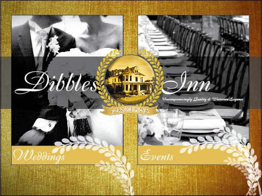
DIBBLES INN HOMEPAGE - A homepage design for the Dibbles Inn, located in Vernon, NY.


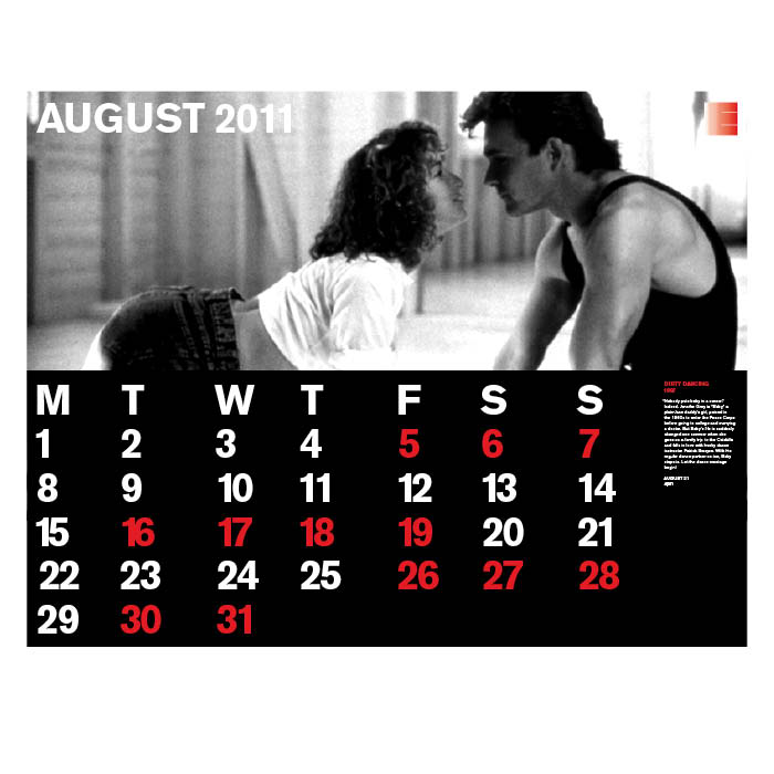
EASTMAN HOUSE CALENDAR_FOLDOUT - This folded out poster was done for the Eastman House for their visitors to have a guide to the films playing at the theater during that month. This project was done during a week long workshop at RIT under the teaching of Massimo Vignelli and George Lois.
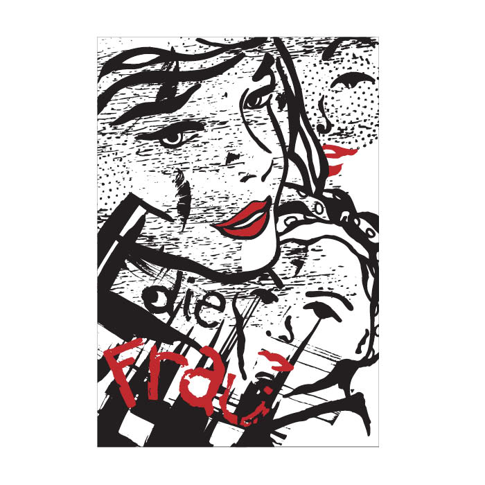
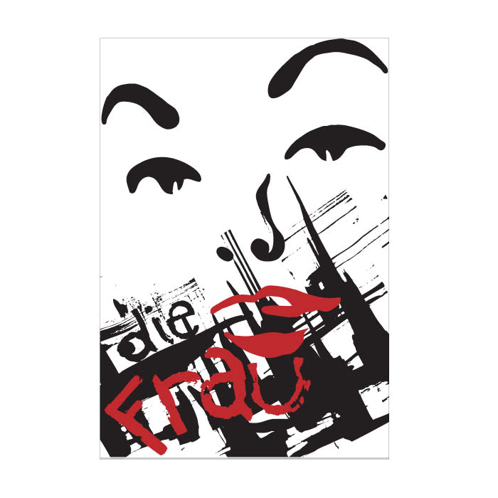
THE WOMAN - One of three graphically rendered versions of a hand drawn piece done in Germany at the Hoschule Anhalt School for Applied Sciences. The purpose of the project was to do work, while also portraying something that represents work, or shows the action of work. I chose the woman to represent the working woman, just as I was the working woman while creating this piece.
THE WOMAN 2 - Two of three graphically rendered versions of a hand drawn piece done in Germany at the Hoschule Anhalt School for Applied Sciences. The purpose of the project was to do work, while also portraying something that represents work, or shows the action of work. I chose the woman to represent the working woman, just as I was the working woman while creating this piece.
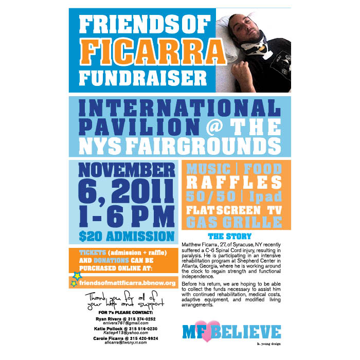
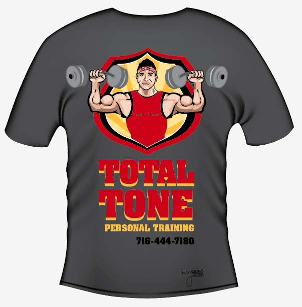
FRIENDS OF FICARRA BENEFIT POSTER - When a friend tragically lost feeling from his shoulders down after jumping out of a boat this past summer, the least I could do was design some posters for his benefit where money was raised to help Matt.

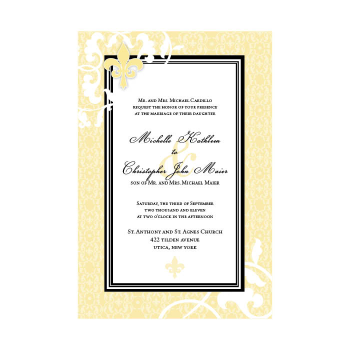
WEDDING INVITATIONS - Wedding invites specifically designed to please a close friend for her wedding.
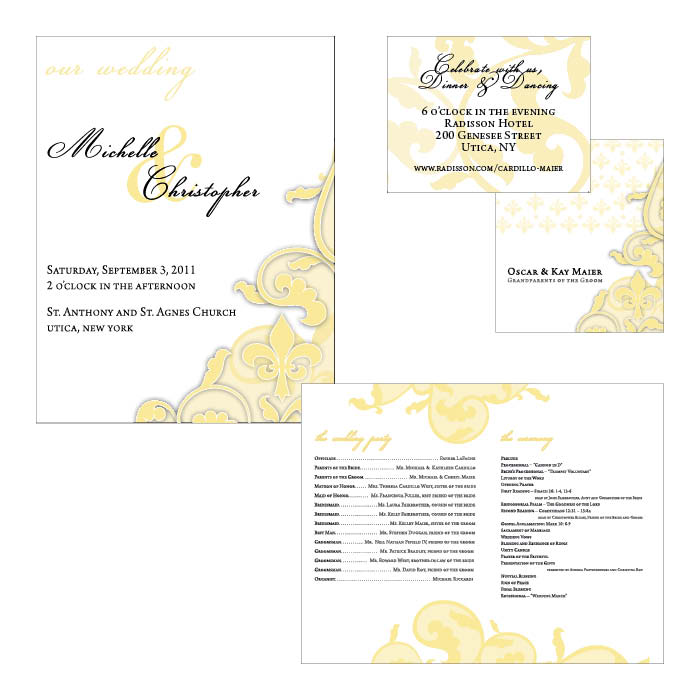
WEDDING EXTRAS - The wedding program, table cards, and reception cards are all shown above. A yellow and black, fleur de lis theme was requested throughout.
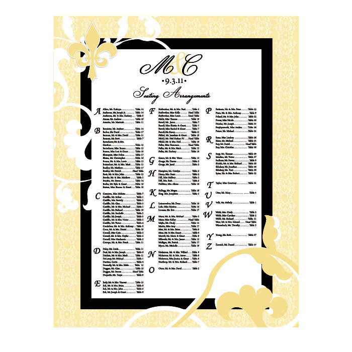
WEDDING SEATING - A seating chart beautifully designed to welcome guests and guide them to their seat.
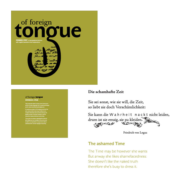
FOREIGN TONGUE_SEMANTIC TYPE BOOK - Another piece done in while abroad in Germany at the Hoschule Anhalt School for Applied Sciences. The purpose of the project was to create some type of coding system that would help others learn something, in a new way. My project was a series of books with semantic typography in them, that graphically could give some way to the meaning of a poem, or saying, even if the language was not understood. An example is above.
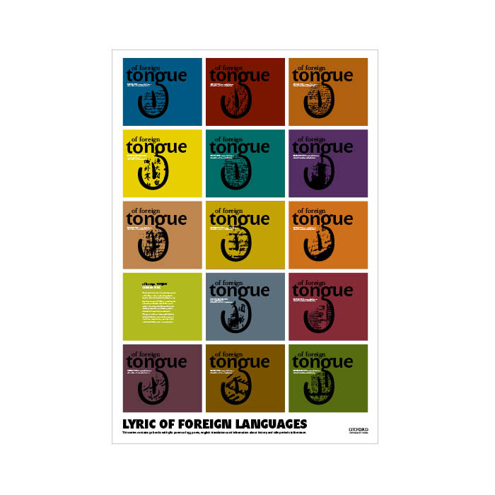
FOREIGN TONGUE BOOK POSTER - A poster done to promote the semantic typography books created. All different books would be available, will all different languages available to learn.
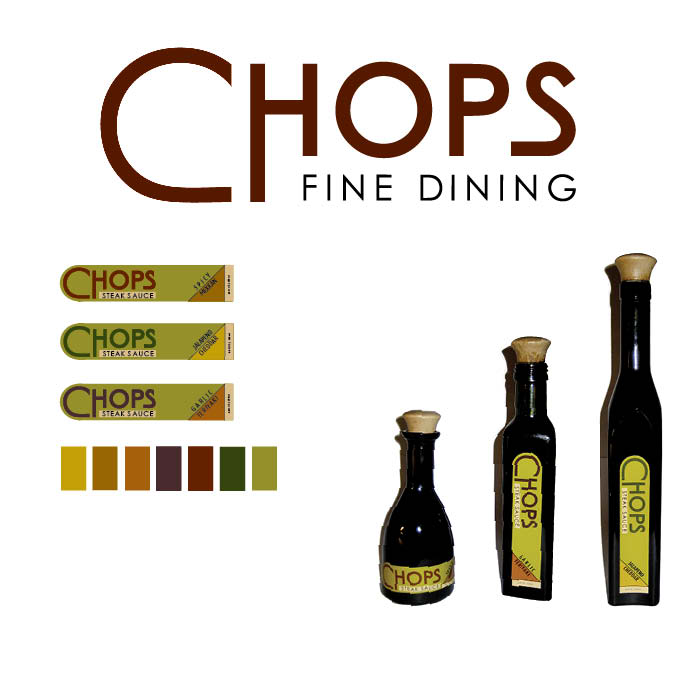
CHOPS FINE DINING
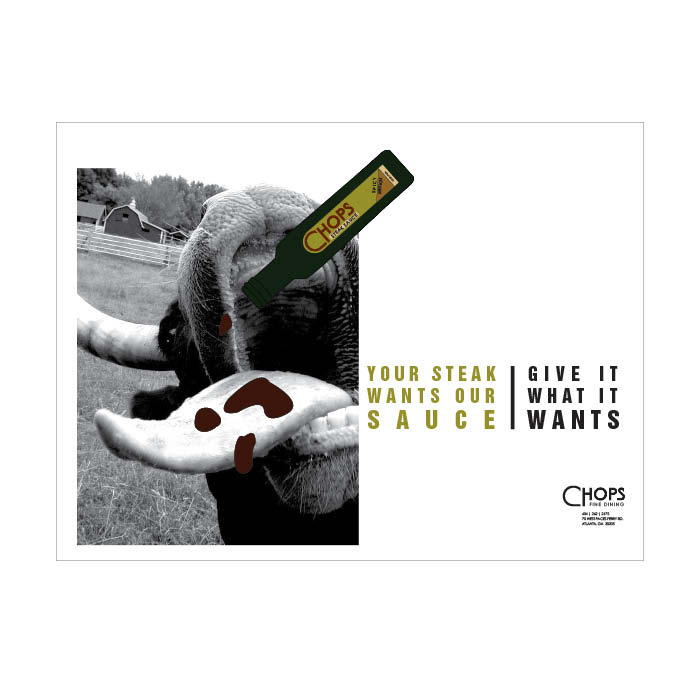
CHOPS ADVERTISEMENT - Another advertisement done to promote Chops Steak Sauce. Chops is a fine dining steak house in Atlanta, Georgia.
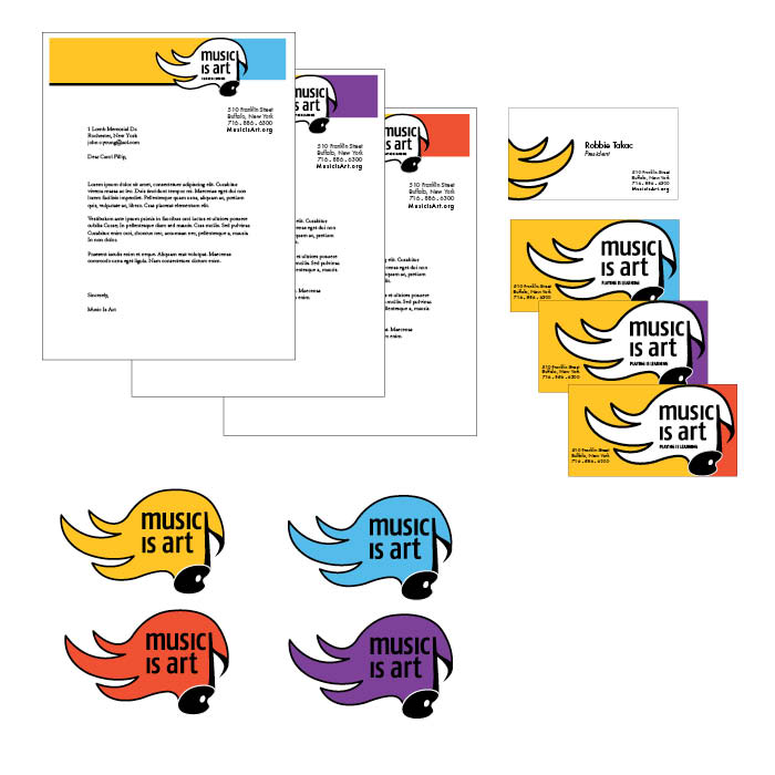
MUSIC IS ART - Identity for Music is Art, a foundation headed by Robbie Takac of the Goo Goo Dolls.
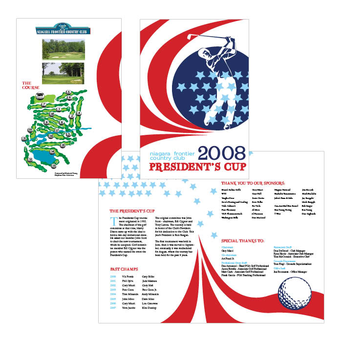
PRESIDENTS CUP - Program design done for the 2008 NFCC President's Cup Golf Tournament.
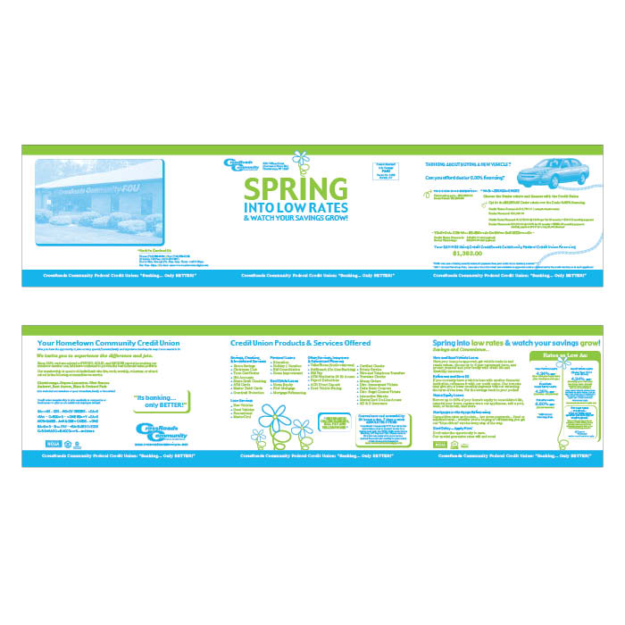
CCFCU SPRING NEWS - A trifold spring newsletter done for Crossroads Community Federal Credit Union. A newsletter was done every quarter to promote new interest rates and the positives of joining the credit union.
gLike
PORTFOLIO
Please enjoy my personal portfolio. Other work can be seen in my other sets as well! Thanks :) Beth