
Yellow Page ads present their own unique challenge with the small amount of space available. This ad introduced the new tagline for a sign company, while the graphic layout pulled the eye through the informative text.
View PDF
View PDF

A much smaller version of the previous Yellow Page ad. Just the basic information.
View PDF
View PDF
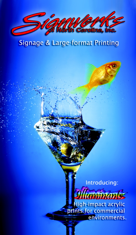
This sign company was attending its first trade show, and had created a 4'x8' acrylic print of this image as their standout display piece. I made it their business card for the show.

The sign company needed a new brochure, both to educate potential clients about the different types of sign construction available, as well as to showcase their abilities. To contrast the old and the new, graphics of old signs were used to head each major section, based on type of construction. Those same images were printed at 75-80% transparency on each page of that section as reinforcing background images. The particular shade of red in the company logo was chosen as a unifying element throughout the brochure in specific
graphic elements (lines and call-outs), and was also added to the section header images.
gLike
Signworks
A local sign company needed new promotional materials, including print ads, online ads, business cards, and catalog.