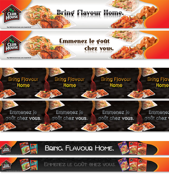
Initial Concepts - First run at the shelftalkers.
The series is branded with the slogan, logo, colours (red, orange) and their signature wave.
The middle one was designed to be endlessly repeating as necessary.
3 set is half the height for thinner shelves and instead displays the packages themselves instead of meals.
As Canadian material both languages have to be prepared.
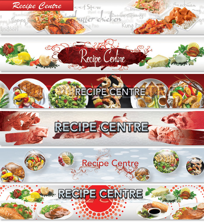
Round 2 - Now client requested Avant Garde font, and instead of slogan and logo switched to "Recipe Centre" design for locations where their product would share the shelves with competing brands.
Although unbranded made sure to prominently include their red to maintain the association in the consumer's mind.
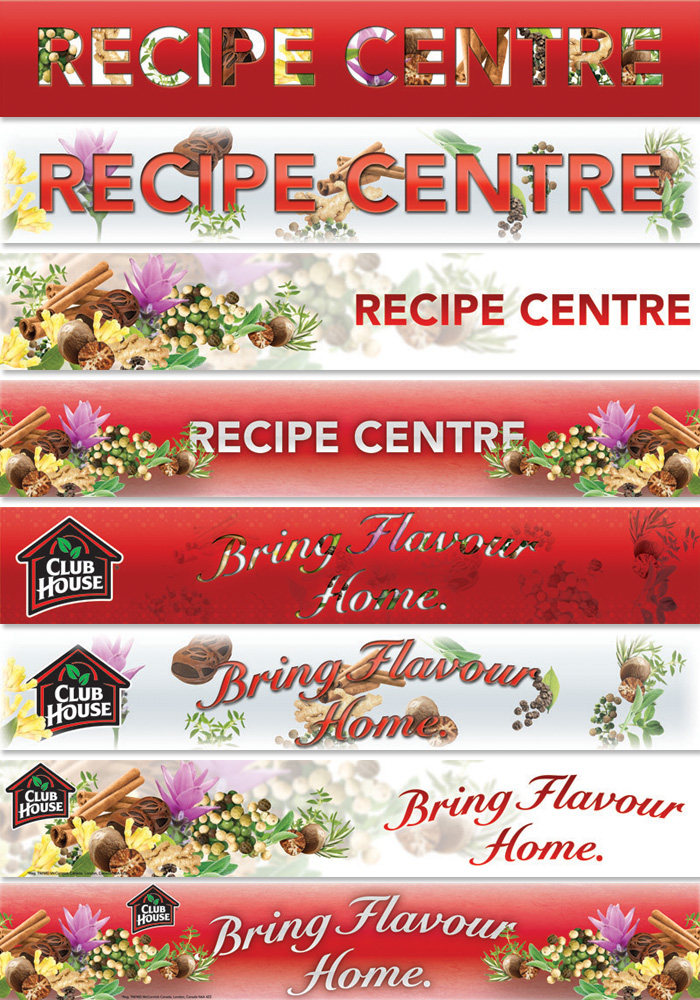
Round 3 - Final batch included sets with branded and unbranded versions of designs.
These focus more specifically on spices than the meals themselves.
gLike
Club House Spices