Finalized iCare logo
View PDF
View PDF

iCare Business Card.
Names, titles, contact changes per employee.
View PDF
View PDF
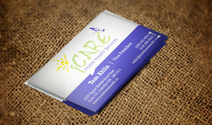
RW iCare card hi-gloss mock-up.

Cover photo for the company's Facebook page. Added a little depth to the logo (allowed under brand guidelines) and added maple leaf touch to distinguish their page from the similarly named ICare in the U.S.
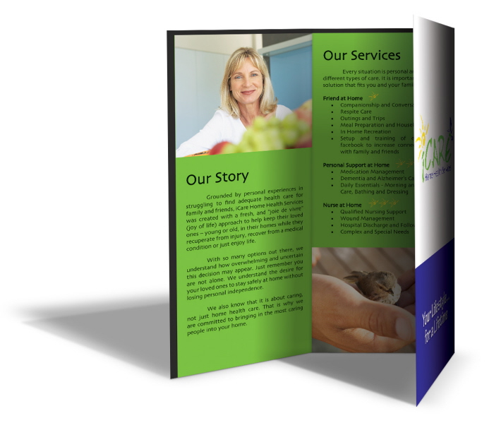
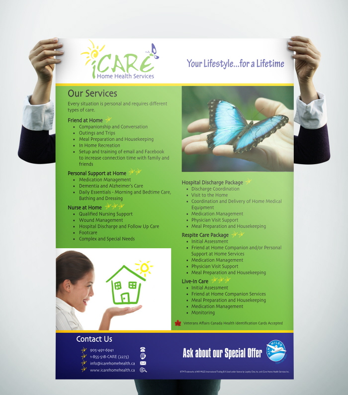
Brochure mock-up.
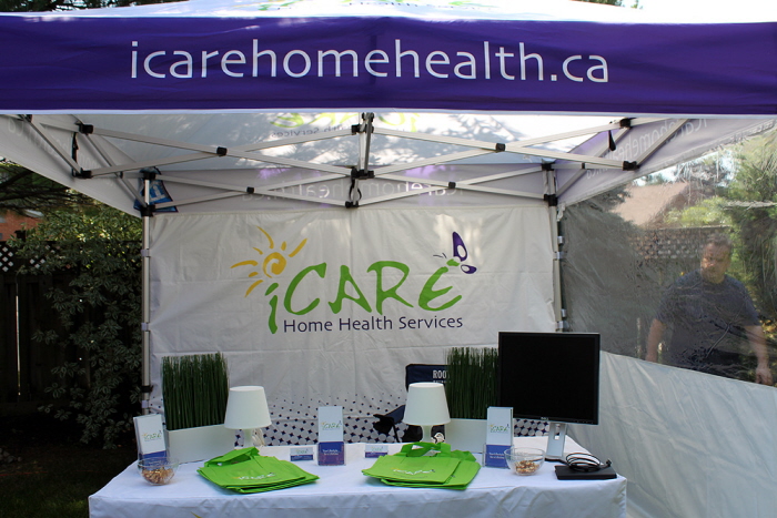
The iCare tent, seen at festivals, job fairs, etc. Purple halftone introduced to draw the eye and compliment the rest of the scheme while making it so their logo is not just floating in white space.
Also pictured: the green iCare reusable swag bags.
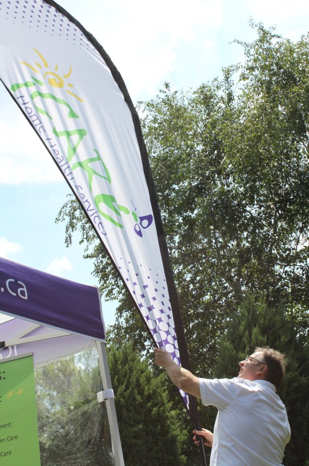
One of two "blades" that go with the tent, a real attention getter that makes them stand out from the crowd (both in size and professional look).
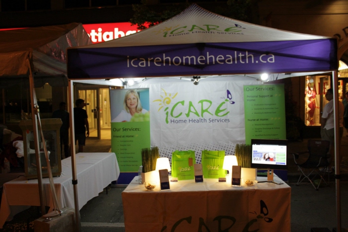
iCare tent set up at the Oakville Midnight Madness, with the new banners standing in the back (relaying succinct information from the brochure).

Partnering with AIR MILES Canada, this is a double sided table sign.
Symbolic of the partnership used the AIR MILES colours, combined with the halftone element of iCare.
View PDF
View PDF
gLike
iCare Home Health
Headed up branding and digital/print materials for the company as the Creative Director.
Unlike the majority of health care companies out there, the idea was to go in another direction: instead of muted and sombre colours and images, we went with bright and joyful - a motif that carries throughout all their materials.