A new brand look for all advertising material was established. These consumer brand layouts showcased large engaging imagery capturing moments that consumers could aspire to and achieve by partnering with LSB. It was important for the photography to be distinctive and reinforce the playful headlines and support copy. Arrows and brackets were introduced as accent elements to draw attention to and insinuate growth and movement. The design "template" offered flexibility for The Nashua Bank advertising as well by simply customizing the logo, copy and corporate colors to the TNB brand.
This brand series for the commercial lending division needed to be different yet complementary to the consumer series. These layouts reflect an updated Lake Sunapee Bank logo. A simpler, more flat style logo mark, new typeface and additional gold color were introduced into the logo (see Logo Design folder for details). The logo was given more dominance than the consumer ads but still relied on non-posed unique imagery and direct messaging to showcase business success partnering with LSB.
A testimonial ad direction was requested to promote LSB's business banking capabilities. Skinny Pancakes was chosen as they were in the process of expanding their business by adding a new location.  Step 1: propose a photo style and on-brand layout which showcased the family of brands in a simple and contemporary way (2nd layout from right). The photo chosen captured the owners casual down-to-earth personality, a spontaneous and approachable feel. Step 2: scout the location for potential camera angles (far right). Step 3: meet with photographer to discuss goals and approved scouting shot. Step 4: art direct photoshoot. Renovations were not completed as expected and time availability of the owners short the day of the shoot. The proposed shot wasn't possible so moving of construction material and clean up ensued to capture the final shot shown. Shots were taken of both owners looking at the camera and conversational but LSB ended up preferring the more staged pose.
Various marketing pieces were produced to promote the pre-opening and grand opening of the new financial center in Concord, NH. Pre-opening full page ad (11.25"w x 21"h shown far left), oversized direct mail postcards (center) and a Now Open ad (11.25"w x 10.5"h). The new branch was slated to be very contemporary in decor with an open concept layout. Royalty free photos were researched for the "Now Open" series which relayed a welcoming and contemporary feel while being abstract enough to not see within the glass. To give the brand more presence, the logo mark was enlarged and ghosted in the background of each of the marketing pieces within the series. The light gradients, tints of "gold" and blues were woven in to reinforce the brand image.
These ATM display ads were created for The Rewards Mastercard promotion. The display ad creative needed to be eye catching and enticing to the consumer. Rewards highlighted in the headline were chosen which would be appealing to both men and women. 
gLike
Lake Sunapee Bank

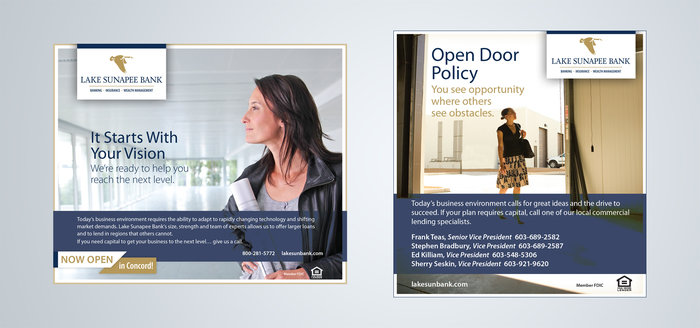
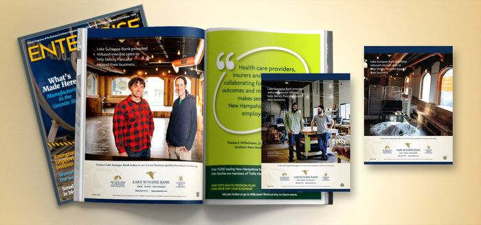
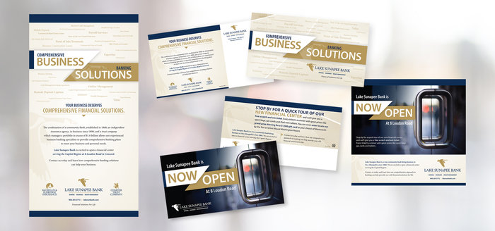
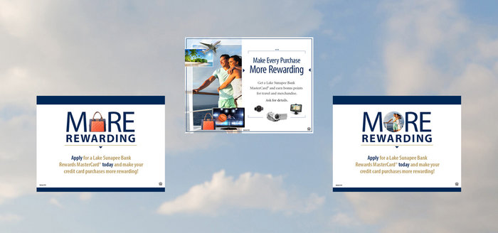
Lake Sunapee Bank wanted a "refresh" given to their existing advertising. Working with Roaring Fork Communications (RFC), a new brand look was developed and recommended based on input from the agency (RFC) and client. Print advertising was tackled first with brand ads targeting consumer and commercial markets. All other marketing material was updated over time based on the branding guidelines established in the print ads and logo updates (see details in the logo design folder).

Clever and simple messaging tied to images of carefree non-posed moments in time were integral to the new brand direction. Existing and potential customers needed to feel that LSB was the partner that could help them on their journey to achieve these moments. 

Available
Freelance
Deb Beaudoin
Freelance Print & Digital Graphic Designer Londonderry, NH