
CryoGen is a company created under the New England CryoGenic Center umbrella.
The lotus flower was chosen as the mark due to it’s symbolism of fertility and conception. The gray within the o is symbolic of an egg. Several of the petals were highlighted in purple to reinforce the idea of protection of life which the company offers with their extensive knowledge and scientific technology.

Eideard Group provides family office and wealth management services to an elite socio economic group.
The logo mark is in the shape of a flame housing two koi fish. Koi fish are symbolic of success and prosperity while the flame is representative of Eideard Group's ability to provide guidance for ensuring a clients legacy. A contemporary sans serif typeface was suggested for the tagline to complement the client dictated font usage for "Eideard Group".

E-Volve Health was a division of the Elliot Health System offering a suite of services to guide an organization through the EPIC EMR conversion.
The logo was required to incorporate the “E” from The Elliot Hospital logo and needed to portray consistency, reliability and stability. Various secondary colors were presented but, red was requested from the client. Research was invested in finding a typeface that would flow and work in conjunction with the style of the existing mark. The hyphen was created from the shape of the “E”.

New Hampshire Bankers Association is a statewide, not-for-profit trade association representing and serving all of the banking institutions in the State of NH.
The main objective of the new logo was to visually portray a current and forward thinking association. Bankers Association logos across the US look very similar, so it was important for this logo to stand out. The colors, arrow elements, typeface and type treatment were recommended for distinction and legibility. The arrows were intentionally positioned to reinforce the relationship this association has within NH among the banking industry, its employees and community.

Positive Intelligence is a motivational speaker’s program focused on helping business leaders to shift their mind from self-sabotage to optimal performance using simple and proven neuroscience-based techniques.
It was important to reinforce the ability of this program to help change an individual’s way of thinking to a more positive mindset. The plus sign was incorporated to reinforce the success CEO's and upper management achieved by using this program.

The Positive Intelligence Quotient Score (PQ) is an assessment test that is just one component of the Positive Intelligence Program (logo shown above).
Both logos needed to reinforce the programs ability to help change an individual’s way of thinking to a more positive mindset to achieve greater success professionally and personally. The plus & negative signs were incorporated into the "P" and "Q" to reinforce that inner battle many individuals struggle with daily.

Financial Strategies Retirement Partners offers retirement planning services for wealthy business owners and individuals.
The client requested a logo that would showcase vision, trust and strength. The colors were dictated by their alliance with The Commonwealth Financial network and the logo design was approved by this organization. The mark incorporated the triangle element from The Commonwealth Financial network logo but was designed in a way to visually showcase protection and independence.

Specialized Grounds Solutions, LLC is a startup landscaping company that wanted to stand out from the competition with a contemporary yet simple logo.
The one client request was to incorporate a water droplet into the design. The goal was to provide a mark that would relay the company’s capabilities at a glance and also be easily adapted to various promotional needs (i.e. embroidered t-shirts to van signage). The colors were chosen to reinforce the companies dedication to providing solutions in growth (green), irrigation (blue), and maintenance of grounds (brown).
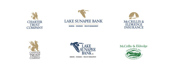
Lake Sunapee Bank had a new family of brands with the addition of insurance (McCrillis & Eldredge Insurance) and wealth management services (Charter Trust Company) prior to being bought by Bar Harbor Bank & Trust.
The goal was to offer brand consistency among all three companies in color and typeface usage. The Charter Trust gold was chosen to complement the Lake Sunapee dark blue. A new typeface was remained within the serif family with a more current visual appeal. The Lake Sunapee goose mark and McCrillis & Eldredge lake scene were simplified so that as a family each mark was similar in flat style.

Summit by Morrison is a recently built senior living community situated in NH's North Country.
The request was for this logo to be easy to read, appear warm and inviting at first glance and incorporate a graphic element that would pay tribute to the region. The large leaf is representative of the beautiful mountain views and is broken into three separate leaves to represent the services and care offered: Independent Living, Assisted Living and Memory Care. The earth tones were chosen to give a softer feel that would complement the exterior/interior design of the buildings.
Hampshire First Bank was a state-chartered commercial community bank with it's first branch location in southern New Hampshire.
It was important for the logo to portray a bank that was current and approachable. The logo mark is an abstract arrow created to relay forward movement not only from the banks perspective of services/technology offered but their role in customers personal and/or commercial growth. The typeface was chosen for its combination of angled edges and curved letters as seen in the logo mark. A vibrant PMS green was chosen for the banks NH roots.
gLike
Logo Design