
Smart Car Contest - Here is my first design!! Sorry it’s uploaded so late!! For this, I put together some of my favorite car skin designs I had created for a “Smart Car Contest†through DeviantART. I absolutely love how they came out!! Once I find out the judging for the contest, I’ll let y’all know how it goes!! *Crossing my fingers* I win!!:) I hope you all enjoy the first design!! Thanks so much for checking it out!!xx

Joker - Design #2: “Jokerâ€!! I absolutely love this one! I worked really hard on making her look realistic, yet surreal. During my college graduation party, I was “doodling†on a balloon, and ended up drawing up this girl. I really loved how she looked, and decided to vector her. I hope you enjoy this illustration as much as I do!!:)

Glassbox Photography - Design #3: "glassbox photography"!! The design was created for my friend Josh. He is a great photographer, and needed a business card to get his name out there! He thought up the name to represent his photography, and we collaborated on the concept. I am really proud of myself on this one. I really feel I created an identity that is modern, and appealing. This logo was incredibly fun from the design concept, to the final product!!

Pond & Beyond Website - Design #4::Pond & Beyond Website!! This piece is a "redesign" of a project I did in school w/ a classmate for a client. Her 3 main color choices were; purple, green & orange. My partner & I tried our best to incorporate those colors. We each created mock-ups for her, and I wasn't to proud of my design, so I thought, why not re-do it! Here is the homepage. I really like how it came out with what I had to work with! Thanks for checking it out!!xx

Pond & Beyond Webpages - Design #5: Pond & Beyond Webpages!! Here are the webpages for the previously uploaded Pond & Beyond homepage. I kept with the color scheme, and really enjoyed working on this project. I’m happy with the end result, and really think it spoke to what the client was looking for!!xx

Tobiko - Design #6: Tobiko!! This design definitely tested many of my skills as an illustrator. I learned a lot while designing this piece. My first idea for the Tobiko sushi was completely different, and not as detailed, but as I went along, I thought up new ideas, and researched new things, and here is the final product!! (I added a zoomed in photo of three main pieces in the design. I put a lot of detail into this illustration, and I want to demonstrate that up close!!)xx

Tobiko - Design #6: Tobiko!! This design definitely tested many of my skills as an illustrator. I learned a lot while designing this piece. My first idea for the Tobiko sushi was completely different, and not as detailed, but as I went along, I thought up new ideas, and researched new things, and here is the final product!! (I added a zoomed in photo of three main pieces in the design. I put a lot of detail into this illustration, and I want to demonstrate that up close!!)xx

viciGRAPHICS - Design #7:: My temporary website!! Here is the temporary home of my online portfolio// viciGRAPHICS. It took me a long time to decide my color scheme, type, logo, and overall feel. I am so impressed with how it has all come together, and super excited to get my full website up in the near future!! Thanks!!xx
http://vicigraphics.net/

Hello Seattle - Design #8:: Hello Seattle!! For this design I was originally going to do a black and white outline of a girl, but as I went along with the design, I started to experiment with some textures, and stripes. Besides the background, my favorite part of this design is her eyes. I love the colors, and shading I did & am very happy the human face is becoming easier for me to vector. The lyrics in the background are from the band “Owl City.â€

Joy!! - Design #9:: Joy!! I’ve always loved photo manipulation, but never knew where to start. My inspiration for this came from a tutorial through PSD Tuts. I love the vintage feel of the photo, almost like it was hidden away in a photo album, and recently discovered. I have really fallen in love with this photo, and I hope you all enjoy it as much as I do!!:) Thanks!!xx
Tutorial: http://psd.tutsplus.com/tutorials-effects/mix-cool-retro-curves-into-your-photographs/

Bubbles - Design #10: Bubbles!! I really wanted to try out a different style vector…more of a vexel style, but without the pixels…and this is what I created with the help from a wonderful tutorial! I wanted to do a photo of someone blowing bubbles, and I found a great photo and utilized that!! Thanks for checking it out!!xx
Reference Photo: http://T110MAS.deviantart.com/art/Bubbles-54180318?q=&qo=
Tutorial: http://lekiluv.deviantart.com/art/Vector-Tutorial-Illustrator-167723628?q=

Candy Corn - Design #11: Candy Corn!! I wanted to do a design in honor of one of my favorite holidays...Halloween!! I chose to create a vector of candy corn since it's delicious, and fun to illustrate!! I wanted to keep the vector relatively simple since there isn't much detail to that candy. I hope you enjoy the illustration!!:) Thanks!!xx

Tea Time - Design #12: Tea Time: This design was extremely fun to create. I love the imperfections, and all the different elements that are compiled in it. This design actually helped shape my current logo for myself. I am very pleased with this creation! Thank you for checking it out!!xx

S'more - Design #13: S’more: This design was inspired when I was in Florida last weekend. I was making a s’more (funny since I was in 70 degree weather!) and I thought how cute it would be to vector a marshmallow. He has his chocolate bar friend off to the side, and graham cracker background. I decided to make flames in a low opacity, to continue the whole s’more experience! Thanks for checking it out!!xx

Bowling!! - Design #14: Bowling!! First, bowling has never been my cup of tea. I am terrible at it, but I was “doodling†in my sketch pad, and I found myself drawing this up. I wanted to make the bowling ball excited, and the pins nervous to add a “cute†feel to the illustration. I believe I got the bowling alley down, and the layout of the design should be on point. I absolutely adore this illustration!!:) Thank you for checking it out!!xx

Fall Flower - Design #15: Fall Flower: Once again I was “doodlingâ€, and I came up with this design. I sketched it out, and scanned it in. I wanted to stick with mute, fall colors that would keep it simple. I like the style, and the form of this illustration. As you may be able to tell, fall is my favorite season from the changing of leaves, and crisp air, to the beautiful colors it offers, and the wonderful designs it inspires! Thank you for checking it out!!xx

Mini Me - Design #16: Mini Me: When I was younger, I used to doodle on my notebook; like any teenage kid in school, and one of the cartoons I used to draw was a mushroom. (No drug reference) Lol. So I was doodling on Illustrator, and this came to mind. I love the “mini me†feel, which adds a cute sense of humor. I chose simple colors for this piece. Thank you for checking it out!!xx

Scarlet Macaw - Design #17: Scarlet Macaw: For this design I wanted to try out different overlapping opacities. I chose to do a Parrot because of their beautiful colors, and the feathers would work well in the idea I was going for. I also was inspired by the gorgeous parrots I saw while I was in Florida. Thanks for checking it out!!xx

Dream - Design #18: Dream: This design I found recently in my old notebook for school. I have always been big on "doodling" in class; like most students. When I saw this illustration, I knew I had to vector it. I hope to paint it at some point in the near future. I really love this piece because of all the different shapes, and thick strokes. I chose to have a "gradient" style to it, but not use the gradient tool. Thanks for checking it out!!xx

Snow Globe - Design #19: Snow Globe: I really wanted to do something for the Holiday season, and decided to make a traditional snow globe. This design was extremely fun, and festive for me. I wanted to make it look realistic, but yet still have an illustration feel to it. Thanks for checking it out!!xx
Snowman Tutorial: http://www.adobetutorialz.com/articles/3024/1/Creative-christmas-cards
Snow globe Tutorial: http://www.devwebpro.com/create-a-snow-globe-wallpaper-for-the-holidays/

TYPE o' Present - Design #20: TYPE o'Present: I've never really worked with creating imagery out of type, and thought why not try?? The fonts I used were Walkway Black, and Imprint MT Shadow. I chose to do a present to keep with my Holiday theme for this month! It was a tedious task, but I'm very pleased with the result!! Thanks for checking it out!!xx
Story used was written by Paul O'Neill. It's the Part 3 & pieces of Part 2Christmas Trilogy for the Trans-Siberian Orchestra!!

Event Poster - Design #21: Event Poster: For this week, I had to put together an event I’m hosting for a PartyLite, Pampered Chef party. I thought it would be fun to make an event poster. I really enjoyed making this since it’s something out of my element. Thanks for checking it out!!xx
Tutorial: http://psdfan.com/tutorials/designing/create-a-mock-retro-poster-concept/
Sunburst: http://psdfan.com/freebies/freebies-high-res-sunbursts-free-download/

2011 Calendar - Design #22: 2011 Calendar: For the start of the New Year, I decided to make a calendar for the 2011 year. I had a few ideas in mind for this, and I’m really happy with the final product. I love the color scheme which I got from Colourlovers. The fonts I used were Harabara & Geo Sans Light.
Colors: http://www.colourlovers.com/palette/1404639/Sunny_Road_APC

Red Eyed Tree Frog - Design #23: Red Eyed Tree Frog: I wanted to vector something simple, but intriguing. I remembered how cute, and adorable these frogs are, and decided to put together this illustration! I chose bold, bright colors since they are such a vibrant amphibian. I decided to go with a charcoal gray background to help the foreground colors pop! I really hope to get one of these little guys one day! Thanks for checking it out!!xx

Inspiration - Design #24: Inspiration: This design was created from an array of “doodles.†Vectoring people has always been a challenge for me, and I really want to keep practicing my techniques. This is probably one of my favorite designs I’ve created. I like that it is sort of out of the box, but still has a structured look to it. Thanks for checking it out!!xx

Inspiration (Addition) - Design #25: Inspiration (Addition): I really loved the “Inspiration†design I did last week, but felt it wasn’t finished. I decided to add some clothing to her, and some Chucks. I am so happy at how this design developed. I hope this is a beginning to some great vectors of people since that’s what I struggle most with. Thanks for checking it out!!xx

World in our hands - Design #26: World in our hands: For this design, I wanted to practice my photoshop skills, and decided to make a “crystal ballâ€. I put the world inside the ball to represent that we all are unified in some way. Positives, or negatives, we all live in the same world, and experience life in different, yet similar ways. I really adore this design. Thanks for checking it out!!xx
Tutorial: http://www.adobetutorialz.com/articles/3057/1/Create-a-Magic-Crystal-Ball

Art for Australia - Design #27: Art for Australia: I created this design in honor of all those effected by the recent Queensland, Australia floods. I am hoping to put this poster in an auction coming up to help raise money to be donated to the disaster relief effort established by the Queensland, Australia Government: http://www.qld.gov.au/floods/donate.html. Thanks for checking it out!!xx

Designer's Block - Design #28: Designer’s Block: This past week has been so crazy, and when I sat down at my computer, I couldn’t think of anything. Absolutely blank. So I thought, why not express my “designer’s block†in a design?! So here it is!! I actually like how it came out. It’s simple, only a few colors, yet interesting. The fonts I used were: Coolvetica, and Haettenshweiler. Thanks for checking it out!!xx
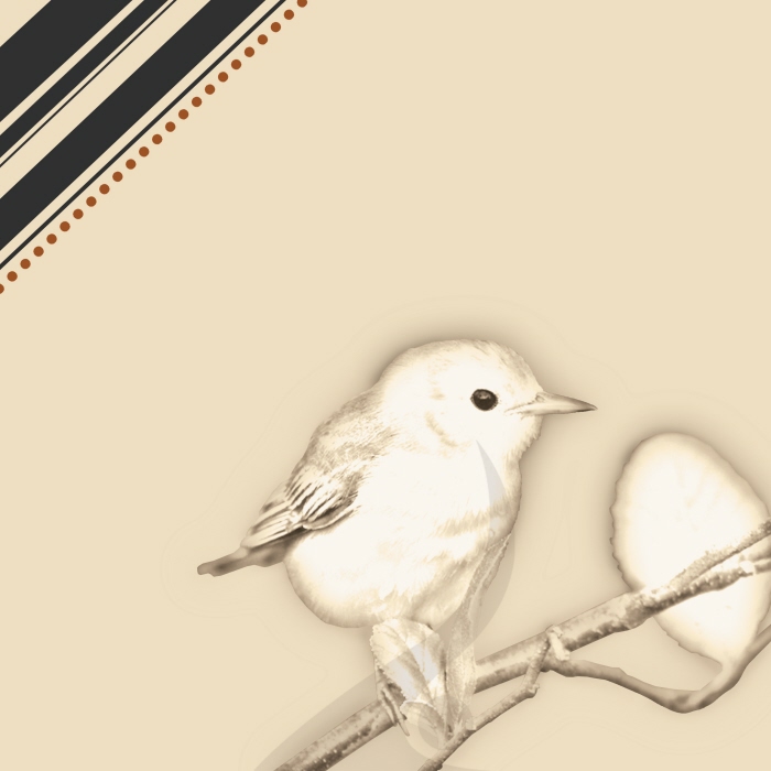
Waiting for Spring - Design #29: Waiting for Spring: For this design I wanted to do something simple, and cute. I’ve always loved bird designs, especially “vintageâ€, hand-drawn ones, and I wanted to try that myself through Photoshop. I also wanted to create a design that had a “spring†spirit since it’s been a long winter!! Can’t wait for some beautiful weather!! Thanks for checking it out!!xx

Speak - Design #30: Speak: I've definitely been favoring poster designs lately. Not sure why, but I love the outcome from it. I like variety when it comes to designing, and I feel I've been doing a wonderful job exploring different areas. For this design I used the Neutraface font, and wanted to represent it's characters. I really love how the lips came out, and the contrast between the bright red against the charcoal grey background. Thanks for checking it out!!xx

Persistance - Design #31: Persistance: I wanted to try to do a silhouette with a colorful background. I’ve been working hard working out, and at times it can be difficult, and motivation goes up, and down all the time. I wanted to make a vector design to show persistence that’s needed to keep going. The font I used was Apple Garamond. Thanks for checking it out!!xx

Cormac's Glossary - Design #32: Cormac’s Glossary: This design was inspired by one of the best holidays; St. Patrick’s Day!! Since I’m Irish, I wanted to celebrate this great occasion full of fun, food, and drinking. I decided to do a pub sign, and got the general idea from a great tutorial on VectorTuts. I came up with “Cormac’s Glossary†from researching some history of Ireland. The font used was Sherwood, and Market Deco. Hope you all have a fun, and safe St. Patrick’s Day!! Thanks for checking it out!!xx

Heal Japan - Design #33: Heal Japan: I wanted to design a poster to bring awareness to the devastation that hit Japan. So much has been happening across the world, and I want to bring this into my designs. I feel this gives my creations a bigger purpose, and help others to take a moment to think about the people being effected. If you’d like to make a donation, visit: http://www.redcross.org/!! Thanks for checking it out!!xx

Africa - Design #34: Africa: Sorry for the delay on my designs these past two weeks. This design is for last week. I’ve been very busy, and having major designers block. I’ve been wanting to do a design with an elephant in it, but instead, I thought of a giraffe. I remember my friend saying they’re her favorite animal, so I decided to go with this, and create an African theme. The giraffe spots are from a stock website: http://www.sxc.hu/photo/716067. Thanks for checking it out!!xx

Spring Fling - Design #35: Spring Fling: I wanted to do something in spirit of the spring season. I was listening to Owl City, and decided to do a simple photo manipulation. I found a great tutorial to guide me through it, and some great stock photos. I really like the abstract feel to this design. Designing pieces that are a bit “different†allow for a lot of fun, and creativity. I really enjoy this piece! Thanks for checking it out!!xx
For the links to the stock: http://vicigraphics.deviantart.com/#/d3dnm9z

Dandelions - Design #36: Dandelions: As a kid I always loved the seeds of dandelions. It’s great how even when they die, they allow themselves to grow again. I decided for the beginning of spring, I’d vector a colorful dandelion. I didn’t want to keep with the “traditional†white color, and expanded on a new idea. I think they came out cute, and a little whimsical. Thanks for checking it out!!xx

Fashion - Design #37: Fashion: I've never been very big into fashion, or the latest styles, but I've always had respect for designers. I think fashion sketches are beautiful, and have an interesting style to them. I decided to make a "collage" with some vintage colors, and different aspects of fashion. Thanks for checking it out!!xx

Dreamer - Design #38: Dreamer: It’s said that you can see a person’s soul through their eyes, and I wanted to represent this. I love our country because it provides us with experiences, and opportunities (usually). I truly believe that if you put your mind to something, you can achieve it, and to follow your dreams wherever they may take you…Thanks for checking it out!!xx

Think green - Design #39: Think green: I had a sketch I did a little while ago, and this was incorporated in it. I decided to crop this part out, and make a “green†design out of it. I know the whole “go green†has been used by many designers/companies/individuals, but I decided to make my own! I really love the abstract aspect about this design, and enjoyed creating the concept. Thanks for checking it out!!xx

Home sweet home - Design #40: Home sweet home: This design is quite personal in the aspect of my experiences. Throughout our lives we leave imprints in this world whether we know it, or not. Our thoughts, and actions change our paths as we progress through life. I wanted to represent this with my own experiences. Everybody has their own ongoing story…enjoy creating it…Thanks for checking it out!!xx

USA - Design Break: USA: I want to thank everybody who supports my “one a week†and follows my designs. Art has been a passion of mine for as long as I can remember, but lately, a new interest has developed. I decided to join the US Army National Guard, and leave for my training on May 31st. My designs will be on hold ‘til I return in about 5 mths. I hope you all return to look at my work! :)
Photo by: Dustin Genereux
dustingenphoto.com

Wild Beauty - Design #41: Wild Beauty:This piece was extremely fun, and carefree to create. I've been wanting to do something with wildlife, preferably a deer for a long time, and I finally was able to create a piece I'm very proud of!

Simple Beauty - Design #43: Fierce Serenity: I wanted to do another design like the deer illustration I created. I really think this has finally helped me to understand skin tones with light & shadows. This illustration was both challenging, and satisfying to create. Took me a long time, but patience can create something beautiful xx
gLike
ONE A WEEK
Old to New designs over a length of time. Progression of art skills is inspiring.