

BACKGROUND: Despite organisations utilising design frameworks within their team structures, resources exhaust time and money. Users, software, and professionals can affect the final design during a design process.

The first ‘user interface’ (UI) was understood to be the use of icons and a mouse device to control a computer. Five decades and incremental refinements later, we have shaped the online landscape in small steps using the same affinity and interaction expression. Users have both direct or indirect experiences with UI that are aesthetically modified to link human logic and computer logic.


A poorly designed user interface can contribute to workplace technology workers with stress and frustration levels escalate to both verbal and physical abuse. There is another crucial aspect to investigate where environmental safety is of utmost importance. Consider UI on systems for use on aircraft, air traffic management, thermal power stations, and medical devices. There are two examples of this, the first on “the three-mile island nuclear power plant disaster.” The other exposes a “cover-up when the United States government” destroyed a passenger plane by accident. Subsequently, it demonstrates how safety can be severely compromised by poor UI design.


VISUAL DESIGN is the most effective visual language combining usability aspects and user pain points while managing important features that preserve the application like: navigation, consistent icons, animation, typography, colour & layout. UX DESIGN: UX is considered a higher order of the UX landscape and architecture that envelope and embrace user-centred design on applications or software. In its essence, UX design is how users feel when using a product.

UI DESIGN AESTHETICS is what users perceive as the look and feel of a product and strongly depends on the user’s cultural background. UI DESIGN HEURISTICS primarily focuses on finding the most effective way of solving problems by prompting users to navigate an application instead of finding and less about the ‘beauty’ or the ‘look’ of a product.

Users who easily interact with a computer system and an application based on good UI find that the experience is easy to comprehend and help users complete tasks.

CONCEPTUAL DESIGN: All design work starts from conceptual design. It is an early phase of the design process. It is where you brainstorm and articulate ideas. USER CENTRED DESIGN or UCD is an approach towards designing and developing UI with the user throughout the entire design and development process.

The information architecture landscape associates itself as the foundation of ‘User Experience’ or UX and ‘Human-Computer Interaction’ or HCI. While UX is the art of making people happy, HCI identifies areas that need improvement to create a better product or service.

Information architecture dictates how content on an application is organised where the intention is to guide users to navigate content and accomplish tasks.

The core reason for producing deliverables is so that designers collaborate and brainstorm projects with their users.

Basically, this is an overview structure of ‘a’ design framework’ – that initiates from an idea to bringing that idea to life in the form of a software application.


The following are eight popular design frameworks that capitalise on suitable UI design for their users. DOUBLE DIAMOND illustrates how every design has different approaches and workings in the creative process. Companies that use it are Microsoft, Starbucks, Sony, and LEGO. LEAN UX works in rapid iterative cycles that only improve existing designs by adopting the ‘minimum viable product’ or ‘MVP’ approach to improve a product with each visit. Companies that use it are Doodle, Intel, Nike, Toyota, and Ford. AGILE SCRUM employs various processes and techniques using an iterative approach. Companies that use it are Netflix, Adobe, Vodafone, Intel. STANSFORD SCHOOL DESIGN was created as a design thinking tool in two phases. The first phase helps designers develop awareness before practicing empathy by focusing on the designer. The second phase is ongoing and transparent, allowing the team to notice, focus, and reflect on actions that impact user-centred context.

IBM LOOP delivers solutions using a continuous cycle of observations, reflecting and making decisions based upon consensus that meets users’ expectations. GOOGLE ‘VENTURE’ DESIGN SPRINTS works with users and customers in a time boxed process that solves design problems through design, prototyping and testing. Companies that use it are Airbnb, Slack, KLM. The HYPOTHESIS DRIVEN framework navigates through an unknown space with questions and assumptions, resulting in actionable steps such as developing the experiment and testing the hypothesis through learning and building. Companies that use it are Invision, IBM. URADLA framework is basically following its acronym. This framework is everything you need to perform in a good design process while keeping users central. It’s more comprehensive than a protocol and more prescriptive than a structure. Company that uses it is Facebook.


Organisations that leverage UX are superior to those that compete on functionality or price alone. Businesses that neglect their application’s UX disadvantage their brand, so it is essential to understand and invest in the importance of UX as a paramount dogma of the design process.

Jesse James Garrett developed a conceptual understanding of digital product design to summarise a broader view to illustrate the decisions product designers generate to build content. Site objectives & User Needs are sometimes aligned. If the company's objectives were more important than the user’s needs, this layer would interrupt the user while browsing the application. This is a balancing act for the company to ask for money without discouraging it. Content requirements & Functional Specifications determine how you arrange the amount of content in a layout that provides the best user experience. Layer 3: Information architecture & Interactive Design uses two disciplines that ask the question, ‘how are information organised, and can you interact with them?’ Interface, Navigation & Information Design presents information efficiently and effectively to navigate and complete a task. Visual Design: This is the aesthetics skin to the application that users love to interact with.

UX has become a popular discipline in innovation because it is key to producing great products. The following behaviour models were applied to design a better user experience (UX) for the user.

The ‘Hooked Model’ is based upon ‘habit-forming products’ designed to drive user engagement. The model is used for user retention that encourages the user to revisit the product and continue using them.

This model helps prioritises information and actions based upon the user’s proficiency level. Users are only shown what is obvious for the first time they encounter a product. As they gain knowledge, users adapt and access what is easier to use.

Our job as product designers is to provide clients with what they really want to the point where they recognised it was something they’ve always wanted. Design thinking uses common sense that utilises the philosophy of approaches, practices, or concepts to help solve problems by using user-centred techniques in creative and innovative ways.

Ontology is the study of whether things exist or not, how they can exist, and attempts to take existing ideas and determine them as real. My research demonstrates how the refined design framework can co-exist with abstracts of existing knowledge. Combining types of knowledges can lead to powerful thinking.

There needs to be a basic understanding of approaches, practices, and concepts accumulated over the years. UX design is a complex field to comprehend, and my research explores how UX can be addressed for people to harness it rather than dissuade them from using it.


CBT is used to treat mental health symptoms and is designed to re-calibrate the part of the brain that’s keeping such a tight hold on your happy thoughts. A research was conducted to observe patients with anti-social behaviour where “the average subject in the CBT condition was better off than 76% of control subjects”. CBT looks at the relationship between your feelings, thoughts, and behaviours and how you relate with yourself, people, and the world around you. This knowledge is the key to identifying conditions that influence users, especially in correlation with the aesthetic function.

ALSO KNOWN AS. THE SOCIAL FUNCTION OF LANGUAGE: According to Geoffery Leech (1974), this function explains the conceptual meaning than the affective meaning. Any art that is valued as an actual art is associated with this function. The ‘five love languages’ comes into effect by association with this function. It is valued for its beauty rather than its usefulness.

‘The five love languages’ was written to help parents perceive love best from one of the five languages that fill their child's emotional tank. Each child has one primary and secondary love language. They motivate a child to live out their quality of life. The five love languages are: touch, quality time, assertive words, acts of service, and gifts.

There are two main types of methodologies namely quantitative research and qualitative research. Both can be used for the transformation of product design.


Firstly, I adopted the ‘love language’ concept to identify certain traits found in test subjects and secondly, used the ‘cognitive behavioural therapy approach to decode those traits. The CBT and the love language conditions were the primary techniques I utilised to seek out missing UI features that should be used for designing the mobile application.


The framework was developed in two stages. Each stage utilised a technique that produced a concept. In the course of the first stage, the phenomenology method was applied to construct a survey questionnaire. In contrast, the second stage utilised the narrative method to generate cognitive CBT tables so that data gathered from the online survey were analysed to predict outcomes.

STAGE 1: DESIGN THE SURVEY: For this process, we used the Phenomenology Method to gather insight from a survey. This is called ‘essence,’ which identified words and their meanings.
There are 4 steps involved in this process:
Step 1. Bracketing accounts for bias.
Step 2. Intuiting is open to multiple meanings of different experiences.
Step 3. Analysing searches for patterns in words and their meanings.
Step 4. Describing understands and defines the phenomenon to establish a new concept to predict outcomes.

In this process, the Narrative Analysis method was used to understand individuals or people's experiences and stories. We can use stories to generate concepts that help us solve problems, and in this manner, we can generate CBT symptom tables to predict outcomes for us. Data from the survey were analysed for their meaning of words and concepts to express the ‘cause and effect’ of the Causality Principle. There are five CBT tables wherewith each one represents a mental health symptom caused by an empty ‘love tank. The tables interpret the keywords to express their equivalent of a ‘Design Feature’ for an application. THE NARRATIVE CAN BE ARRANGED USING PERSONAL EXPERIENCES: By going through similar experiences it helped inaugurate the Whistlebox design framework to empathise with users for cognitive design


Step 1. Match the CBT table with its dominant love language to locate its CBT symptom. Step 2. Locate words or phrases that appear next to its CBT symptom. Step 3. The relationship of those words or phrases from the ‘adverse’ of the love language will match the ‘binary’ of the CBT symptom.
Step 4. The relationship formed by those words or phrases reveals a ‘design feature’ to use for an application.

The actual CBT tables

Stage 1. Utilised the Phenomenology Method to collect data that delivered the common denominator, variable or dominant love language. Stage 2. Utilised the Narrative Analysis to generate the outcome to reveal a ‘featured UI design’ for an application.

The frameworks are analysed for any discrepancies. If the summary of results were consistent, the Whistlebox framework would have a positive impact on outcomes.


INTRODUCTION: 'Qualitative' and 'Quantitative' research was used to collect data utilising the framework's concepts. The research transformed the Whistlebox framework to utilise the phenomenology method and narrative analysis. PROBLEM STATEMENT: Problem Statement: Since its inception in 2016 the existing Whistlebox design framework had not been formally evaluated or published, and therefore seeks to explore, and investigate the following.

HOW DOES IT COMPARE WITH OTHER METHODOLOGIES? The refined framework views users as co-designers and equal contributors to the design process, which contrasts with human centred design, often viewing them as subjects rather than partners to generate ideas. HOW DO WE MANAGE THE REFINED WB DESIGN FRAMEWORK? The framework employs a technique that reduces bias in surveys. It filters out irrelevant information to extract authentic data analysed to predict accurate results by revealing the bare truth. The data that was collected revealed their meaning of words and phrases to generate UI features.


The pragmatic approach in research was to gather literature to support what was explored, reported, and to summarize findings for duplication.

OBSERVATIONS: Workshops were organised to study participants in their natural settings. During the sessions, notes were recorded, and video and audio recordings to capture and observe their verbal and non-verbal behaviours. INTERVIEWS: The participants initiated the research experiment with data collection. It involved conducting face-to-face interviews with the client in a relaxed setting to collect explicit data about their project.

THE SPRINTS: The premeditation behind each sprint meeting was to inspirit non-verbal and verbal communication among the participants. To establish a narrative for each sprint designed to create dialogue that afforded the ability to assist participants in conducting tasks onsite and remotely. THE METHODOLOGICAL APPROACH: The methodological approach explored and substantiated how we could validate the efficacy of the refined framework with the two most popular design frameworks during rigorous comparative analysis.

A positive control variant validates the treatment variant if it has the same quality. However, a negative control variant validates what should happen if the treatment variant has no impact.

THE CONTROLS - POPULAR FRAMEWORKS: Both control variants were depicted as the two most popular design frameworks in the world to evaluate the treatment variant.

TREATMENT - REFINED FRAMEWORK: The refined Whistlebox design framework was assigned as the treatment variant or ‘Not A’ for group 2.
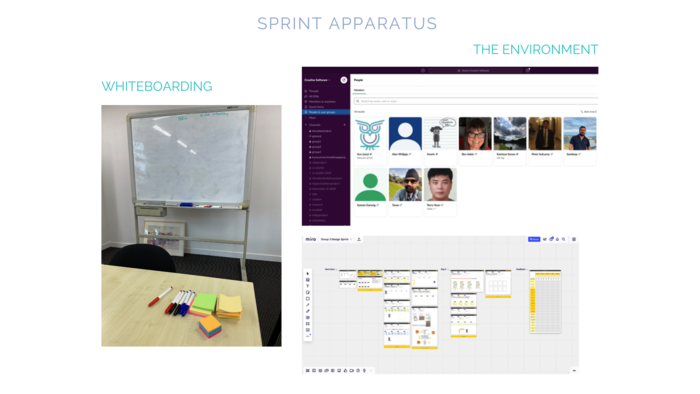
WHITEBOARDING: The sprints relied heavily on using whiteboards to brainstorm ideas and concepts. Whiteboarding was either conducted onsite with a whiteboard or conducted remotely using an online whiteboarding platform called ‘Miro.’ THE ENVIRONMENT: The goal was to create an environment where identities were kept encrypted private-public view. It was essential when utilising the right platform that was highly reliable to protect private data generated from research.

The advantages of running workshops outweigh the disadvantages. To address the disadvantages, preferential study material was compiled for immersive and rapid learning.

THE CONTINGENCY PLAN: Following the resurgence of Covid-19, a contingency plan was put in place to preserve the research study. It was due to adopting online platforms we were able to continue and conduct the research. THE SCHEDULE: I could not preboard the recruitment process on time because of the delay of the ethics application. When the ethics application was finally approved, it complicated the onboarding process. Consequently, the prospects were informally recruited on the first day of the workshop without any prior arrangements generally advocated by the preboarding process.

THE PARTICIPANTS: The participants were recruited from three I.T. disciplines with existing technical skills capable of performing basic tasks. CURRICULUM: To address the different personalities in their learning styles, I looked at videos and blogs and archived artifacts on relevant subjects. Arranged topics were subsequently compiled into useful learning material.

INTERVIEW & SURVEY: The client was interviewed face to face and conducting an online survey to gather explicit data. SPRINT 1: The data collected was too premature to determine an outcome, so the dependant variables were brainstormed for ideas and user pain points. This was the ‘Ideation’ process where participants looked for solutions to mitigate obstacles. It was performed by asking the ‘How Might We?’ (HMW) question reiterated throughout the sprints. SPRINT 2. During the ‘Conceptual Design’ process, the participants learned 'user-centred design’ concepts using visual aids such as mood boards designed to ascertain the organisation’s brand values acquired in SPRINT 3: The ‘Visual Design’ process designed sitemaps and wireframes. The participants could test and finetune the prototype with the stakeholder before SPRINT 4: The development process encountered rigorous design testing. SPRINT 5. The HMW narrative completed the design and development process.

IN-KIND SUPPORT: These were our in-kind support resources used during the entire research. DOCUMENTATION: Documentation was created to guide every course of action for the research study. It involved obtaining permission to utilise human participants through mandating interviews, surveys, and instructions to execute the experiment. Milestones were also documented to monitor and record objectives and all progress. Before commencing the workshops, documentation was reproduced in digital format on the online platform ‘Survey Monkey.’

LEARNING OUTCOMES: The participants required a design thinking mindset to translate their annotations from the workshops to help drive innovation in their designs. The following was the accomplished breakdown of professional and personal development: 1) Participants gained user empathy through observation and interviewing and developed user insights to identify user pain points. 2) Used multiple brainstorming techniques to find innovative solutions. 3) Participants prototyped a solution to a user challenge. 4) They developed and tested the proof of concept to support the viability of the hypothesis.


PHASE 1: RECRUITMENT: The preboarding process was scheduled to implement two weeks before commencing the workshops, but due to the delay of the ethics approval, it was not. The delay disrupted the preboarding process that reflected in the outcome of the results. PREBOARDING - THE SCHEDULED PLAN: Before participants walked through the door, the ‘preboarding’ strategy would be established in advance. Steps were observed to ensure prospects were invested into the entire recruitment process before their first day. CONTINGENCY PREBOARDING PLAN: The schedule planner was our contingency plan that compensated for disruptions during COVID-19. ONBOARDING: The onboarding process was an informal officiation of welcoming new prospects on their first day. Onboarding is a strategy practiced to improve retention by 82%. How you welcome arriving prospects on their first day impacts your brand values.


PHASE 2. WORKSHOPS 1+4: The workshops were an immersive study program that completely takes on participants with no prior knowledge of UX and develops them ready for the research experiment. The workshops were a series of four workshops organised over a period of four days to generate a rapid understanding of UX methodology

PHASE 3: TOOLKIT & SETUP: The workshops were designed to provide a fun learning environment of one-hour blocks at a time to retain fresh information without repressing interest. Sessions were scheduled over four days, where each day consisted of two hours of learning. ONLINE TOOLS: The participants were exposed to current software on the market widely used and made available as freeware and opensource. ONSITE TOOLS: A Projector was used to display presentations from a computer screen. It was considered an onboarding tool to mandate participants with the fundamentals of the UX landscape. Because UX was such a complex landscape to grasp, the projector allowed us to scale presentations on a large wall for clarity and immersive study. Two whiteboards on site were used to accommodate brainstorming activities.


The following guidelines helped the participants adhere to specific facets of the experiment required to complete the study. Appending each design framework were instructions to execute them,

Step-by-step instructions for each framework.


Source: (SurveyMonkey). SPRINT CHECKLISTS: All correspondence and dialogue were harvested online, and group discussions were based on practical challenges and sharing of assemblages accumulated during sprints, whether they were produced onsite or remotely. TIMESHEETS: Group activities were recorded using online timesheets to measure time and reduce bias. The sprint checklists were designed to orchestrate and track time discrepancies found in timesheets that were monitored around the clock. When participants work as a group, the timesheets act as a compliance tool to reinforce accountability and transparency. EXIT FEEDBACK: To ensure that all our findings were recorded for a report, an additional data collection session was conducted for all involved upon exiting the research study. Extra data that was gathered was extended to improve the running of future workshops and services.

FRAMEWORK: The results show that the Whistlebox Design Framework was 50% more agile than the two most popular design frameworks. The data depicts the Whistlebox design framework produced a mobile application in fifth-teen (15) days. Where the Lean UX design framework had generated the application in forty-three (43) days, the google design framework had generated its application in thirty-three (33) days.

SPRINT 1: The ‘Conceptual’ process: represents the Whistlebox design framework accelerated the time difference. It indicates that by using the CBT tables, the participants could conduct their objectives in conjunction with the online survey on the same day. However, due to the design of their frameworks, both control variants were restricted to separate iterations. SPRINT 2: The ‘Ideation’ process demonstrates how the workshops could provide a level playing field among participants to reduce bias. SPRINT 3: The ‘Visual Design’ process represents the ‘hallmark’ of the Whistlebox design framework. The CBT tables had reduced the design process when it predicted the design feature for the application. SPRINT 4: The ‘A/B Testing & Development’ process reflected their design thinking process's effectiveness. SPRINT 5: The ‘Debugging & Development’ process where the results demonstrate the hallmark of Whistlebox started and finished strong

EXIT FEEDBACK: The recruitment phase processed nine (9) participants, including the client. The outcome revealed that only 10% experienced the preboarding process below expectation. This was caused by the delay of the ethics approval, which failed to execute the preboarding process on time. However, 40% of the participants acknowledged that the recruitment process met their expectations, where the majority remained very optimistic, exceeding their expectations. Most of the participants found the second phase of the methodology extremely valuable. They expressed high interest in partaking in the workshops and believed the experience boosted their confidence levels.

SPRINTS: Overall, the groups took longer to process their visual designs & user-testing during Sprints 3 & 4. ONSITE: Group 1 analysing the Lean UX took longer because when they skipped a process (mood boards – ideation, visual), they failed to capture the visual language of the brand that had a ripple effect throughout the whole process. How Group 2 started strong but failed to complete their application on time. REMOTE: Both control groups struggled with their processes based on experience utilising new software tools for their framework and team dynamics encountered during the study.

INTRODUCTION: This section expands on the research questions developed during the research study concerning the hypothesis, from securing the ethics approval for refining the design framework to discovering new insights with an agile perspective and the impact of organising workshops that benefit organisations. BALANCING ETHICAL PRINCIPLES: Both the ethics committee and my legal representatives enabled me to conduct the research and protect all involved in the research. As a result, the ethics consent was necessary for the research to be formally allowed to inaugurate. THE INSIGHTS: The role of each group’s project manager was to ensure that instructions to execute their framework were followed. The frameworks expressed their value when the participants accomplished their tasks.

THE PARTICIPANT: Narratives were either verbal or non-verbal to support each other. One group struggled with English as their second language but overcame this using gestures and facial expressions. THE WORKSHOPS: Everyone involved appeared to enjoy the opportunity to express themselves while learning and engaging in the activities freely. DESIGN PROCESSES: The research study focused on maximizing participation to help develop stamina to accomplish their goals. DESIGN TECHNOLOGY: The research exposed some weaknesses with the popular design frameworks; however, everyone involved had equal opportunity. TECHNICAL: the contingency planner was designed to circumvent COVID-19. SOCIAL: Negative behaviour in those involved was evident at the commencement of the workshops, with egos prevalent in just a few participants. However, it was managed effectively by eliminating the common denominator.

Racial Bias was reduced when the participants were from different ethnic groups. Response Bias was eliminated, which would have had a detrimental effect on the research study. Voluntary Response Bias was reduced when the participants who responded to voluntary surveys were no different than their peers. Under Representation Bias was reduced because there were no minority groups. Implicit Bias: Workshops were organised to reduce inexperience affecting decisions. Net Bias: Onsite meetings using public internet caused intermittent disruption. Onsite meetings were rescheduled to regulate the progress of work quality. Omittance Bias encountered was eliminated by standing firm on concepts and trusting the process. Publication Bias: The intent to publish positive and negative outcomes. Sampling Bias was reduced when volunteers were representatives of our structured format. Truth Bias was monitored carefully to ensure timesheets were correct.

The research study was conducted over a period of 43 consecutive days, examining a new design framework with two of the most popular design frameworks in the world. I believe the investigation was an unprecedented experience for all involved. The participants transitioned from having no prior knowledge of UX to being skilled practitioners. Consequently, the event exhibited anyone could use the Whistlebox design framework.

MANAGING CBT TABLES: In addition to utilising the Whistlebox design framework, the CBT tables can populate a database every-time they are used. This occurs when new data or design features are added in trial and error progressions generated by conducting sprints. Existing data in the CBT tables can co-exist with new data that are applied accordingly. FUTURE WORKSHOPS: The organised workshops benchmarked new concepts and learning behaviours within the limits of weeks instead of months. It can also provide opportunities for personal and professional development where life-long comradery is developed. The conjoined effort was unparalleled on so many levels. EXPLORE CO-DESIGN WITH MENTAL HEALTH: Co-designing with cognitive behaviours to develop new concepts. By exploring the association with mental health sufferers, we can reduce the stigma of mental illness.

The best method to achieve a task is the one that uses less effort. The Whistlebox design framework could turn obstacles into opportunities and assist organisations, product owners, and design teams design software rapidly. Design frameworks are specifically designed to help organisations organise information with efficacy using visuals to improve UI design. The Whistlebox design framework employs a simple algorithm that applies ‘the principle of least effort.’


gLike
The ‘Whistlebox’ Design Framework
Research has shown that organisations that leverage UX are superior to those that compete on functionality or price alone. My 'Whistlebox' design framework (named after its namesake mob app) has demonstrated that it is 50% more efficient than the two most popular design frameworks in the world. (Lean UX & Google Sprints)