
Final Logo - this was the final logo decided for Monika. It is taken from elements of her photography. Her work includes children in her photography as well as paintings by children. Yet it somewhat remains dark and more adult, thus the reason behind the use of black
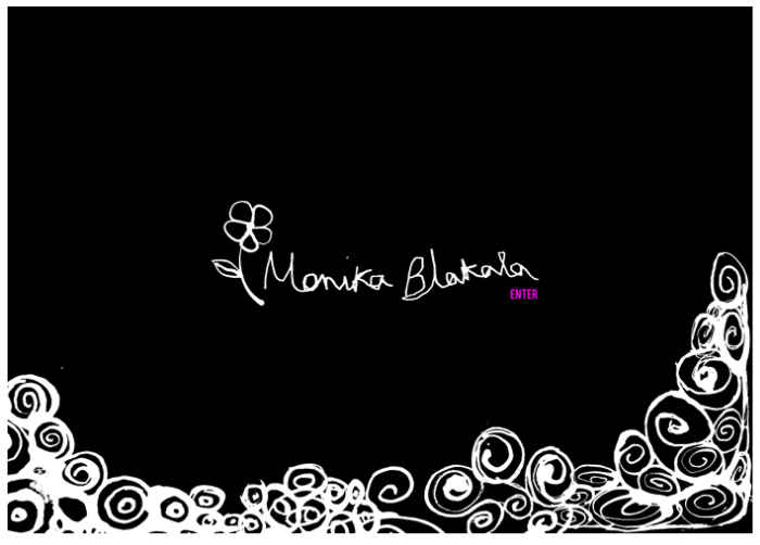
Site Enter Final - In the final "enter" it was decided to include more of Monika's work at the start. The Enter was put in pink to further the femininity of Monika and her work
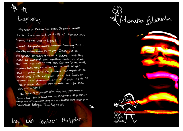
Site Example 01 - Hand rendered type is used throughout the work, examples of her photography are used throughout her site, basically to promote her work. The white conflicts with the black in a positive way, not over powering but still clear and visible.
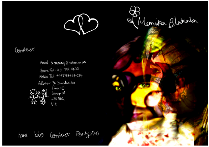
Site Example 02 - the contact page has the least amount of type on it. Again hand rendered but just the required information. remaining simple and easy to navigate is key to the site.
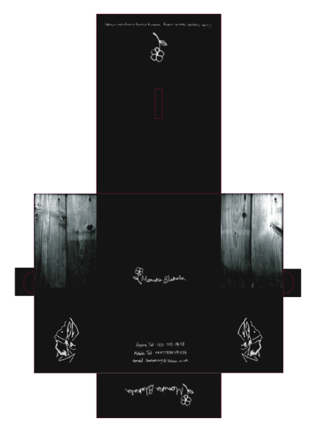
Business Mailer - The idea between Monika's Business Mailer/Catalogue is simply to showcase her work. The Photographs would be placed inside it and posted and handed to potential clients
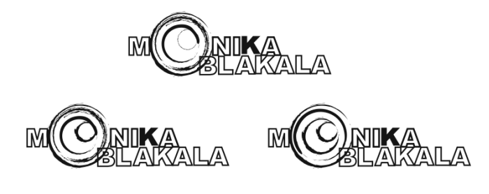
Monika Logo 02 - After seeing some of Monika's photography i tried to "rough" up my work. I tried to represent the loose feel to her work through the blurred lens.
gLike
Monika Blakala Photography