

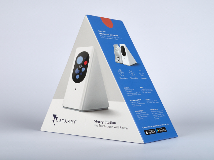
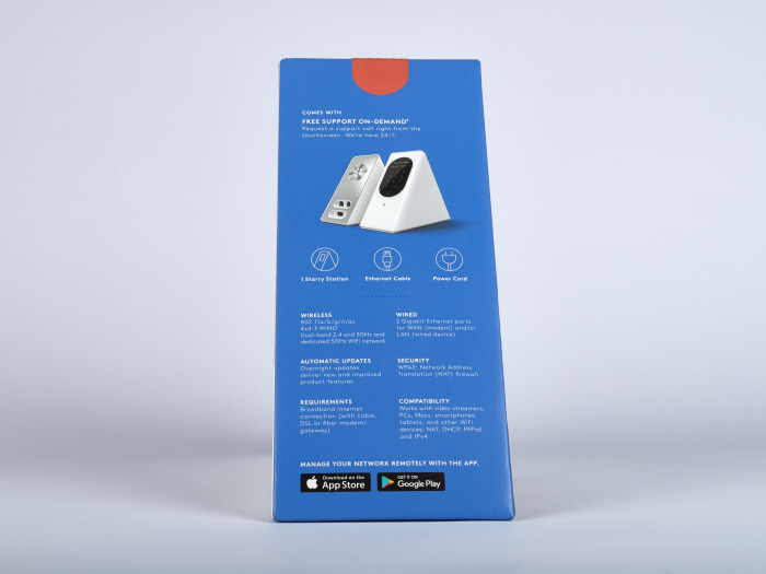
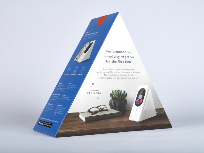
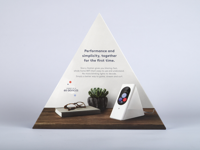
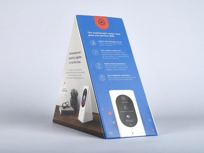
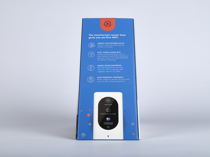
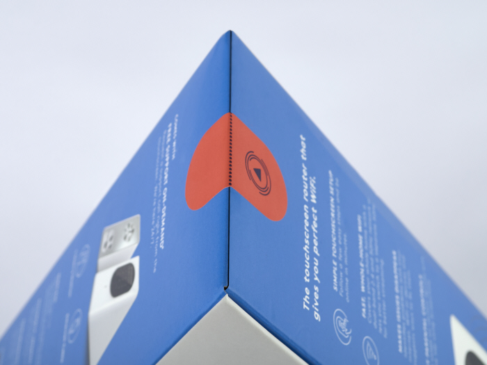
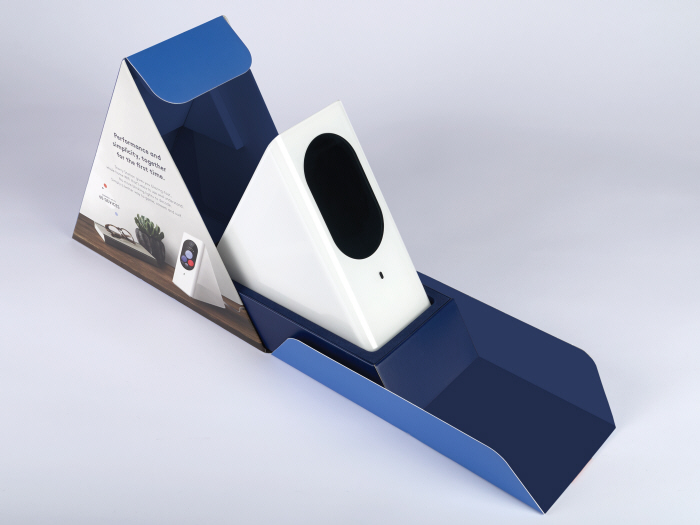
Starry wanted to redesign their packaging and icon system as they moved into the in-store retail phase of their quickly expanding brand. The challenge was three pronged. The first aspect was to to transition the original brand assets to a package that exploded off the shelf in the high-end wifi router category. The second was to educate the consumer about unique and category-changing aspects that the Starry Station has over its competitors. And lastly, and the most important part, is to make sure the design feels legitimate and serious to compete with the standard, uninspired router at a similar price point. Even though the Starry Station is a work of art, it couldn't feel like a novelty product. The result is a simple, yet refined package that confidently separates itself from its competitors on shelf. Work done at RBMM
with Phil Smith and Jessica Young. Logo by Jane Huschka.