
The letter “F” is the first of a series of letterform exercises I am undertaking with my team at Greyspace. It’s a daunting task for me- I feel like a house amongst skyscrapers. My two teammates are classically trained graphic designers, and are quite intelligent. Almost too intelligent. I make the best with what I can without such a formal education, and I find the connection between illustration and letterform a comfortable link. This is a great opportunity to practice what I’ve learned from them, as the best way to learn is to do. Please shoot me an email if you have any comments.

We started this exercise with very vague instructions. This left everything open, no bounds and no limitations. We could do what we wanted, so as not to stop any burgeoning creative spirit inside of us. Sometimes I think the best creative bursts are the result of overcoming an obstacle. I had nothing stopping me, but I also had nowhere to start. Out of a plethora of different options, I tried exploring different forms of the letter, in a very basic sense. Choosing “F,” I started putting pen to paper.

After several timed runs (1 minute to 1 letter), I created several options. Where to go from here? Let’s give each character a personality. Each are unique and carry themselves differently than their brethren, much like people with their personalities. I expounded upon these personalities for word associations.
The two that stood out to me the most, both undercase, seemed very different. One was sinister, seductive, and reminded me of the “f to s” debacle with bible writing. Think of how “succor” looks in fancy script.
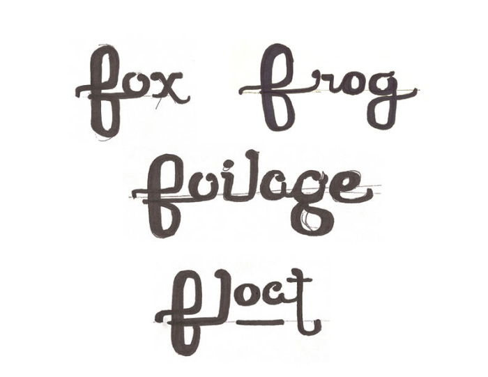
The other form was fun and playful. It was not evil, and I found myself making friends with it easily. It took on word associations well. The most successful word utilized the staggered layers of the letter to double its own meaning.
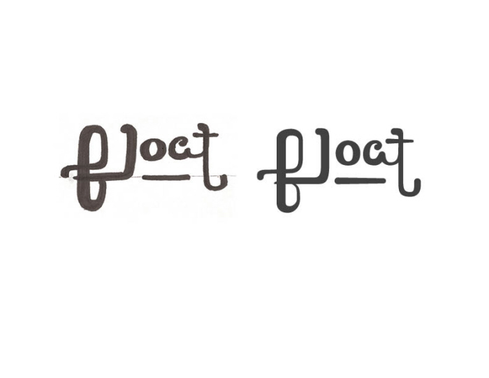
Vectorized and traumatized.
gLike
F is for Float