
From June 2012 until January 2013 my teammate Alexander Bencak and I worked with an engaged couple—lovingly referred to as PB&J—to design a unique wedding package. This wedding package was composed of Save-the-Dates, invitations, table and name cards, and Thank You cards.

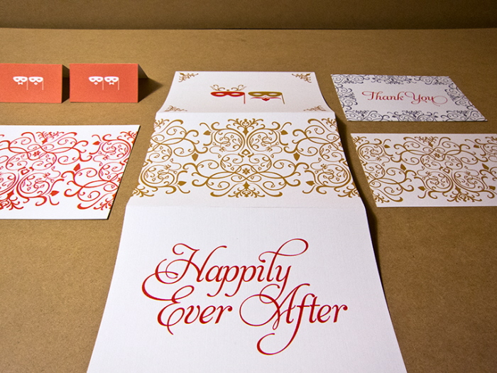
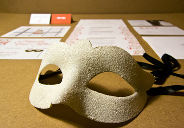
Several meetings were held during the early stages of the project to determine a theme for the couple’s special day. The chosen theme was a winter masquerade wedding titled "Happily Ever After." To complement the selected theme, color palettes, imagery, and type styles were explored.

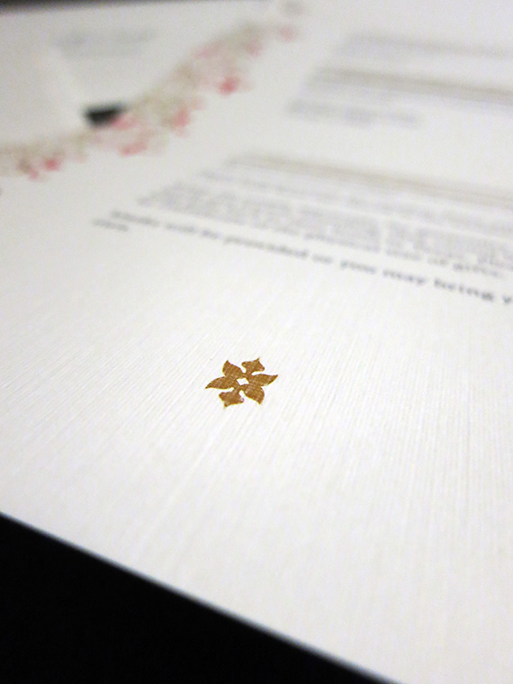
Red and gold became the colors of choice. We began drawing imagery that resonated with the theme and the feel of the wedding. A simple signature icon was created to represent their masquerade themed wedding. This repeating element—a simple, yet adaptable mask—evolved throughout the entire design, offering unique and playful ways of depicting the wedding party and driving the theme. The groom, with his distinct red beard, helped inspire the creation of our two masked characters to represent the wedding couple.

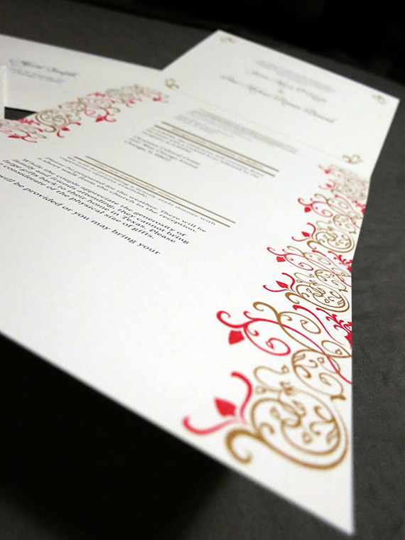
We also developed an intricate pattern used throughout the wedding package. Distinct shapes and elements from the pattern were extracted and used to maintain a consistent visual style with each piece of the package.

With the wedding couples tight budget in mind, we worked to create a small run of digital prints for this part of the wedding package. The mask on the card was applied with offset printing, using metallic gold ink. This small touch added a delicate, eye-catching charm that hinted the masquerade theme.

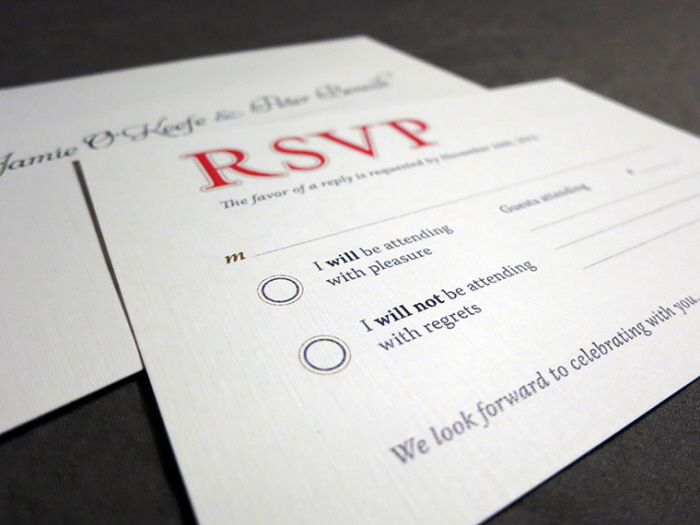
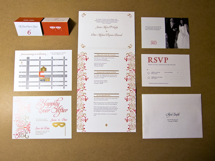
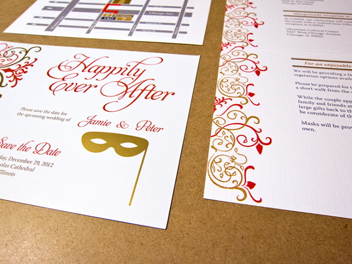
The wedding invitation comprised of an envelope, 3-fold invitation, map card, and an RSVP card with an addressed envelope. Working with the budget and print quantity, digital printing became an obvious choice. A beautifully textured, linen cover stock was chosen to bring formality to the event, producing a stunning package upon opening. After packing the envelopes, it was a pleasant surprise to discover the faint peaking of the wedding's signature pattern on the front of each envelope.

Upon opening the first flap of the invitation, the representation of the bride and groom is set to greet the invited party.
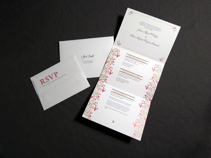

Clarity was key, and common elements from the pattern were used for establishing hierarchy in each panel of the invitation.

Tucked into the invitation were the RSVP and the map card. The packaging and order of each card was carefully considered to make the experience of opening the invitation special.

For out of town guests, stylized map card clear and concise directions from the church to the ceremony. Hierarchy was used on the city streets to help unfamiliar guests recognize major and minor streets.

Alex and Ana packaged, stamped, and mailed the envelopes out for the bride and groom. It was a huge sigh of relief and excitement to have a large stack out and about.

The big day for PB&J was indeed very special. Name cards were requested to match the rest of the wedding material, and we were happy to deliver. Each card was customized for the attending guests. Each card, whether it represented a family or an individual, included the signature masks adorned with lips for ladies and bow ties for gentlemen on the back of the card. Some of these images were courteously provided by the wedding photographer Michael Dreher.
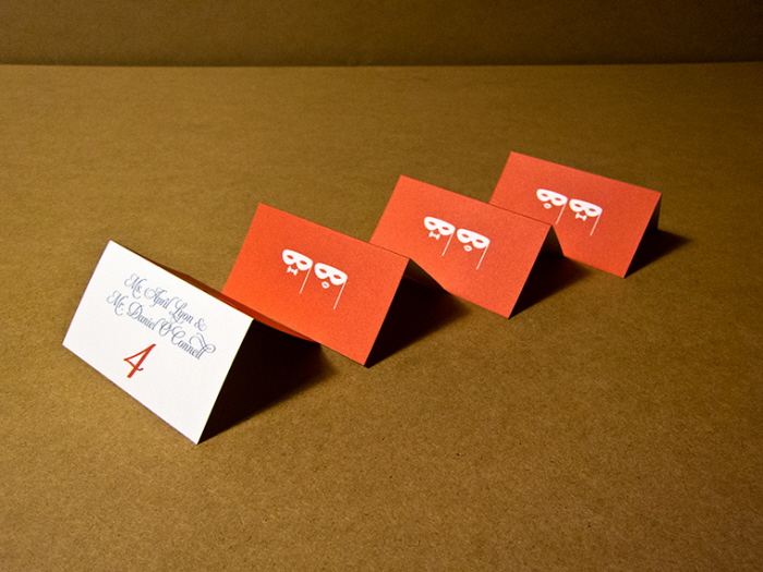
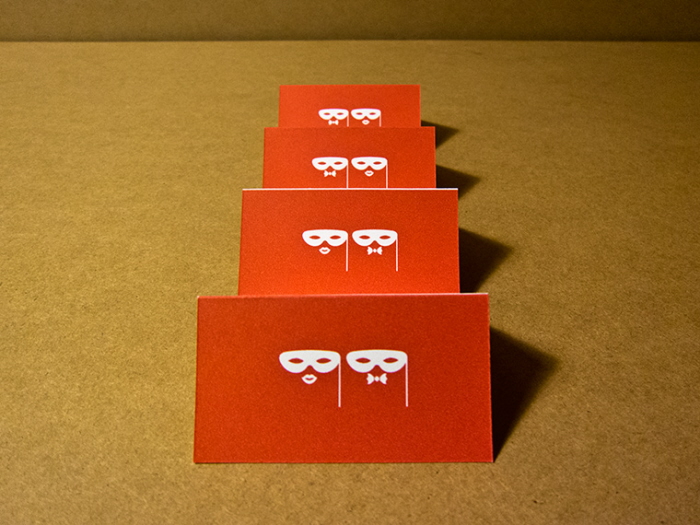
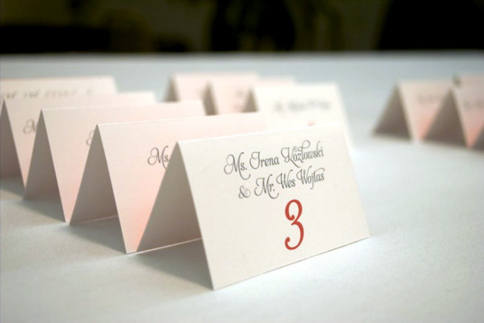
photo provided by Michael Dreher
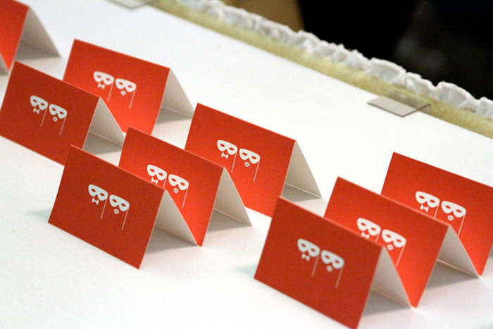
photo provided by Michael Dreher

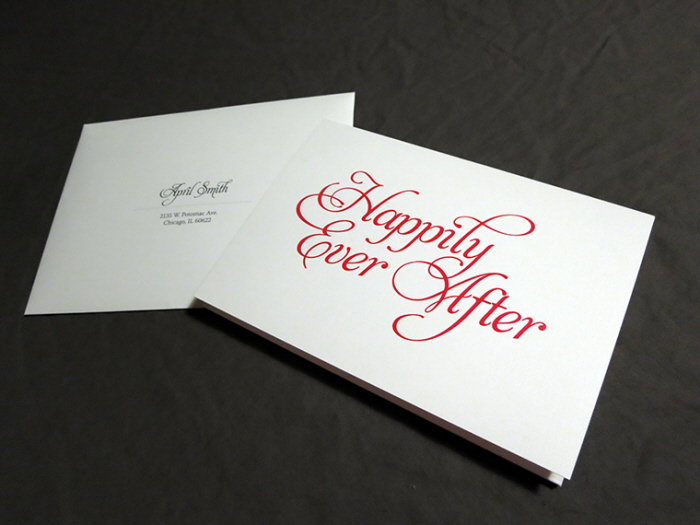
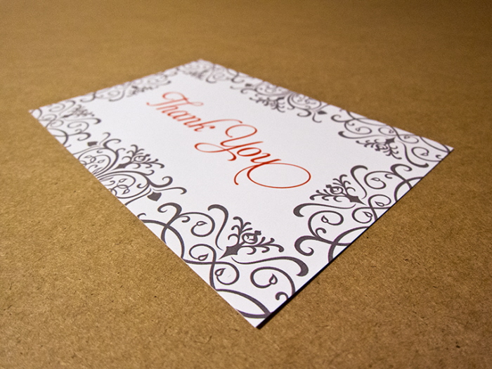
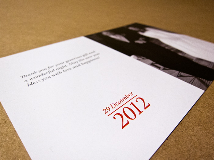
A week after the wedding, we began work on Thank you cards for the newly married couple to send out to their guests. Collaborating with the wedding photographer, a card was made to finalize the entire experience for the bride and groom. Michael Dreher provided a choice selection of photos, and layouts were developed around each photograph. The couple picked their favorite design out of the group, and the cards were sent off. The Thank You cards acted as a keepsake of a wonderful night.
gLike
PBJ Wedding Package
A complete wedding package was made for a couple lovingly named PB&J
View Website